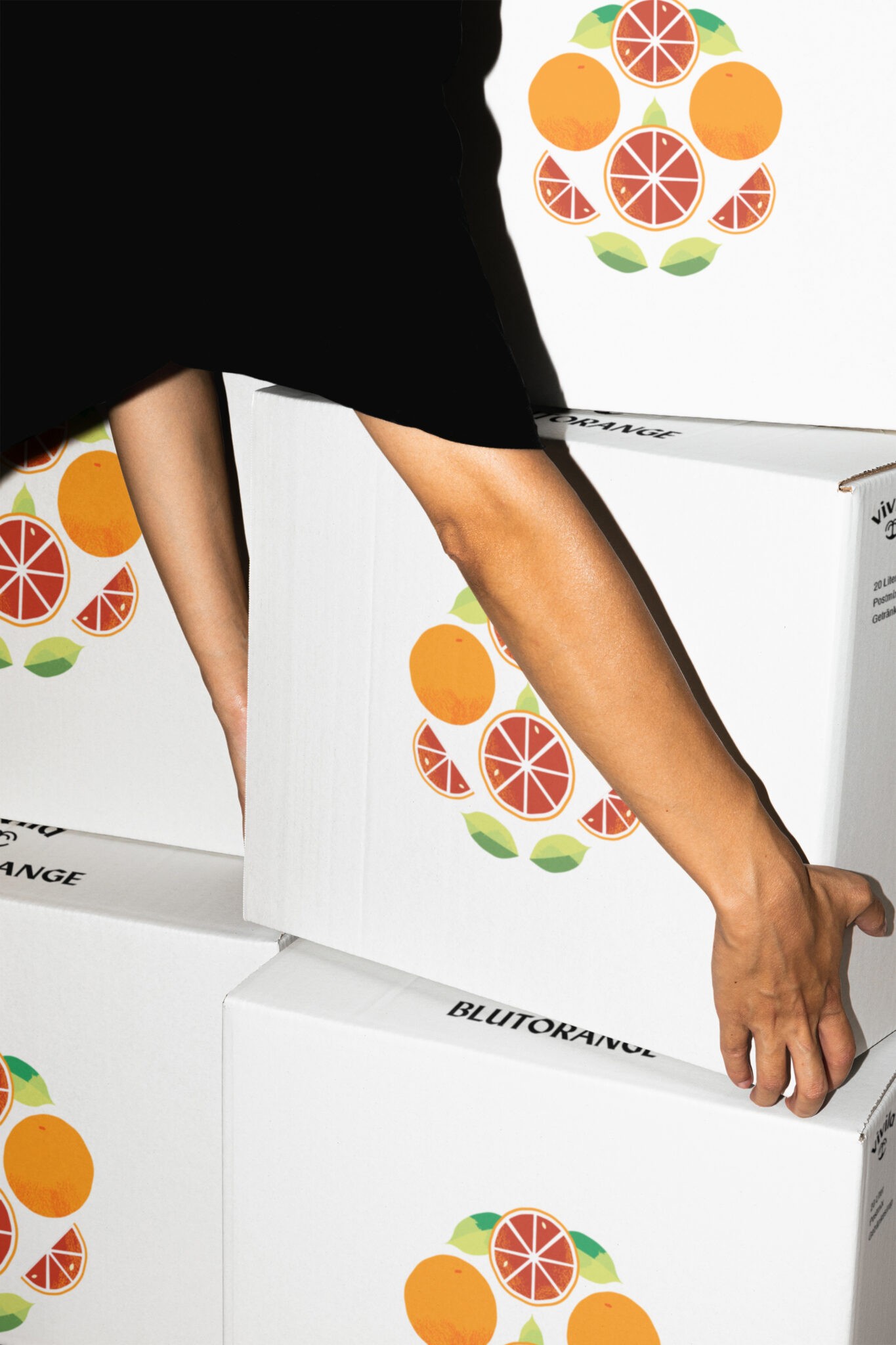



Vivila specialises in large-format post-mix beverages, syrups, and other fruit drinks. The brand originated from the Eiport project, where I collaborated closely with the client to establish a brand architecture that divided Eiport into a master and a sub-brand.
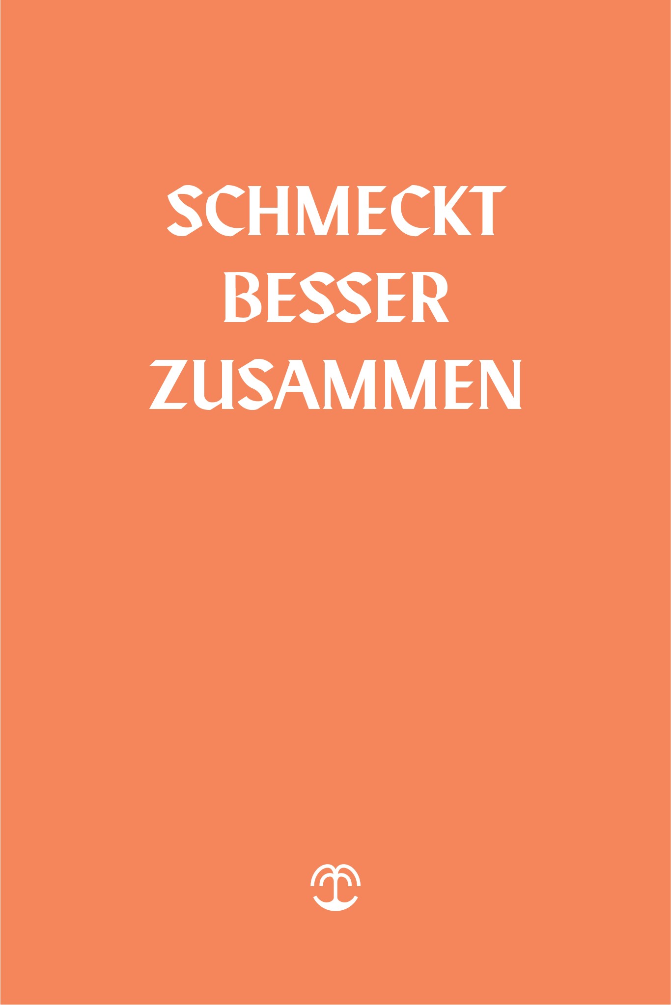
Emerging from the pandemic and offering large-format packaging, we centred Vivila’s identity around community and joy. The name we created —Vivila—has Italian roots, translating to “live it.”
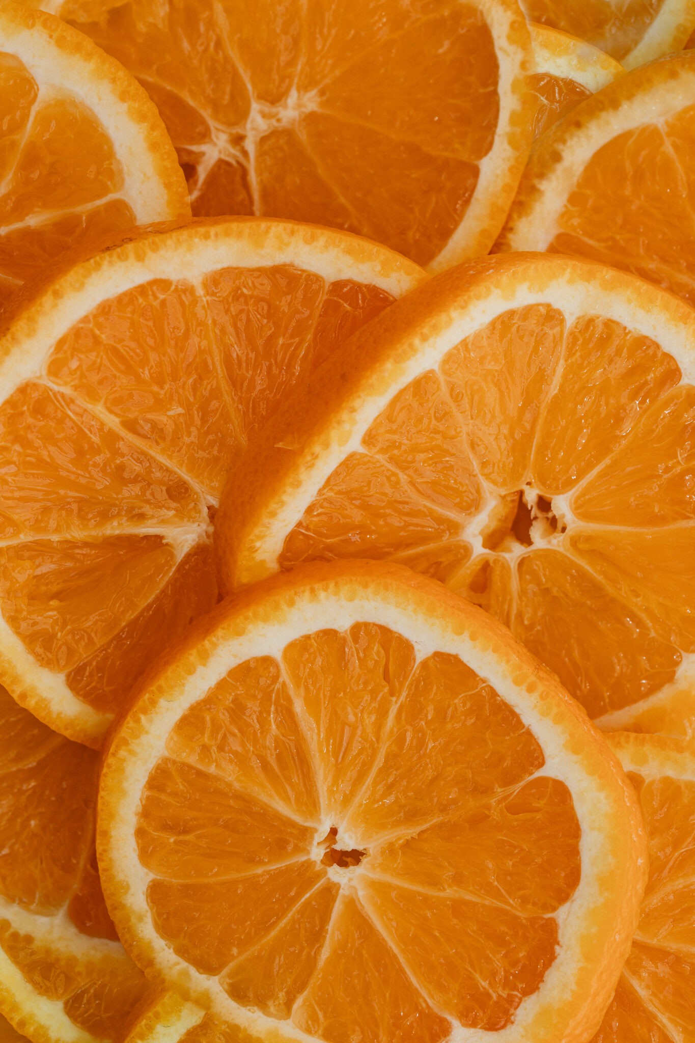
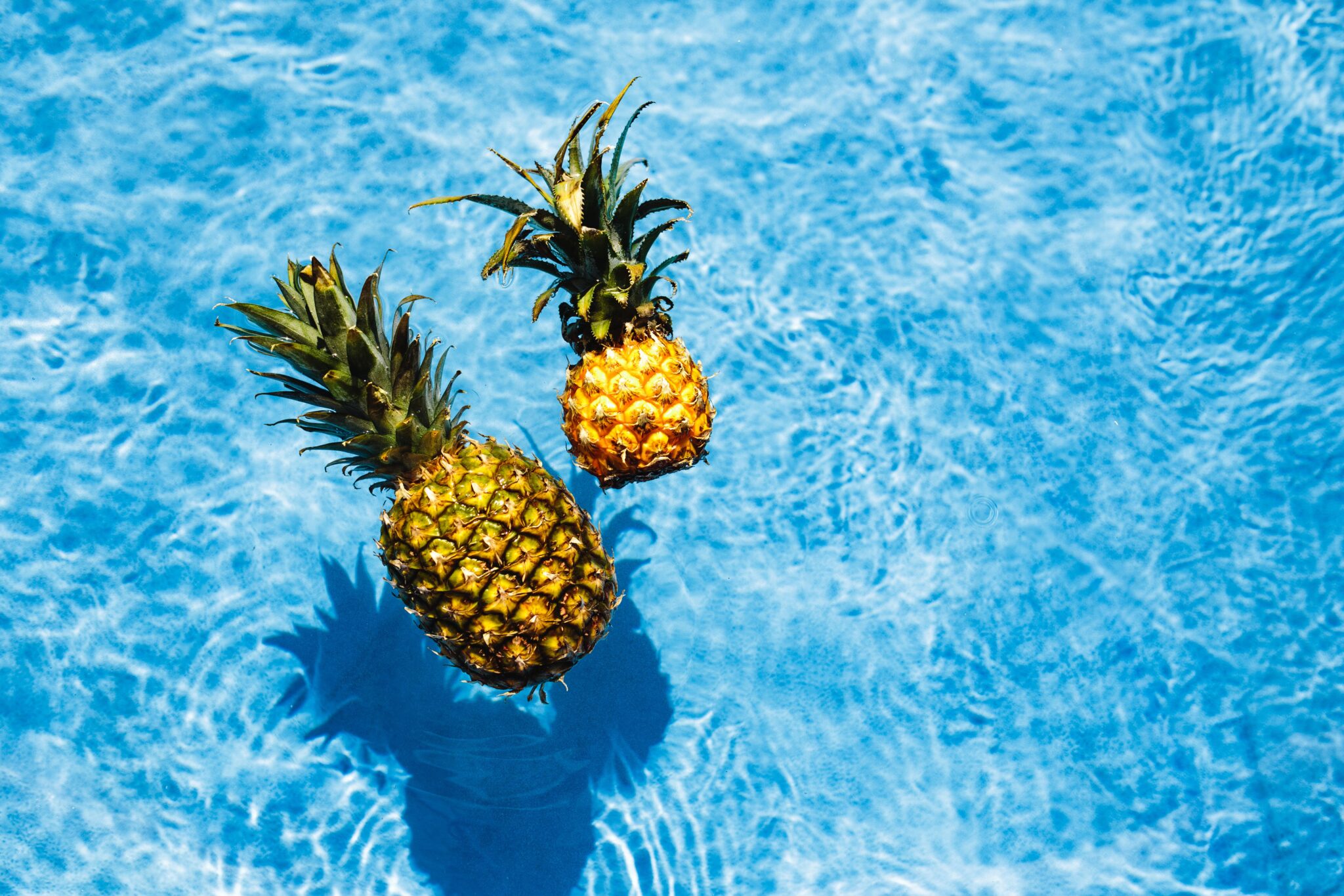
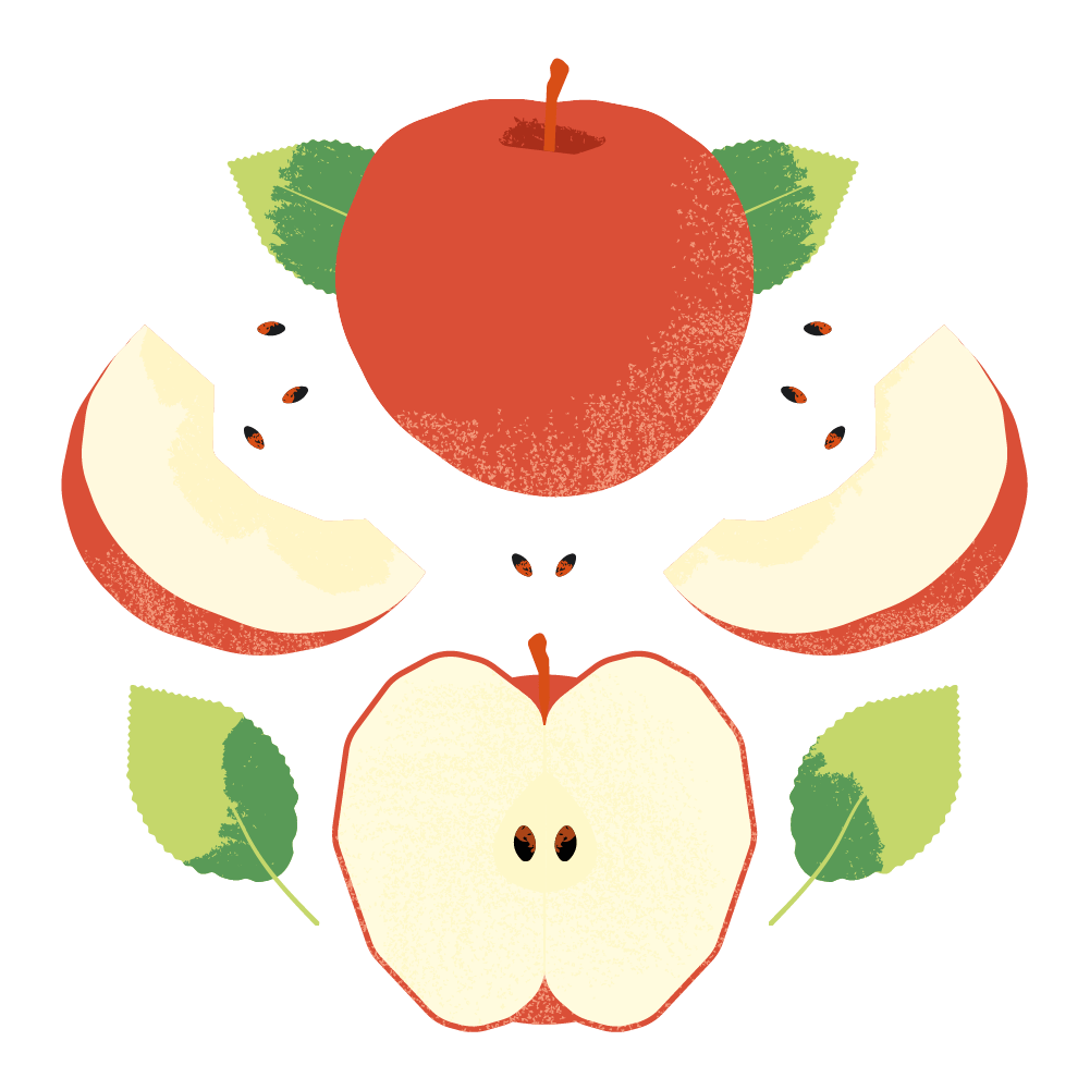
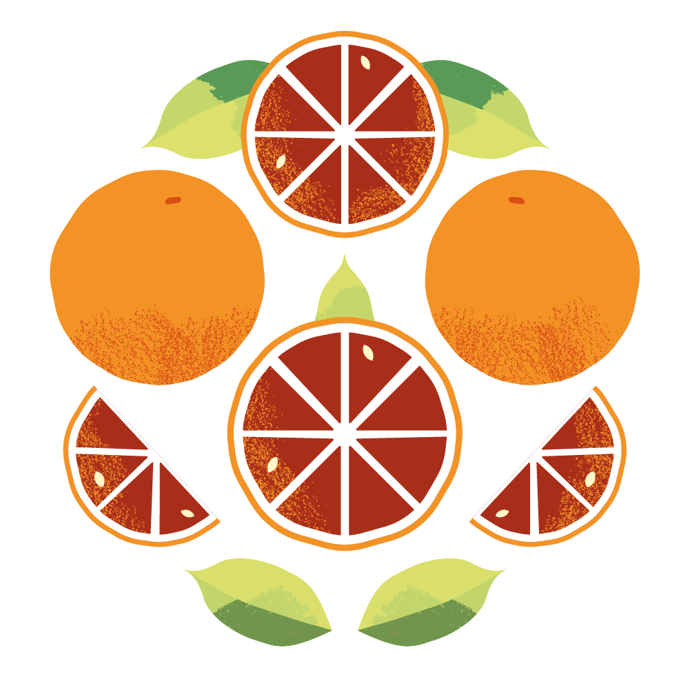
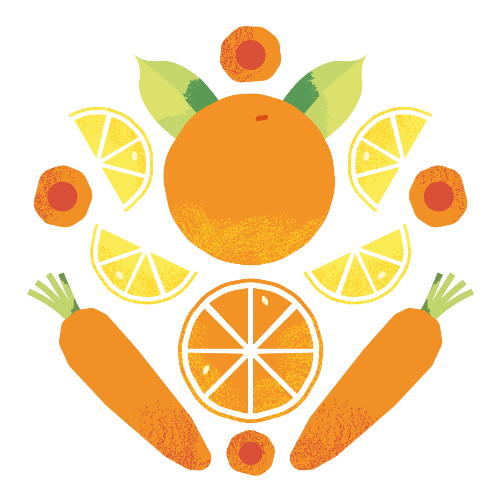
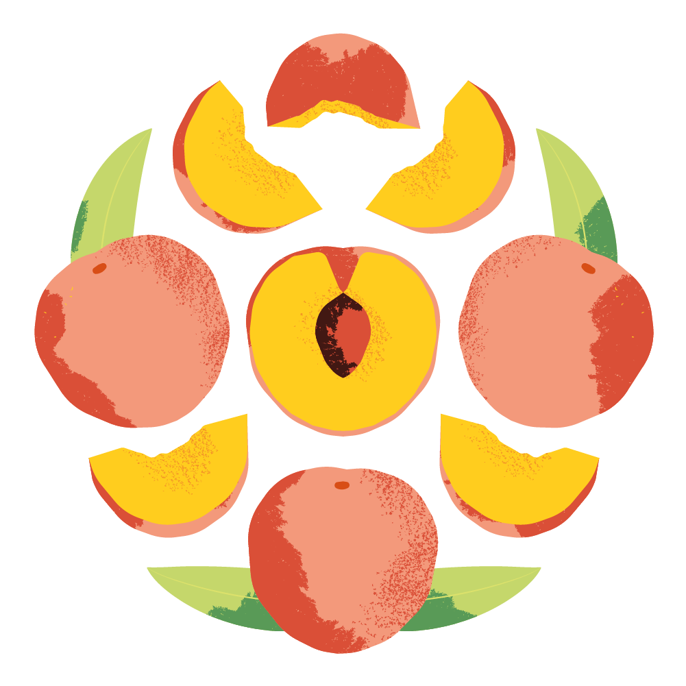
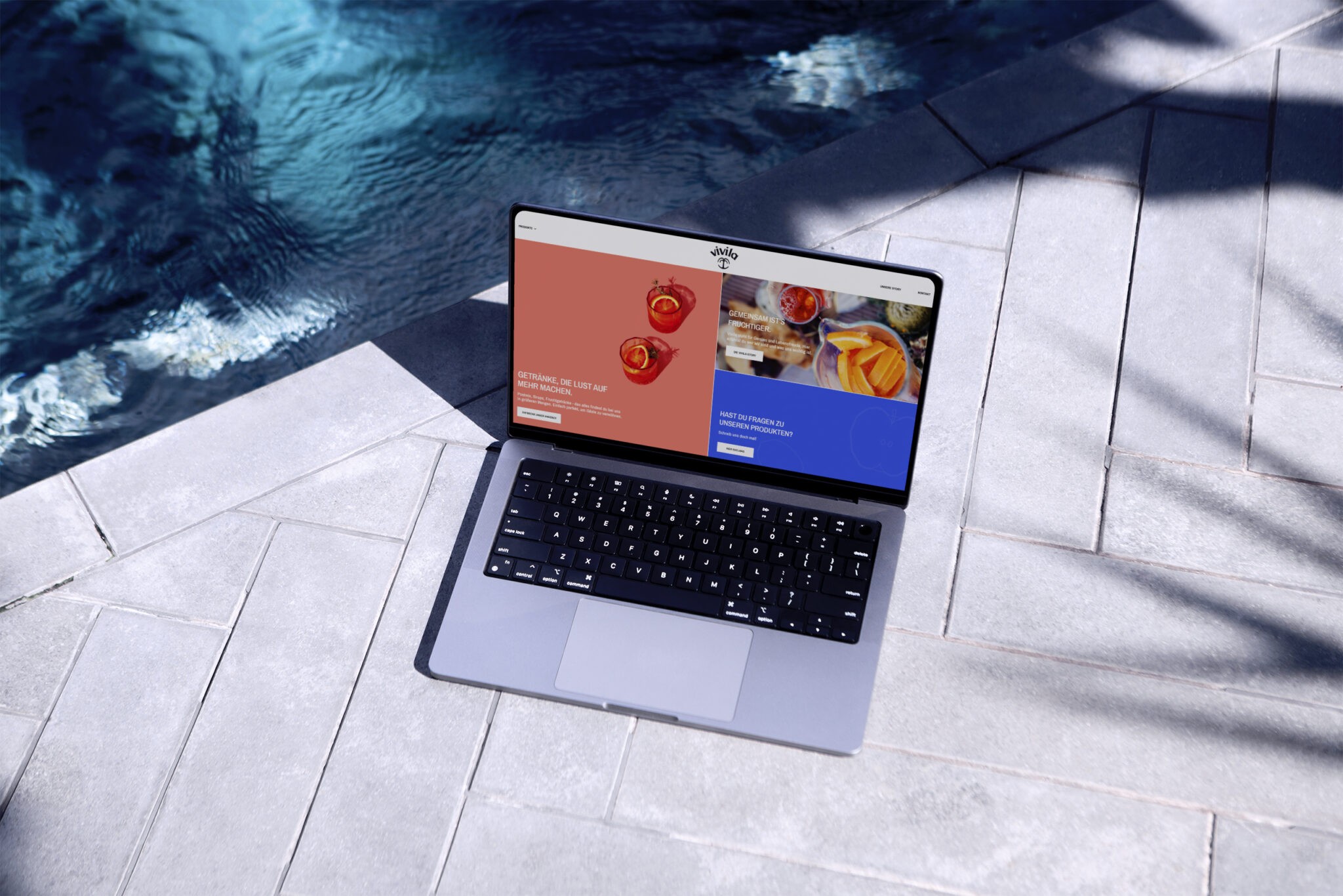
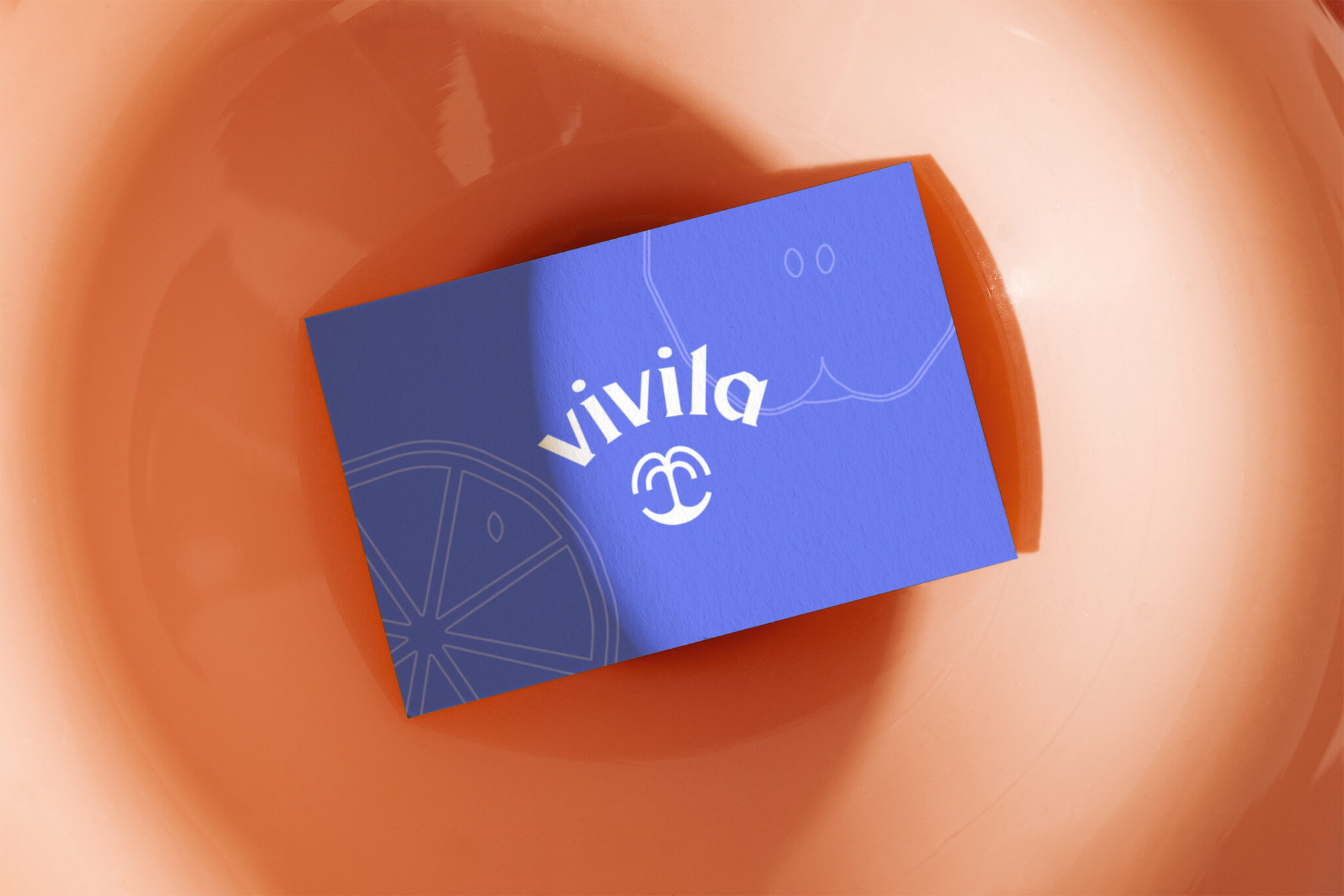
Vivila’s branding is vibrant and refreshing. The logo resembles a fountain, the fruity illustrations and rich photography stimulate the senses, and the Vivila Blue makes the other colours pop. The project concluded with the development of a website featuring an integrated shop.
Web development and photography by Florian Berger. Together we are Berger+Team.


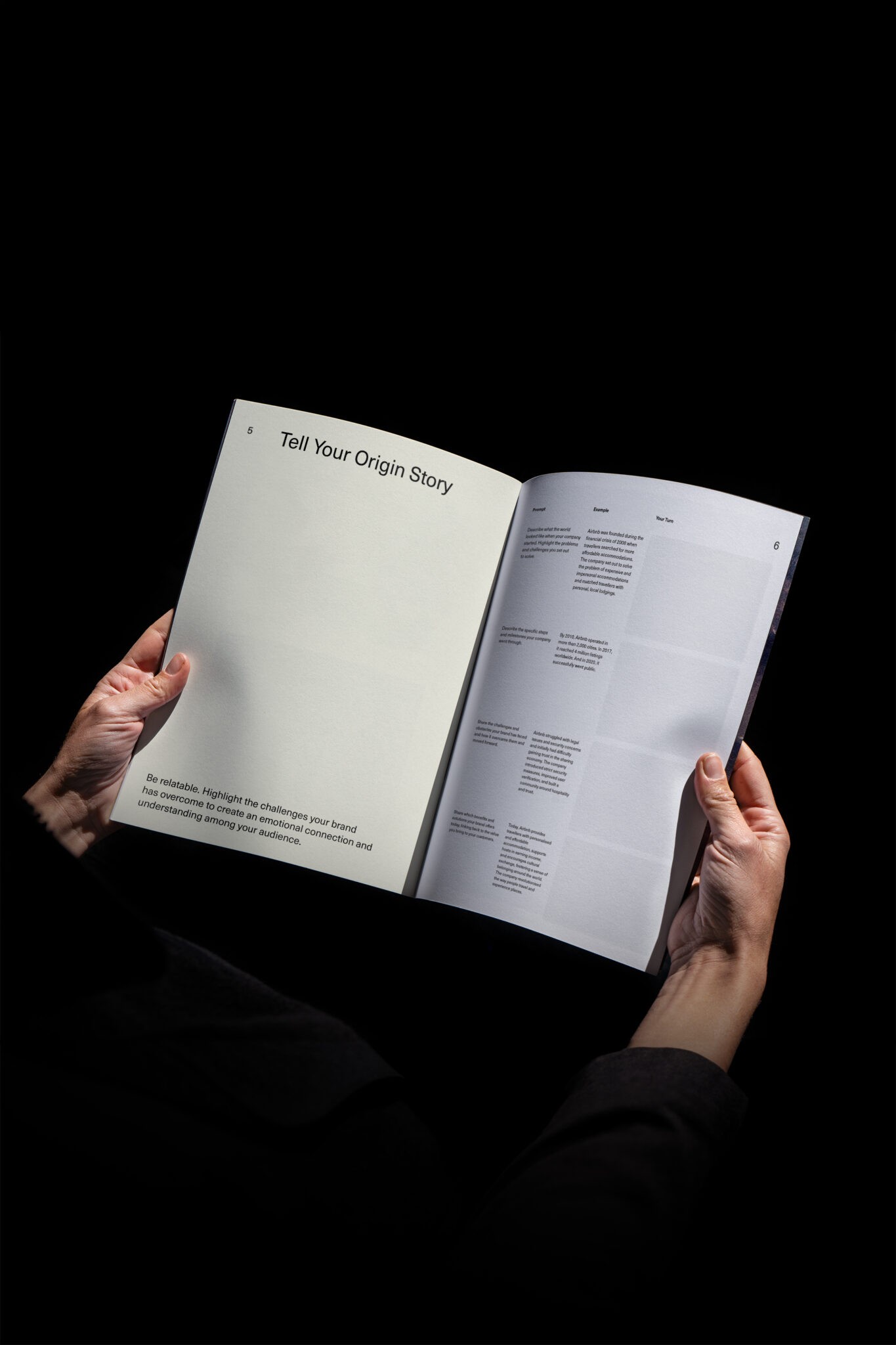
Receive regular branding updates and claim your free Brand Storytelling workbook.