You can attract as many visitors to your website as you like, but if they don’t sign up for your newsletter, try out your products or services or make a purchase, you won’t benefit from that traffic.
So, how do you turn those visits into actions? Let’s explore 10 web design tips for building a business website that converts.
But before diving in, let’s quickly define what conversions are.
When it comes to websites, a conversion refers to a visitor completing a desired action, like filling out a form, making a purchase, or signing up for a service.
To calculate the conversion rate, divide the number of completed actions by the total number of visitors, then multiply by 100:
For example, if your website receives 500 visitors in a month but only one project enquiry, your conversion rate would be 0.2%.
According to the NZ Marketing Association, a reasonable conversion rate is around 5%.
Keep in mind though, benchmarks vary significantly by industry. SaaS businesses, service providers, and e-commerce stores all operate with very different baselines, so it’s worth researching what’s typical for your specific field.
Conversion rate calculator
What would a better rate be worth for your small business?
I’ve built this calculator, so you can see the numbers for yourself . Because sometimes the best motivation to optimise your website is seeing what you’re leaving on the table.
Once you enter your monthly visitors and current conversion rate, you can see what a 1%, 2% and 5% increase would mean for your monthly revenue.
But now, let’s get into the 11 steps to help your website convert and achieve these goals.
TL;DR
If you want to skip to the insights, here’s the short version:
- Start with clear goals, one per page
- Research your competitors and audience before you build anything
- Make your messaging speak to one specific person
- Use consistent branding across every page and element
- Create visual hierarchy so visitors know where to look
- Use visuals to create your own world
- Optimise for mobile first, that’s where most visitors are (but don’t neglect desktops)
- Spread social proof throughout the site, not just on one page
- Convey authority through credentials, client logos, and case studies
- Use AI as a thinking partner, not a replacement for your brand strategy
- Page speed matters and every second counts
1. Know your goals
Before you can develop a business website that generates conversions, you need to know the goals of your website.
- What does a conversion mean to you?
- What do you want visitors to do when they land on your website?
It’s advisable to focus on one main goal per page instead of overwhelming visitors with too many options.
Several options can lead to decision paralysis—a phenomenon known as Hick’s Law.
So, by setting clear goals for each page, you’ll improve the user experience and increase the likelihood of conversions. For example, my goals are:
- Get visitors to book my branding and web design services.
- To get visitors to buy via my affiliate links.
- Sell small products like workbooks or ebooks (in the future).
By setting your goals in advance, you can optimise your website’s design and content to drive visitors to the desired actions and ultimately increase your conversion rates.
2. Conduct competitor and audience research
Before you create or optimise your website, you should thoroughly research your competitors and target audience.
This will allow you to develop a website that is specifically tailored to your audience’s needs and stands out effectively.
Competitor research
For your website to stand out, a thorough competitor analysis is essential. Here are some aspects you should pay attention to:
- Design: Evaluate your competitors’ websites’ appearance, layout and user interface.
- Brand Elements: Analyse the brand assets used by your competitors, such as logos, colours, typography or tone of voice.
- Unique selling propositions (USPs): Identify the unique selling points of your competitors and consider how you can differentiate yourself from their offerings.
- Content: Assess the type and quality of their content, such as blog posts, product descriptions and multimedia.
- Usability: Analyse the usability of their websites, including navigation, loading times and responsive design.
- Additional functionality: Are there any particular features such as search functions or quizzes?
Audience research
To create a website that resonates, understanding your audience is important.
Here are some points you should clarify when analysing your audience:
- Demographic data: Determine the demographic characteristics of your audience, such as age, gender, location and income level.
- Psychographic data: Use psychographic data to gain insights into and better understand your target audience’s attitudes, values, lifestyle and personality.
- Preferences: Investigate their preferences and interests, such as their preferred communication channels and content formats.
- Behaviour: Analyse your target group’s online behaviour, browsing habits, search queries and purchasing behaviour.
- Pain points: Identify their challenges, needs and pain points and consider how your brand and website can address these issues.
Further reading
In this article, I’ll explain why it’s important to identify your target audience in more detail.
3. Nail your value proposition and messaging
Developing a unique value proposition and a clear brand message helps you to convey the uniqueness and value of your business.
Value proposition
Create a clear value proposition differentiating your product or service from your competitors.
Focus on the added value you offer to your customers.
Why should they buy from you?
A clearly formulated value proposition will help you convince potential customers to choose your company over others.
Messaging
Now is the time to translate your value proposition into compelling, customer-centric messaging.
Good copywriting plays a major role in captivating your users and encouraging them to take action.
Over half of all consumers today expect companies to understand their individual needs and expectations.
To create content that appeals to your audience, you need to reach them emotionally and address their problems. Emphasise what makes your business unique and attractive and how it can help them.
Keep your brand messages simple. Avoid overwhelming users with too much information or jargon.
Also, your copy should be free of spelling, grammar, and punctuation errors—that’s a given.
Don’t forget that users often only skim your website instead of reading it word for word. That’s why your headlines are particularly important.
By the way, you may find my article on brand storytelling interesting in this context.
Further reading
Before you get to messaging, though, make sure you’ve sorted out whether to start with website copy or design first. It makes a bigger difference than most people think.
And if you want your messaging to land, this article on the psychology of effective brand messaging is a must-read.
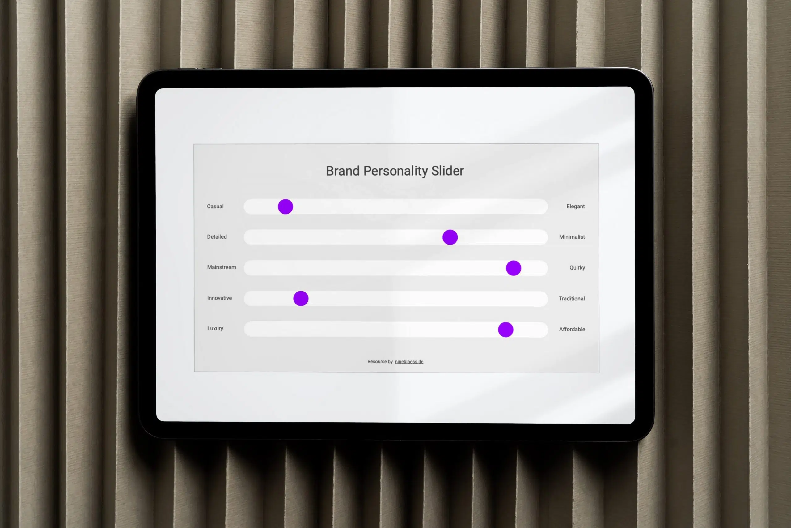
4. Use consistent branding
You won’t get a second chance to make a first impression. Visitors will form an opinion of your business within seconds of seeing your website.
This initial impression can significantly impact their perception of your brand as a whole (due to the Halo Effect).
Studies confirm this: 75% of consumers judge a brand’s credibility based on its website design, and 38% of people will even leave a website if they find it unappealing.
Your website, alongside your branding, should reflect the quality of your products and services, communicate your brand’s personality, and meet your audience’s expectations.
Ensure your website remains consistent by using your brand assets the same way across every page — from colours and fonts to tone of voice and imagery or illustrations.
By keeping the look and feel consistent across your website and all other brand touchpoints, you can strengthen your brand identity, increase brand recognition, and create a coherent and memorable experience for your audience.
Further reading
You may enjoy my article on creating a branded website in this context. And if you want to understand what makes your brand stick in people’s minds, this article on what makes a brand recognisable is a good next read.
5. Create hierarchy and order across design elements
Organise your content logically and clearly and draw the user’s attention to the most important information.
Here are some design tips to achieve this:
Typography
By systematically using fonts, font sizes, weights, and styles, you can organise information hierarchically and present your content clearly.
- Font choice: Opt for easy-to-read fonts, especially for body text. Remember: The more fonts, the slower your website loads.
- Font size: Make sure the font size for body text is at least 16 px.
- Hierarchy: Establish a clear hierarchy for elements such as headings (H1, H2, H3, etc.), buttons and body text and adhere to it consistently.
- Line length: Use an optimum length of 45-75 characters per line.
- Line height (leading): The line height should be about 1.4-1.6 times the font size of the body text. The leading can usually be slightly smaller for headings.
- Paragraph spacing: Ensure even spacing between paragraphs to create a visual separation.
- Alignment: If possible, align your body text to the left; this is easier to read and is particularly important for longer text.
Further reading
You might also like these articles:
- How to choose brand fonts, a practical guide to picking typefaces that align with your brand personality.
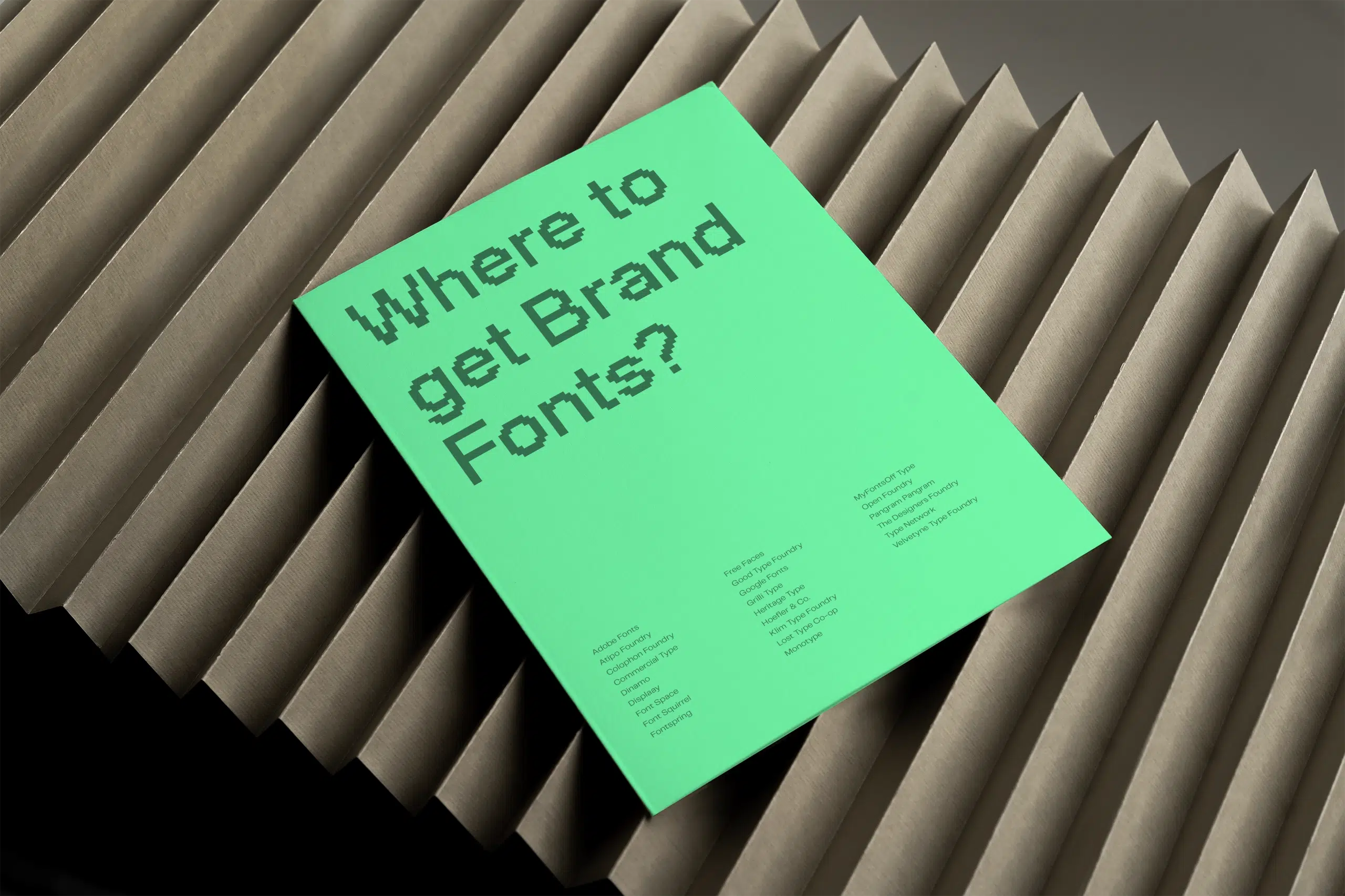
- The best websites for finding fonts for your brand, curated to help you find free and premium fonts with personality.
Colours
- Contrast: Ensure sufficient contrast between the text and background colours. This is particularly important for people with visual impairments. There are contrast checkers you can use.
- Colour and function: The colours on your website can have different functions. For example, a specific call-to-action colour of your buttons can prompt action; your brand colours can promote recognition and trust; background colours can divide the content into sections and create a visual hierarchy.
- Colour systems: If your brand colour palette is insufficient, the Eva Design System Generator, among other tools, can help you develop a harmonious palette.
Further reading
You might also like these articles:
- How to create your unique brand colour palette, a step-by-step guide to building a colour system that reflects your brand
- How many colours should a brand have?
- Pitfalls when choosing brand colours, common mistakes to avoid
Other design principles
- Rule of Thirds: The rule of thirds divides an image into a 3×3 grid. Important elements can be placed along the intersections for a pleasing composition.
- Gestalt Principle of Similarity: Objects with similar visual characteristics such as colour, shape, size or texture are perceived as belonging.
- Golden Ratio: The golden ratio is a mathematical relationship often found in nature, art and design. Alignment according to the golden ratio is generally perceived as harmonious.
- Whitespace: Whitespace prevents cluttered pages and draws the user’s attention to essential elements.
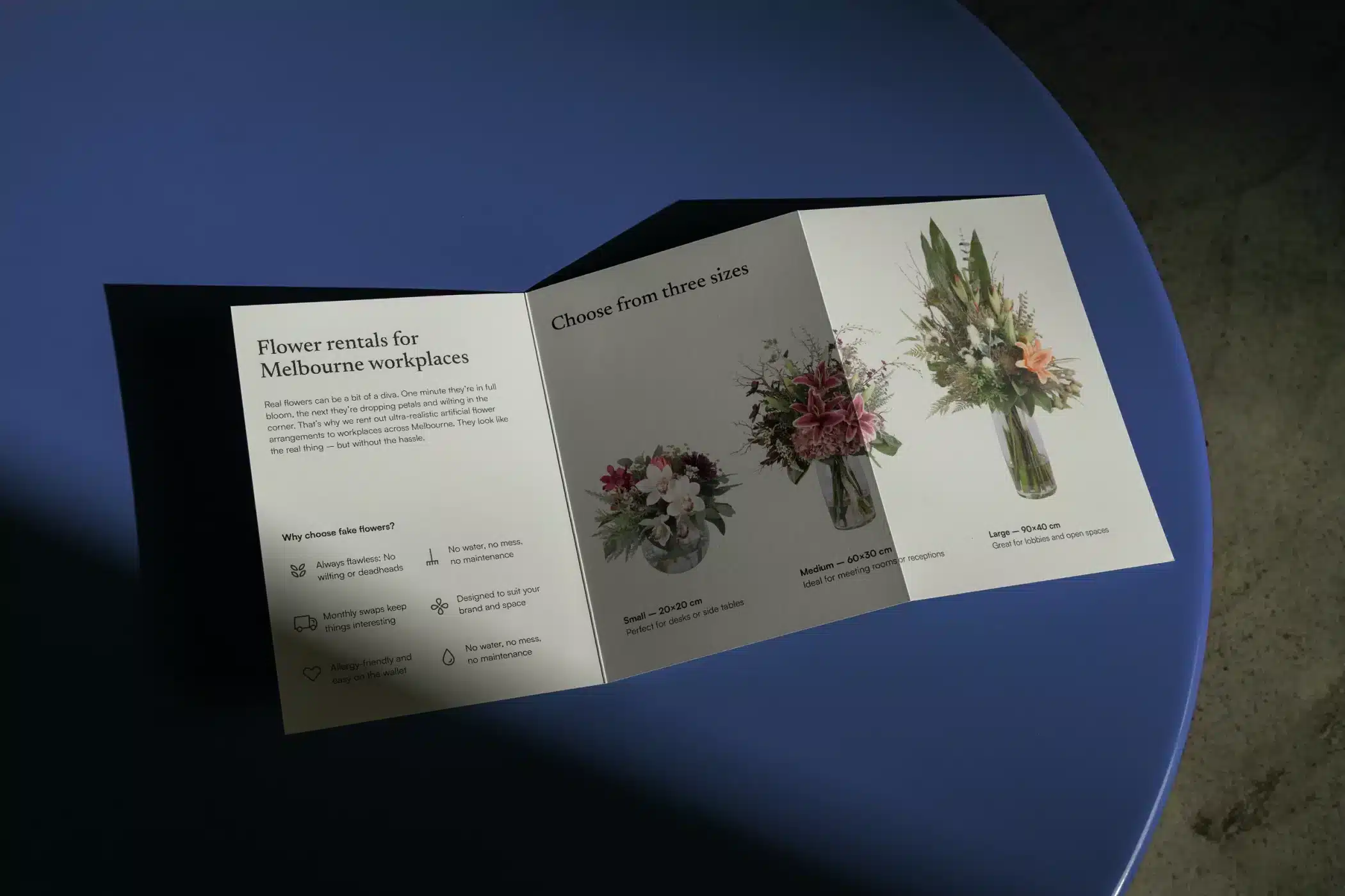
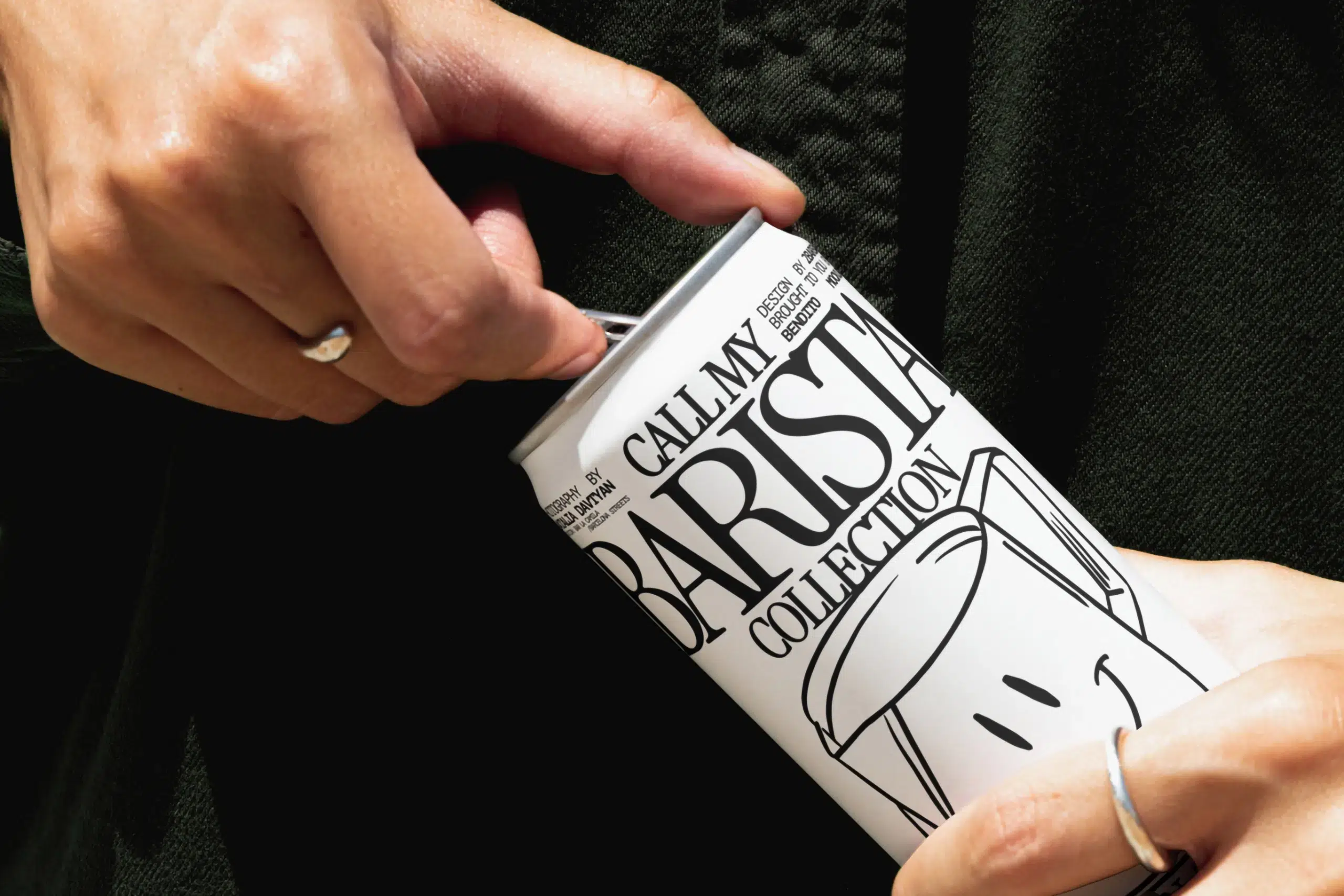
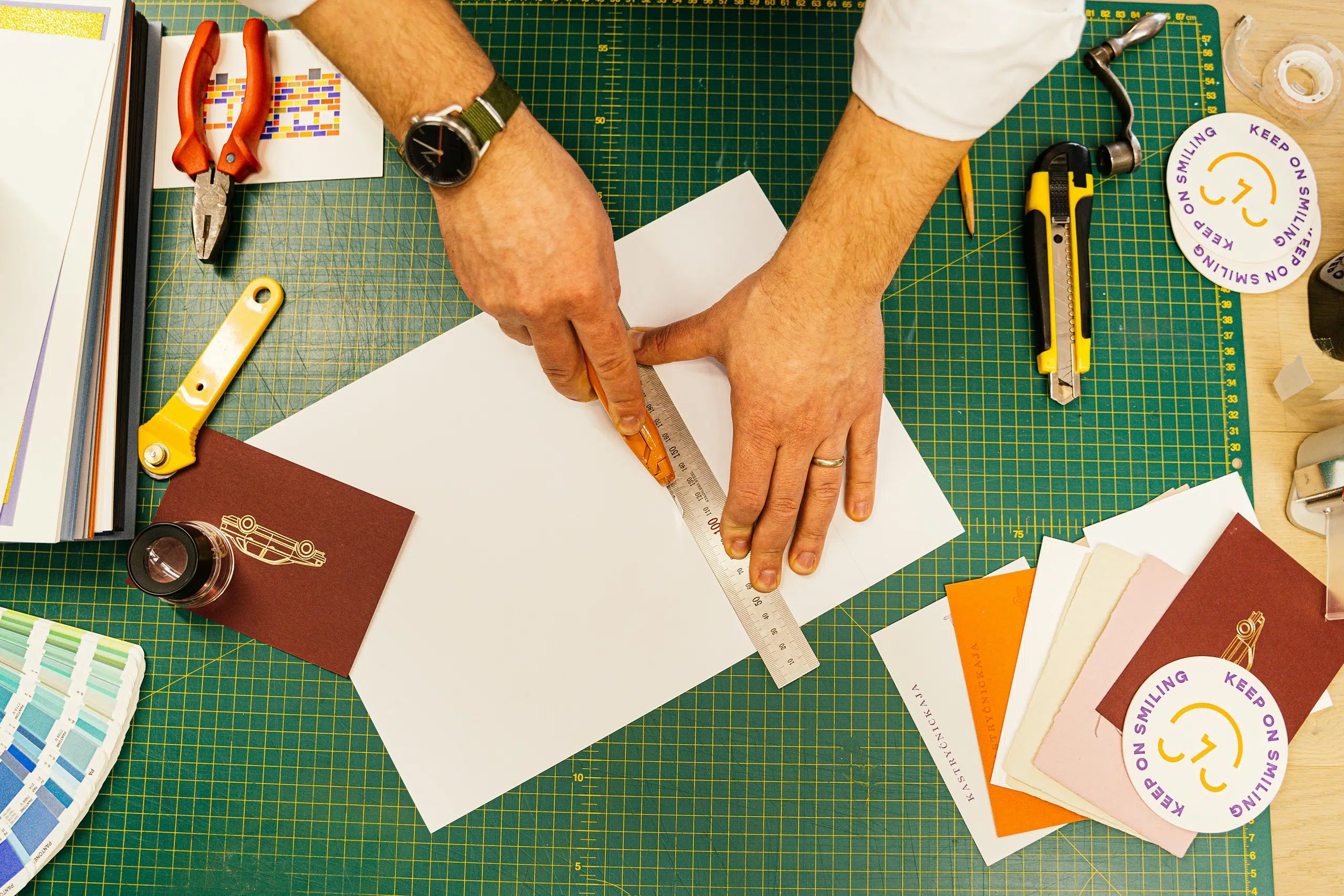
6. Use visuals to create an immersive world
High-quality images are a given today. Everyone has access to good stock photos and AI-generated visuals. So, a polished design alone won’t set you apart anymore. What does is using visuals to create a world your audience wants to be part of.
Thanks to the Picture Superiority Effect, visual content can be processed faster than text alone. Visuals grab attention, guide the visitors’ eye to what matters and prompt them to take action. In fact, including videos on your website can increase visitors’ stay on the page by 88%.
But it’s not just about having visuals. Generic stock photos can actually work against you. Research shows users often skip right past them. It’s about having the right ones that feel specific to the brand and the experience you want to create.
Here are some ideas of visuals you could use on your website:
- Short explainer videos that show how you work or what results clients can expect
- Lottie animations for subtle motion that brings a page to life without slowing it down
- Illustration styles that are distinctly yours and can’t be mistaken for anyone else’s
- Images of real people, especially faces, build trust and emotional connection faster than almost anything else. If you’re looking for images that don’t feel generic, check out my roundup of the best stock photo sites for authentic, on-brand images
7. Optimise the user experience (UX)
A good user experience (UX) is a must for your website.
After all, 88% of online consumers are less likely to return to a site after a bad experience. And 44% of shoppers will even tell their friends about it.
But what does good UX mean in practice?
Mobile-first Design
Mobile devices are becoming increasingly popular.
Almost two-thirds of online time is spent on them, and Google now indexes websites predominantly based on their mobile performance.
So, a mobile-friendly design should be your priority—but not at the expense of user-friendliness on desktops.
A clever example is Noho’s website, which splits the desktop screen into two columns. This prevents the images from becoming too large and makes it easier to adapt the layout to mobile size.
Intuitive navigation
Intuitive navigation is important for the smooth use of your website and for visitors to find what they are looking for quickly.
Ensure your website’s menu leads visitors where they want to go (and where you want them to go).
For example, about 36% of visitors who visit a website via a referral click on the company logo to get to the homepage. Other frequently visited pages are ‘About us’, ‘Contact us’ and ‘Services’.
It’s therefore essential that these pages are easy to find.
To further simplify navigation, keep options to a minimum. Be strategic; plan a sitemap with all the necessary pages before you create the website.
Also, make sure that users know where they are on the website. You can use breadcrumbs for this or mark the current page in the menu.
Effective call-to-actions (CTAs)
Design clear and visually appealing CTA buttons to prompt action.
Make your primary CTAs eye-catching and compelling by choosing colours that grab attention and using persuasive language that encourages users to take action.
Streamlined processes
Did you know that 65% of website visitors would refuse to fill out a form if it asked for too much personal information?
To ensure your visitors stay engaged and actually buy, you should simplify your forms and checkout process.
By reducing the number of form fields and creating a seamless user experience, you can minimise friction and improve your conversion rates.
8. Display social proof
A staggering 93% say reviews impact their buying decisions.
Showcasing satisfied customer testimonials, reviews, and endorsements is a great way to build trust and credibility.
It’s better to spread this social proof across your website, complementing other information rather than dedicating a separate testimonial page.
Testimonials don’t always have to be in writing. You can also consider including video feedback from satisfied customers.
9. Convey authority
In addition to social proof, you can include relevant credentials, awards, or certifications to demonstrate your authority and convince visitors of your expertise.
You can also include the logos of companies you have worked with to demonstrate your authority in your field.
Further reading
You may enjoy my article on cognitive biases brands can leverage.
10. Consider to use AI in your website process
AI tools have become part of how many designers and strategists work. And used well, they can genuinely speed things up.
Here’s how I use them:
Once the brand strategy is in place, AI is a useful thinking partner. I’ll use it to check the site structure and if I missed any pages. I also explore different copy angles for the same section, or run a quick proofread.
It’s also good for iteration—getting from a rough idea to something worth developing, faster. The conversion rate calculator earlier in this article is a good example. In fact, I used AI to help build it.
Where I’m more cautious is design. It’s true—AI-generated visuals are getting better and better, but brand consistency still requires a trained eye. An AI tool doesn’t know, yet, why you chose that shade of green or what feeling your brand should create.
In my experience, AI works best as a collaborator on the strategic and editorial side, not as a replacement for brand thinking. Feed it your strategy first, so it has some baseline to work off.
11. Optimise the page loading speed
Did you know that 39% of users will stop engaging with a website if images load too slowly? A mere 1-second delay in page loading time can lead to a 7% reduction in conversions.
If you don’t want visitors to abandon your site due to slow loading speed, here are a few tricks to keep your website fast and efficient:
- Keep software updated.
- Minimise third-party plugins and scripts.
- Limit the number of fonts.
- Compress image sizes.
- Use clean and efficient code.
- Enable browser caching.
There are also tools like Page Speed that tell you the loading times of your website. Experte is also great as it lets you scan the whole site rather than just an individual page.
Conclusion
While attracting many visitors to your website is fantastic, it’s not enough. About 96% of visitors who land on your website are not ready to buy.
To design your business website to drive conversions, you need to test, experiment and adapt accordingly constantly. After all, a website is a dynamic platform that evolves with your company.
Tools such as Google Analytics or the Search Console help you monitor user behaviour and identify new opportunities.
Remember: building a successful website is a journey, not a destination.
If you need help with your branding and website design, let’s chat.
Frequent questions
What is a good conversion rate for a small business website?
It depends on what you’re measuring. For e-commerce, the global average is between 2% and 4%.
But for service businesses where a conversion is an enquiry or a contact form submission, benchmarks look very different. The NZ Marketing Association suggests a target of around 5%, but honestly, the most useful benchmark is your own.
Keep track of your rate and work to improve it over time instead of chasing an industry number that might not even apply to your business.
How long does it take to see results from website optimisation?
It depends on what you’re changing. Quick wins like improving your CTAs, simplifying the navigation, or adding social proof can show results within weeks. Bigger changes, like a redesign or a new messaging strategy, might take a few months to reflect in your data. The key is to measure consistently so you know what’s working.
Do I need to redesign my website to improve conversions?
Not necessarily. A full redesign isn’t always the answer and rarely the first step. Start by auditing what you have:
- Is your messaging effective?
- Are your CTAs visible?
- Is the page loading fast enough?
A brand audit can also help you identify whether the issue is the website itself or the brand foundation underneath it.
Further reading
Still not sure if you need a website at all? Here’s why your business still needs a website in 2026. Or in fact, now more than ever.
Title image by Anastasia Shuraeva