The truth is, crafting an effective brand colour palette takes more than a good eye. It takes intention, strategy, and an understanding of how colour affects us—both psychologically and culturally.
In this guide, you’ll learn how to create a brand colour palette that’s not only attractive, but aligned. One that supports your visual identity, shows your values, and works well across all brand touchpoints—from your website to your packaging.
Before we get started, let’s clarify what brand colours actually are and why they matter more than you think.
What are brand colours?
Brand colours are the specific colours you pick to represent your brand and express its personality.
They should be chosen with purpose. Your brand colours should back your message and evoke the feelings you want your audience to have.
Just as importantly, they need to work together as a system. A strong colour scheme isn’t a random mix of hues. It’s a set where each colour has a function.
Brand colours help your brand stay consistent and be easy to recognise everywhere—from car signage to an Instagram grid.
Here’s how brand colours typically break down:
- Primary colours: These are your main colours. They show up in your logo, on your website, and in other brand visuals. They’re key to your visual brand identity and should be used consistently for people to instantly recognise your brand.
- Secondary and tertiary colours: These support your primary colours and provide more flexibility. You can use them for backgrounds, buttons, icons, or illustrations. They add variety while keeping visual consistency and balance.
Why are brand colours so important?
Choosing colours isn’t solely a creative decision. It should be a strategic one. Colour can influence what people notice and how they remember your brand.
Here’s what the right branding colours can do:
Colours shape your brand personality and identity
Your branding colour palette is at the heart of your brand’s visual identity. When used consistently, they form a recognisable look and feel across all platforms. This builds a strong image that people can remember and connect with.
Just think of iconic colour combinations like IKEA’s blue and yellow, which are deeply tied to the brand.
Colours help boost brand recognition and differentiation
Distinctive brand colours help your brand stand out in an increasingly crowded market. The right colour palette sets you apart from the competition and makes your brand easier to identify and recall in a buying situation.
You’ll often see claims that signature brand colours boost recognition by up to 80%.
This statistic is sometimes linked to the Seoul International Colour Expo and sometimes to Loyola University, Maryland. However, the original source is unclear, and many cite it without context. So, take that number with a grain of salt.
What we do know is that colour helps—but it’s rarely enough on its own. Research by JKR and Ipsos found that only 4% of brand colours are distinctive enough to trigger brand recall on their own. In most cases, it’s the combination of colours and other brand elements—like logo, layout, or typography—that makes a brand identifyable.
You can find out more in my article What makes a brand instantly recognisable?
Colours influence how people feel about your brand
Colours also shape how people feel. Whether you want to convey trust, luxury, calm, or excitement, the right palette helps express those emotions and shape the overall brand experience.
Certain colours can affect our mood, our energy levels, and even our physiological responses. For example, research has shown that red light increases heart rate and blood pressure.
Another example comes from Tokyo, where blue lights were installed on train platforms to reduce the number of suicides. Blue is often seen as a colour of calm and serenity. The results were impressive, with suicides dropping by 74%.
This goes to show that colours evoke feelings, and brands make use of this fact.
Colours can communicate your brand values
Your brand colour scheme can signal what you stand for. Earthy tones hint at sustainability. Bold, vibrant colours suggest creativity, innovation—or a strong, confident attitude.
Research shows people form an opinion about a product or person within just 90 seconds of first contact. And between 62% to 90% of that judgement is based on colour alone. That study dates back to 2006, so it’s safe to assume those snap decisions are happening even faster today.
In short, colour has the power to communicate your brand values before a single word is read.
Colours help build trust and loyalty
The more often people see your brand assets—including your colours—the more familiar and trustworthy your brand starts to feel.
Psychologists refer to the cognitive bias behind this phenomenon as the mere exposure effect: the more we are exposed to something, the more we tend to like and trust it.
10 steps to creating your brand colour palette
1. Define your brand
1. Understand your brand’s strategy
So, how to choose brand colours? Before you choose a single colour, you need to get to the heart of your brand.
This involves defining your brand strategy and how you want your brand identity to be perceived.
The better you understand your brand’s foundation, the easier it becomes to choose colours that actually mean something.
Start by asking yourself:
- What’s the mission behind your brand? Why do you exist beyond making a profit?
- What values guide your brand? What beliefs shape the way you show up?
- Who are you here to serve? What do they need, want, or struggle with? What drives them?
- Who else is out there? How do your competitors show up visually—and how will you position yourself differently?
2. Shape your brand’s visual and verbal identity
Once you’ve got a solid grip on your brand strategy, it’s time to shape how your brand looks and sounds. These decisions help bring your strategy to life in a way that people connect with.
Start thinking about your visual and verbal identity:
- How do you want people to feel when they come across your brand?
- What’s your brand’s personality? Is it bold, grounded, playful, innovative—or something else entirely?
- How will you communicate? What kind of brand voice and tone will you use to connect with your audience?
- And what kind of visual style supports that tone? What design choices will tie everything together across your brand touchpoints?
3. Choose colours that reflect your brand
With these foundational elements in place, you can now start thinking about colour. Ask yourself:
- Which colours will help your brand stand out in your space?
- Which ones will resonate most with your target audience?
- How can your colour choices instantly communicate your unique brand personality?
- What emotions do you want your brand to evoke—and which colours support that?
2. Strike a balance between standing out and representing your industry
You want your brand to stand out—but it also needs to make sense within your industry. It’s a fine line to walk.
On one hand, your brand should feel familiar enough that customers instantly recognise what kind of business you are. On the other, it needs a distinctive edge to actually get noticed.
Take a wellness brand, for example. A calming green can signal nature and tranquillity—great. But if all your competitors are also using green, it might be time to think outside the box.
Maybe a soft sand tone still evokes calm and balance, while helping you stand out in a sea of sage.
Then again, some brands completely break away from category norms—and that can work, too. Instead of leaning into natural tones, you might choose bold red to make a confident statement in the wellness space.
Lululemon does this to some extend.
That said, always consider your audience and context. What works for a yoga studio could feel cringe for a pharmaceutical brand. A playful colour palette might feel fresh for one, but untrustworthy for the other.
3. Consider the effects of colour psychology
Colours can trigger all kinds of emotions and associations, ultimately shaping how it’s perceived.
While you can’t control every personal connection someone has with a colour, understanding the basic principles of colour psychology can guide your decisions.
Just keep in mind: rules are made to be bent or even broken when it serves your brand’s unique voice.
Let’s break it down with a few examples:
Yellow
Yellow is often linked to optimism and happiness. Brands like McDonald’s, Snapchat, and Best Buy use yellow to bring out a sense of joy and energy.
Red
Red is all about excitement and passion. Brands like Netflix, Lululemon, and Nintendo make use of red to tap into those high-energy emotions.
Blue
Blue is associated with trust and reliability. That’s why brands like Facebook, IBM, and American Express use it to convey security and professionalism.
Green
Green is tied to growth and nature. Starbucks, Whole Foods, and Animal Planet use green to reflect concepts of freshness and a deep connection to the natural world.
But don’t forget: there are different shades and variations of each colour. Olive green might communicate sophistication and elegance, while lime green can feel fresh and youthful.
Not all reds are equal, either—deep red can feel luxurious, while bright red can feel bold and energetic.
While colour psychology can be a helpful guide, remember that cultural backgrounds also influence how people perceive colour.
This brings us to the next step.
4. Consider the cultural context of colours
The meaning of colours can also vary depending on the culture. If your brand connects with a global audience, it’s worth paying attention to these nuances, especially if your brand has a global reach. You don’t want to send the wrong signal.
Take red, for example:
- In many Western cultures, red suggests danger or urgency.
- In China, it’s the colour of good fortune and celebration (especially during Lunar New Year).
- In India, red symbolises purity and is traditionally worn at weddings.
- In some African cultures, it represents power and vitality.
Or white:
- In the West, white is linked to weddings and purity.
- In Japan, it’s worn at funerals and associated with mourning.
- In several African cultures, white can stand for spirituality and sacredness.
David McCandless’s infographic is a brilliant visual resource if you want to explore this further.
Ultimately, when you’re aware of how colours might be interpreted differently, it becomes easier to choose ones that resonate with your audience—wherever they’re from.
5. Choose your primary brand colour(s)
Now it’s time to commit. When selecting your primary brand colour(s), consider all the factors we discussed so far:
Look back at everything you’ve uncovered so far:
- Who’s your audience, and what speaks to them?
- What’s your competition doing and how can you stand out?
- What makes your brand unique?
- What colours feel right for your industry—but still you?
- How might your choices be perceived psychologically and culturally?
Start by selecting one or two core colours that hit the sweet spot between strategy and instinct.
These colours should capture the essence of your brand—your vibe, your values, your personality—all at a glance.
They will show up in all your brand collateral—your logo, branded website, packaging, social media posts, and beyond. So take your time. Test how they feel in context.
6. Choose your secondary brand colours
Once your primary colour(s) are locked in, you can start building around them.
Your secondary brand colours should complement your main colour(s) while adding flexibility and depth to your visual identity. While they shouldn’t steal the show of your primary colours, they play a major role in shaping your brand’s overall look and feel.
Together, your full palette should feel balanced, cohesive, and practical. You want enough variety to create interest across different touchpoints without feeling chaotic or off-brand.
Here are a few considerations to help you:
How many colours does a brand need?
Brand palettes include more than one colour. But how many exactly?
There’s no strict rule on the exact number of colours you should use. Too few, and you risk limiting your creative possibilities. Too many, and things can start to feel messy or inconsistent.
As a general guide, your brand palette should include a few essential types of colours:
- Neutral light colour(s): For backgrounds and whitespace
- Neutral dark colour(s): For body text and contrast
- Primary brand colour(s): For recognition and brand consistency
- Accent colour(s): To draw attention—great for calls to action, buttons, and highlights
Further reading
I’ve actually written an entire article on how many colours a brand needs—including real-world examples from 10 different brands. If you’re curious about what works in practice, it’s worth a look.
What is the right ratio of colours in a brand?
Even the best colour palette can fall flat if all the colours are used in equal amounts. When everything screams for attention, nothing stands out—and your brand might end up looking more like a kids’ birthday party than a cohesive visual identity.
The solution is: Use your colours in uneven proportions.
Illustrator Greg Gunn once gave a good rule of thumb in a Webinar I attended:
- 60% primary colour
- 30% secondary colour
- 10% accent colour
Sure, most brand palettes include more than three colours—but this ratio is a great starting point to help bring structure to your designs.
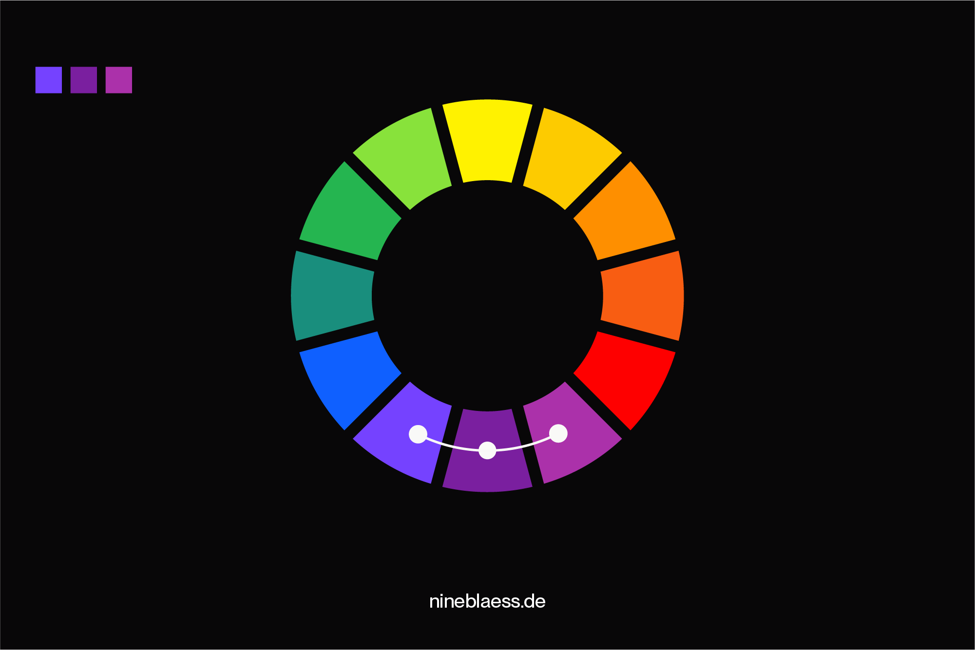
Using colour harmonies
To create harmonious colour combinations, you can use colours that complement each other on the colour wheel.
Let’s take a look at some common colour harmonies:
Complementary
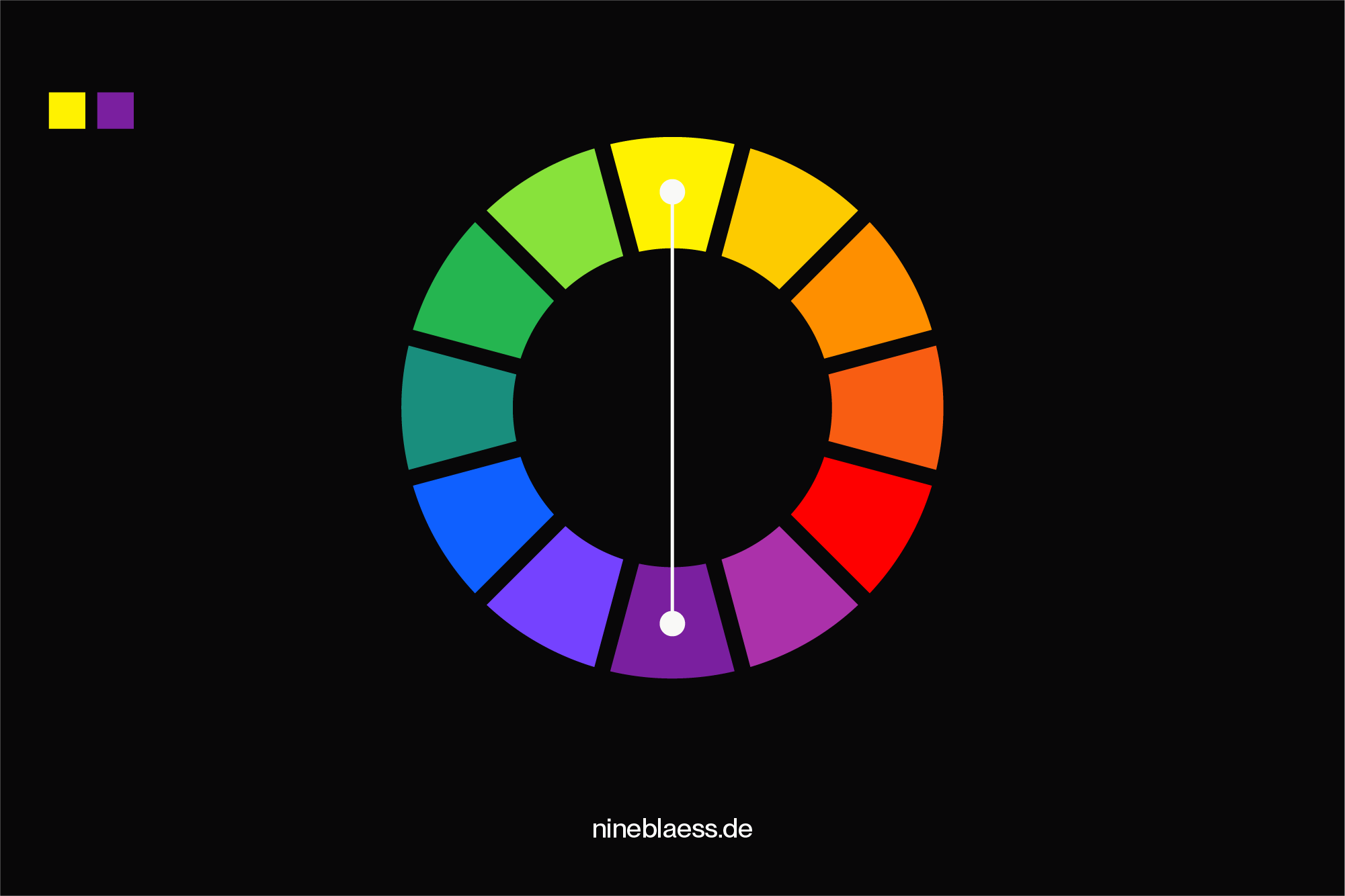
Two colours that sit opposite each other on the colour wheel (like blue and orange). High contrast, great for making elements pop.
Split complementary
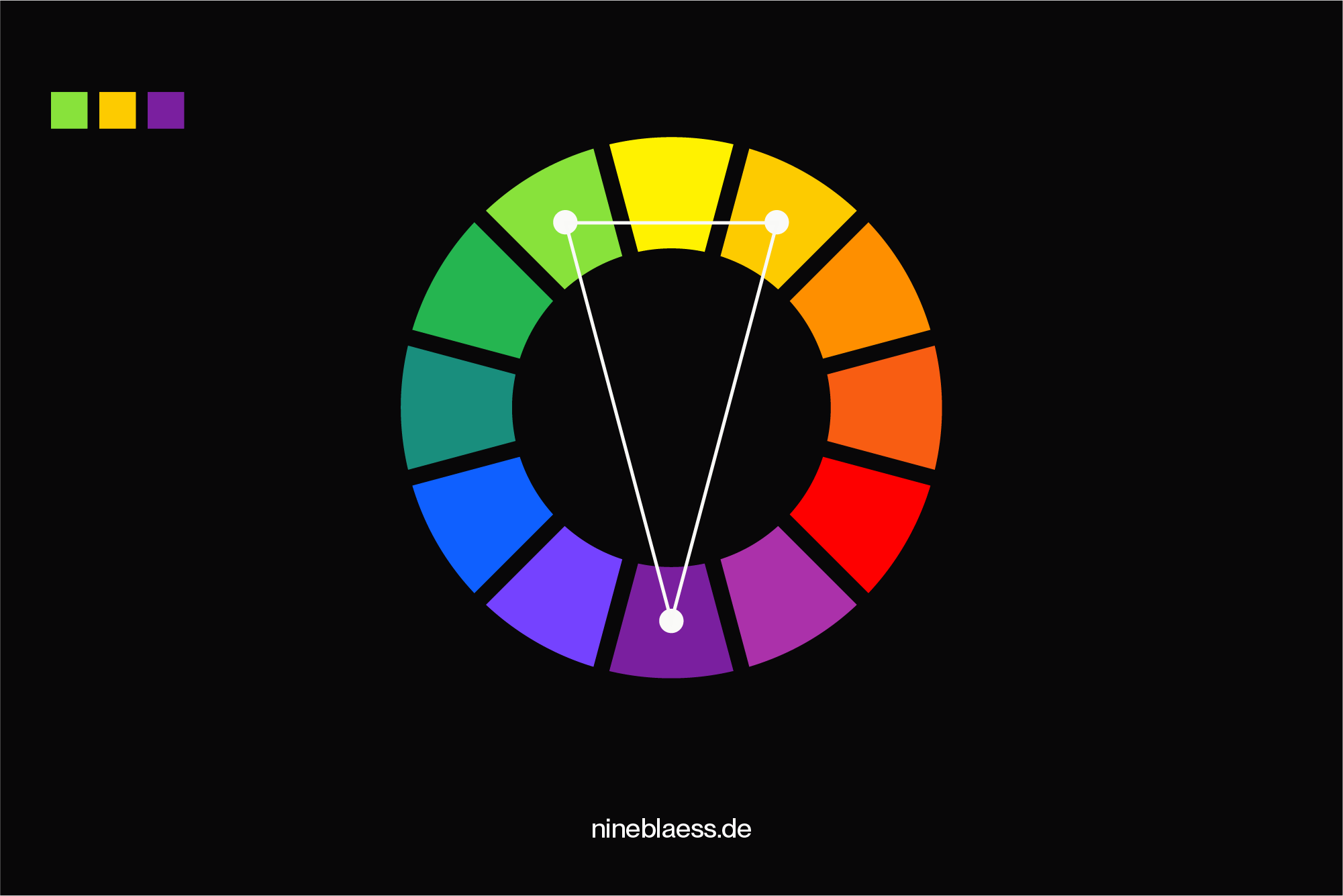
One base colour paired with the two colours next to its opposite. Offers contrast with a bit more harmony than a pure complementary scheme.
Triadic
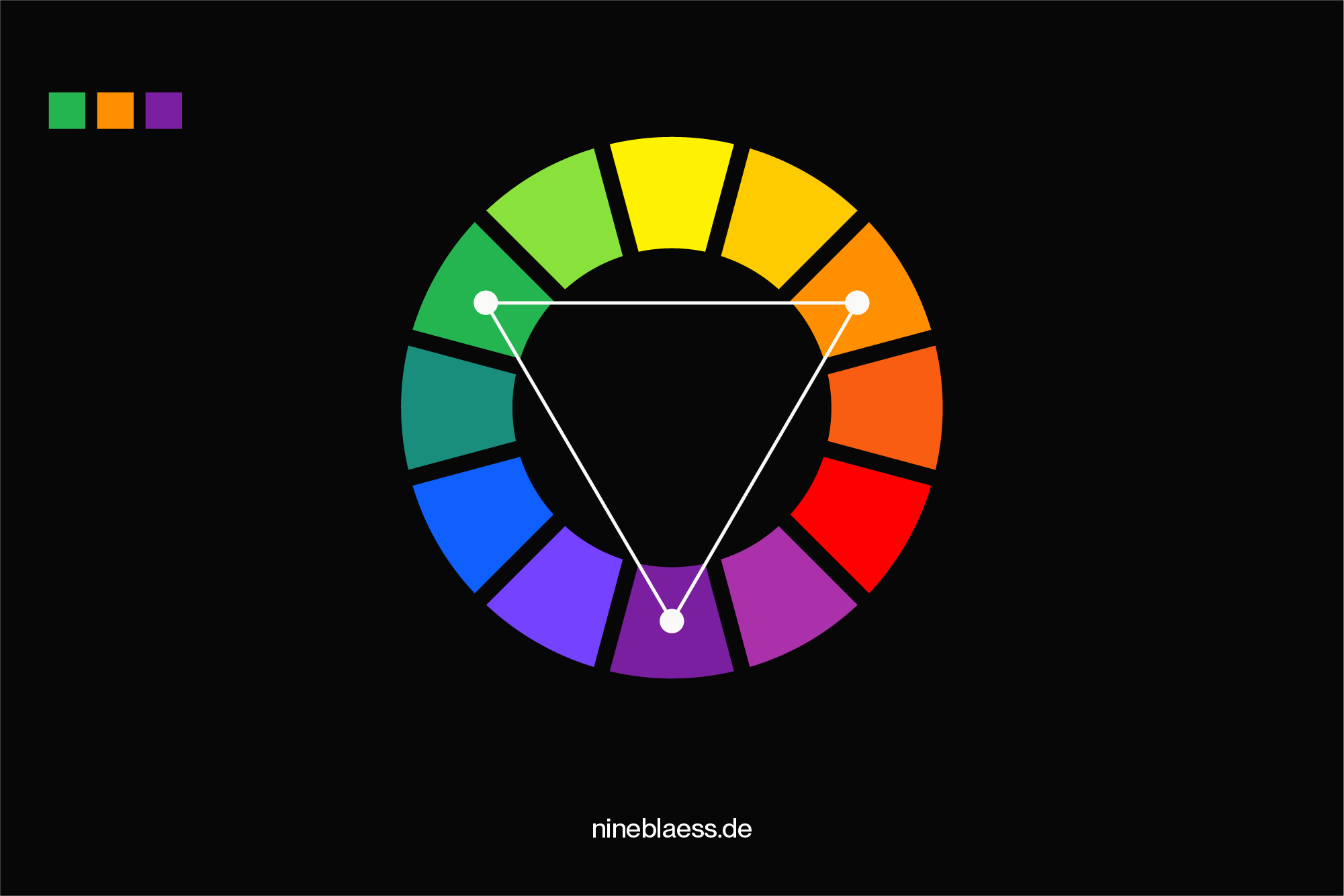
Two sets of complementary colours (four colours total). This one gives you lots of variety but can be tricky to balance.
Tetradic
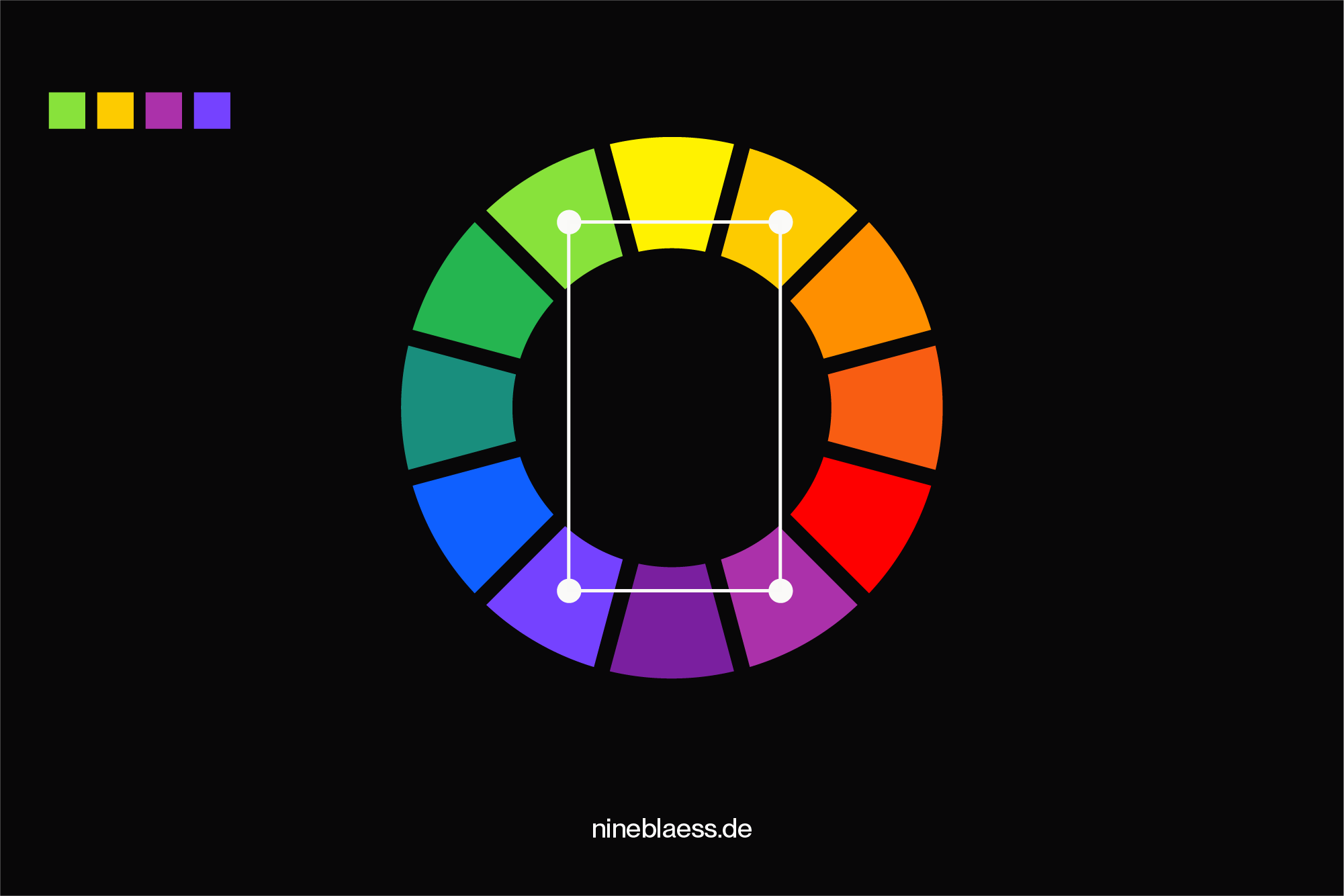
Two complementary pairs of colours
Analogous
Three to five colours that sit next to each other on the colour wheel (like teal, blue, and purple). These schemes feel harmonious and natural—perfect for a calm, unified look.
Experimenting with tints, tones, and shades of colours
Adding white, grey, or black to your colours can introduce more depth and sophistication to your palette.
- Tints: These are created by adding white to a hue, resulting in a lighter version of the original colour.
- Tones: Tones are achieved by adding grey to a hue to create a softer, more muted version.
- Shades: By adding black to a hue, you get a darker, more intense version of the original colour.
Specifying neutral colours
Don’t neglect neutral colours. While they may not seem important, you need neutral tones for elements like text, backgrounds, and for adding whitespace and balance to your designs.
Typical neutral colours range from whites and blacks to greys—often with a slight hint of colour to align with your brand identity.
Specifying functional colours
As we’ve mentioned, a branding colour palette is inherently functional, but you can also assign specific roles to individual colours.
For example, a news website might use a colour-coded system to differentiate between various topics to help users quickly navigate to the content they like.
Consider your brand’s main functions—can colour help clarify or enhance them?
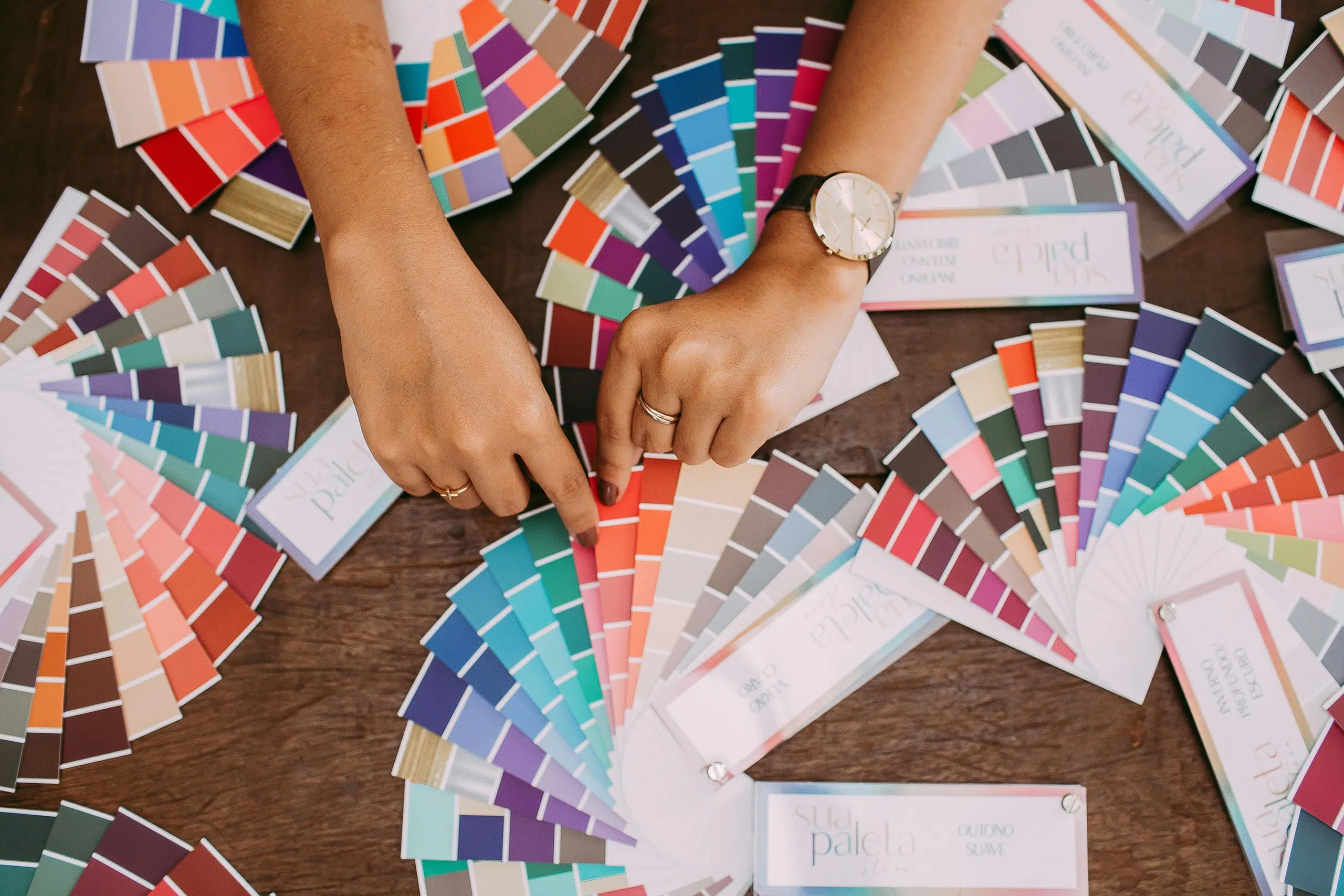
Experimenting and using colour tools
Sometimes, the best way to find the perfect colour combinations is to experiment and get inspired by what’s out there.
Luckily, there are plenty of online tools to help you explore, create, and refine your brand’s colour palette:
- Coolors: A playful and interactive tool with features like a palette generator, contrast checker, and palette visualiser. You can also create gradients and much more.
- Adobe Color: Offers ready-made colour palettes and the option to create your own using the colour wheel. You can even upload images to extract colours and export your results in multiple formats.
- Colour Hunt: A curated collection of beautiful colour palettes shared by designers from around the world.
- Dribbble or Behance: Browse through other designers’ work to spark your own creative ideas.
- Canva Color Palette Generator: Upload your images to generate colour palettes or explore pre-made palettes for inspiration.
- Pinterest: A great place to discover colour combinations used in illustrations, photography, and more.
7. Test your colours
Once you’ve created a brand colour palette that feels right, it’s time to put it to the test.
Evaluate in different contexts
- What do your colours look like on various backgrounds?
- Do they print well?
- Do they work well in combination with your logo and brand fonts?
- Do they reflect and support your brand’s voice and personality?
Consider accessibility
Make sure your colours are accessible to all users, including people with visual impairments.
You can use colour contrast checkers to make sure your colour combinations meet accessibility standards, ensuring that text is legible on backgrounds and that your colours provide sufficient contrast.
Test your colours in different applications
Make sure your colour system holds up across various formats, including print and digital usage.
This will ensure that your colours are versatile and always look good, no matter where your brand appears.
Remember, consistency in using your brand colours is key to creating strong brand recognition and a cohesive experience across all platforms.
Create mockups and prototypes
Mockups are a great way to see how your brand colours will look in real-world applications.
Also, don’t forget to test how your colours will appear when printed. Different printing techniques can alter the look of your colours, so it’s important to check how they’ll appear on physical materials too.
Further reading
You can explore a selection of the best premium mockup sites here.
8. Consider future growth
Are your chosen colours scalable as your business expands?
Will the colours still fit when the brand enters new markets or launches new products and services?
It’s okay not to have all the answers upfront, but taking the time to at least consider these factors can pay off in the long run.
It also helps to have some variation in your secondary and tertiary colours so your communications don’t become boring.
9. Use your brand colours consistently
I have mentioned this before: consistency is key to creating a recognisable brand.
So, use your colour palette consistently across all brand touchpoints. This will forge a connection between your brand and its audience, strengthen brand recognition and build trust and loyalty.
It’s worth noting that colours can vary on different mediums, such as on a computer screen versus in print.
To ensure consistency across all mediums, create brand guidelines and specify different colour codes such as Hex, RGB, CMYK, and Pantone. Then, stick to your specifications.
10. Review and refine
Your brand identity colours will most likely evolve with your business.
As your brand grows and your business adapts, subtle adjustments or the introduction of new shades might be necessary to stay relevant and aligned with your evolving identity.
However, be cautious when making changes. Every tweak should be carefully considered to ensure it doesn’t disrupt your existing brand identity or cause confusion with your audience.
That said, some modern brands are moving towards a more flexible use of colour. Rather than sticking rigidly to a set palette, they experiment with a broader range of hues that align with their evolving brand personality.
Example: Dropbox’s brand colours
Dropbox’s colour guidelines show how a brand can use an expressive colour system without losing consistency.
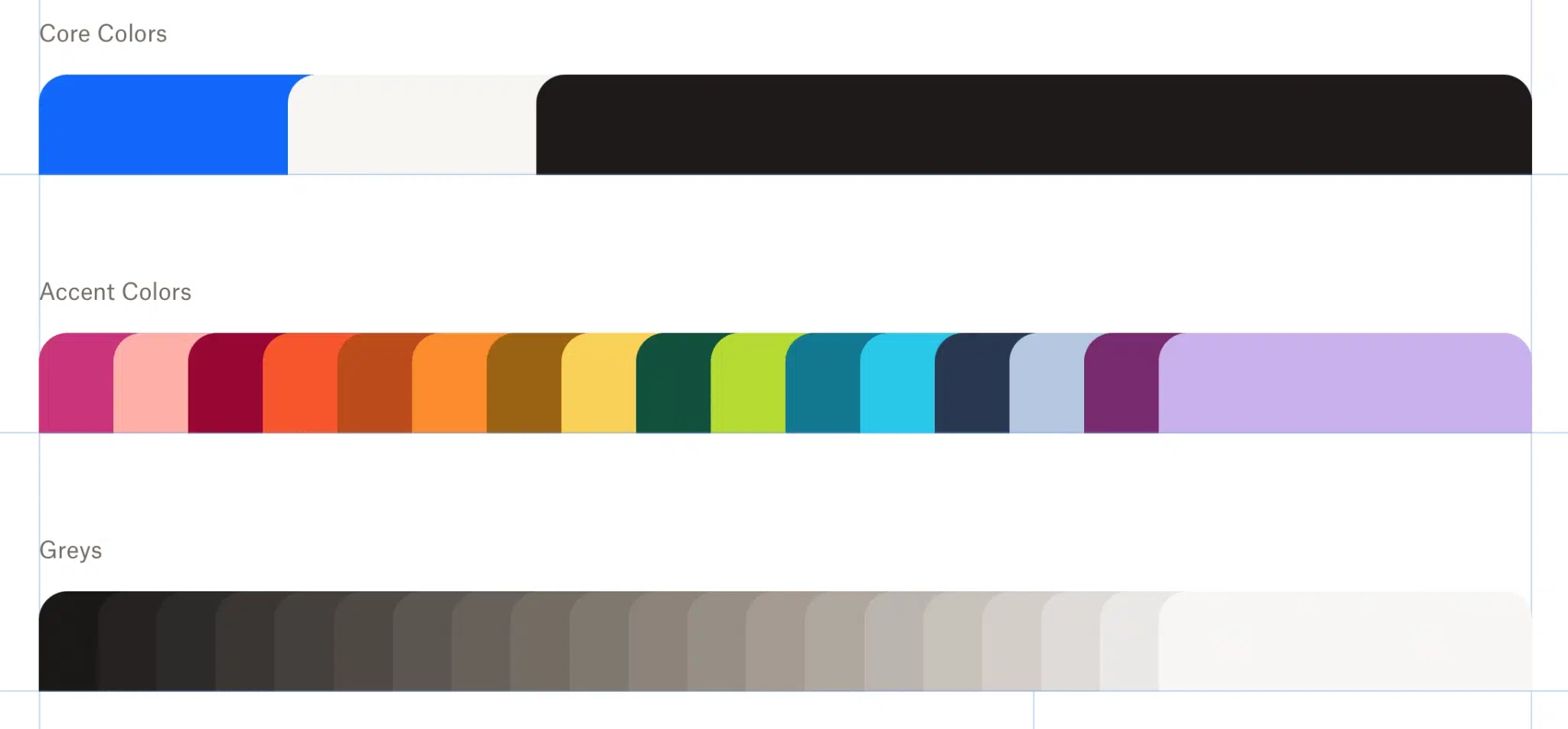
Its core colours—Dropbox Blue, Coconut, and Graphite—anchor the brand.
Around it, they’ve built a flexible system with neutral greys and a set of vibrant accents like pink, green, and orange.
These brighter colours show up in illustrations, UI elements, and campaigns—adding energy without overwhelming the design.
The secret is, Dropbox uses colour sparingly and intentionally. The bold accents bring life, but the strong base of blue and neutrals keeps everything feeling cohesive and recognisable.
It’s a great example of how modern brands can stay consistent without being rigid.
Conclusion
Colour is a key part of how people see and feel about your brand—it’s often the first thing they notice.
When chosen intentionally, your palette can communicate your values, build recognition, and make your brand feel like you. So take the time to get it right. It’s worth it.
To recap, here are ten steps to creating a meaningful brand colour palette:
- Define your brand: Start with clarity on your mission, values, audience, and positioning.
- Balance distinctiveness and industry fit: Stand out, but don’t feel out of place.
- Understand colour psychology: Know the emotional cues colours can trigger.
- Factor in cultural context: Avoid choices that miscommunicate across cultures.
- Choose your primary colour(s): Anchor your brand with one or two core colours.
- Add secondary and tertiary colours: Create depth and flexibility with supporting hues.
- Test your colours: Make sure they work across digital and print.
- Plan for growth: Choose colours that can evolve with your brand.
- Be consistent: Use a style guide to maintain a unified look and feel, even when more people apply your brand.
- Review and refine: Don’t be afraid to adjust as your brand matures.
Want more help building your brand? You might like my articles on choosing brand fonts and creating a strong brand name.
Or explore my curated collection of branding resources for hands-on tools and tips.
If you’re ready to get expert support for your brand, feel free to get in touch, I’d love to help.
This article contains an affiliate link, but rest assured that I only recommend products that I have tried and tested myself.