That’s what this article is for. It’s based on Jenni Romaniuk’s framework from the Ehrenberg-Bass Institute, which is considered the standard in marketing science.
Let’s look at what the framework is actually measuring and what building distinctive brand assets as a small business can look like in practice.
You’ll still see some bigger brand examples throughout, as distinctive brand assets are just easier to explain with brands you already know.
What is a distinctive brand asset?
A brand asset is any element you create to represent your brand. They can be tangible, like your logo, colour palette, typography, packaging shape, mascot, sound, or intangible, like your brand story.
A distinctive brand asset (DBA) is one that people immediately recognise as belonging to your brand, without seeing your brand name. It acts as a mental shortcut—a trigger that brings your brand to mind when someone scrolls past an ad or decides who to contact for a service.
You can have a gorgeous logo and a well-balanced colour palette, and still have no distinctive brand assets. Because design quality isn’t the only point.
What matters is whether those elements are uniquely yours and have been used consistently enough, for long enough, to build memory structures—so your brand comes to mind at the right moment. Romaniuk calls this mental availability.
Distinctive assets work in two ways:
- Recognition: someone sees your asset and knows it’s yours.
- Recall: your brand pops into someone’s head the moment a need comes up—like a brand of water coming to mind the second you’re thirsty.
Recall is what really builds mental availability, and it takes large brands years to get there. For a small business, recognition is the realistic place to start.
Jenni Romaniuk's framework: fame and uniqueness
Romaniuk identified two qualities that determine whether a brand asset is truly distinctive:
- Fame is how many people associate the asset with your brand. High fame means it’s widely recognised in your target market.
- Uniqueness is how exclusively it’s linked to your brand. High uniqueness means people don’t confuse it with a competitor.
You need both. An asset that’s famous but not unique triggers thoughts of the whole category rather than your brand specifically. Think of how many wellness brands use a muted sage palette. Even when the colour registers, it no longer points to a particular brand. That’s category recognition, not brand recognition.
And an asset that’s unique but not famous hasn’t been seen enough to build any association yet. It has potential, but hasn’t been used enough.
The distinctiveness grid
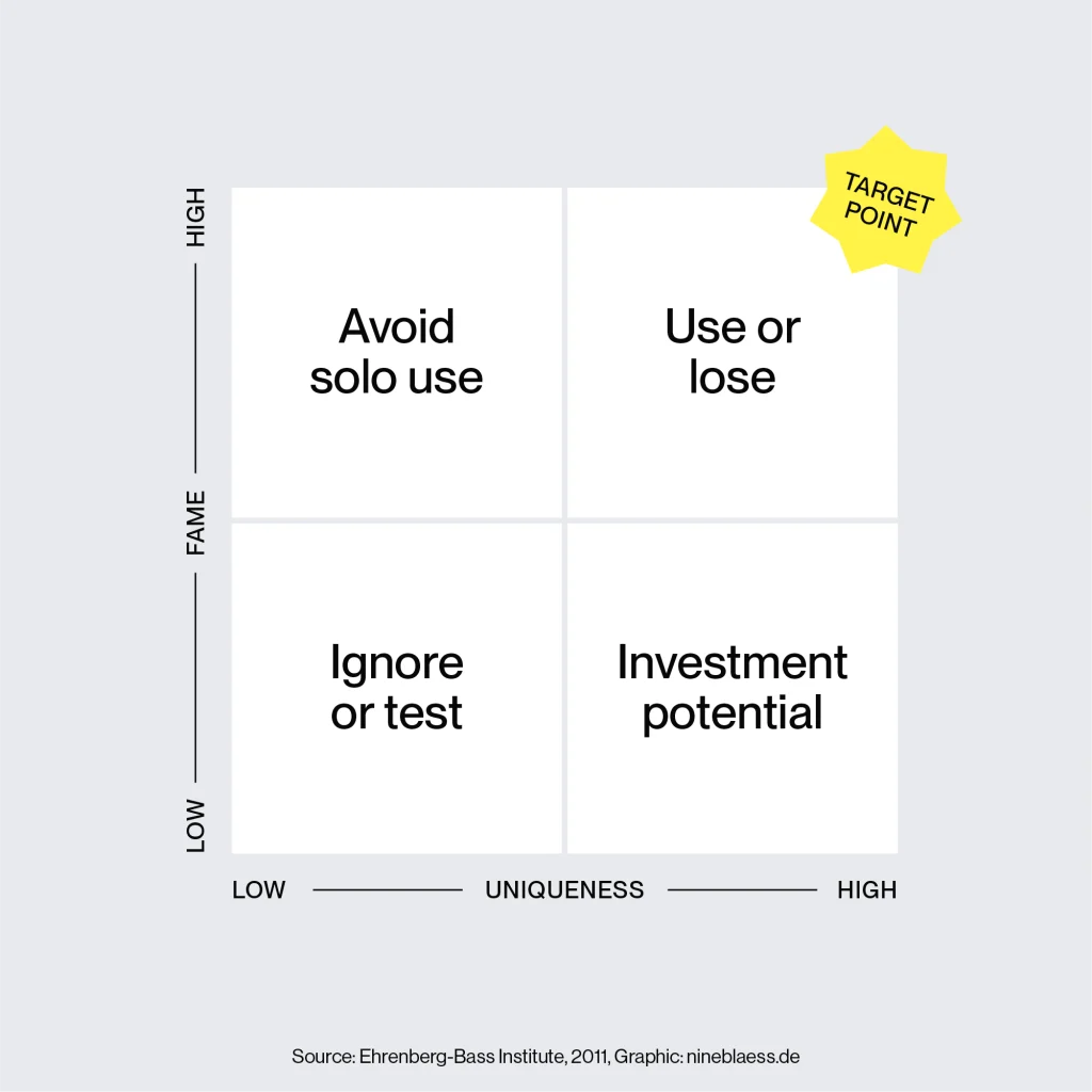
Romaniuk maps uniqueness and fame on a grid. Where your assets sit tells you what to do about them.
- High fame, high uniqueness: These assets can replace your logo entirely. People know exactly who they belong to without being told. The Coca-Cola script font, McDonald’s arches or Toblerone’s triangular packaging shape are good examples.
- High uniqueness, low fame: This is the right place to start when building distinctive brand assets for a small business. It means your assets are genuinely yours and that no one else uses similar ones. But not enough people have seen them yet. Don’t change them. Repeat them relentlessly to make them famous.
- High fame, low uniqueness: That’s a difficult position to be in. It means your assets are widely recognised, but they point to your category rather than your brand. If you’re a tech company using a clean sans-serif font, you might go unnoticed. People see it and think “just another one of those brands”.
- Low fame, low uniqueness: Unfortunately, that’s the starting point for most brands. It means the assets are generic and nobody has seen them enough to associate them with your brand. It’s where you can end up when assets are designed without researching your market before you start.
The ultimate goal is to have your assets in the top-right corner. But the more realistic starting point for a small business is the top-left: high uniqueness with fame yet to build.
The main reason most assets never reach high fame and uniqueness is a lack of consistency. Brands might use different fonts or colours across channels, or simply haven’t repeated their assets enough over a long enough period.
Related reading
While this article focuses on the strategic framework for building these assets, my guide on what makes a brand recognisable looks at these assets through a data and performance lens—unpacking the data behind which elements actually perform best.
What this means for small businesses
Large brands have the budget to build multiple assets simultaneously and test them across markets. But they also have to appeal to a massive audience and can’t afford to niche down.
As a small business, you don’t need five high-fame assets. A small number of elements that start in the high-uniqueness quadrant and slowly move toward fame through consistent repetition is already great.
The small business advantage
It’s enough to be recognised in your specific niche or location, which means you need far less exposure to build distinctive brand assets than a global brand does.
A small brand also has fewer brand touchpoints to manage. You might have a website, an Instagram account and a proposal, all handled by one designer. That means you have greater control over your consistency than a large brand with regional teams and multiple product lines.
Using brand assets in combination
Getting to the point where a single symbol, like Nike’s swoosh, is enough to trigger recognition takes decades. But that’s not really the goal for a small business. It’s easier to build distinctive brand asset combinations—and that’s where small businesses can compete.
Red Bull’s blue and silver squares always appear together on the can. Coca-Cola’s red, script font, and ribbon are inseparable. But would you connect red alone to Coca-Cola, or blue alone to Red Bull? Probably not.
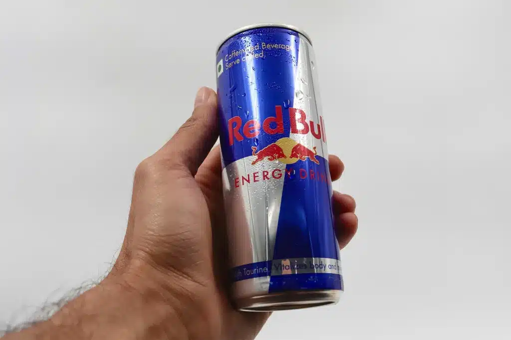
Romaniuk calls this co-presentation. The brain wires assets together into a single memory structure when they appear consistently as a unit.
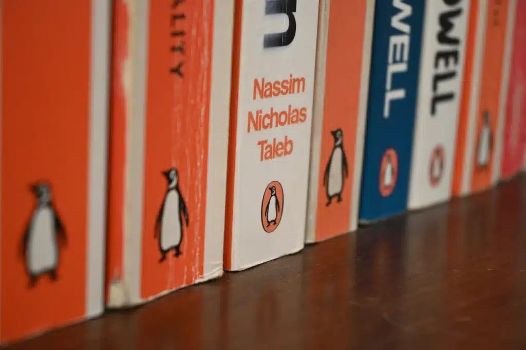
Penguin Books uses the same orange backs with the penguin icon consistently across almost every cover. So now, it’s instantly recognisable, even in a packed bookshelf or on a tiny thumbnail.
Start with three brand assets
Romaniuk recommends aiming for four to five distinctive assets across different categories—shape, colour, face, sound, and words. You can design all of these from the start, and I’d encourage you to do so.
But when it comes to building fame, focus your exposure on three assets first: your logo, your colour combination, and your typography—maybe mixed in a specific layout. Use those everywhere, consistently, before you start introducing other assets. Otherwise, you’re spreading them too thin, and none of them builds recognition.
Now that we have the theory covered, let’s look at each asset type, how difficult it is to build, and what that means for your small business.
One thing worth keeping in mind across all of them is that simple usually works better than complex, as long as it’s not generic.
Logos and symbols
Logos are the most obvious distinctive brand assets most businesses have. They can be very effective because we process them holistically—reading shape, colour, and font as a single unit of information, which makes them inherently more unique and recognisable than any of those elements on their own.
It’s the reason Coca-Cola could swap its name for others in the Share a Coke campaign.
It’s also why Snickers could replace its logo with words like “Hungry” or “Confused” on the Hunger Bars. The whole visual system of colour, packaging shape, and font fired simultaneously, even when the brand name was missing.

For a small business, that means a logo with an icon, embedded colour, or a very distinct font will be more effective than a modern wordmark in black and white. A purely typographic logo in a neutral colour gives the brain fewer cues.
For GenEM, an online education provider for emergency doctors in training, we built a bird mark with three differently coloured feathers—one for each founder.
Every appearance of the logo is also an appearance of the colour system. And the bird itself works as a standalone symbol, like Apple’s apple or the WWF panda; it can also appear without the wordmark and still carry the brand in small applications, such as the website’s favicon or a social media icon.

That said, some of the most distinctive logos are also very simple. They just do more than one thing at once, which ties them to the brand.
The FedEx arrow is hidden in the negative space between the E and x. Tupperware’s T peels back like a lid. Amazon’s arrow combines A and Z and doubles as a smile. Hometree’s tree references electricity and works in 3d as well as patterns.




Colour
Colour is the lowest-performing asset in Romaniuk’s research when used in isolation. It ranked consistently low on both fame and uniqueness.
That’s because most industries share similar palettes, so a single colour, or even a combination of colours alone, rarely points to a specific brand. Red and yellow could belong to McDonald’s, Kodak or Shell.
You could argue that when a colour has been used consistently enough, it crosses into ownership, like Tiffany Blue or Cadbury purple. Both are trademarked colours built over decades. But I’d argue you still wouldn’t link them back to their brands if you just saw the colours out of context, as plain squares.
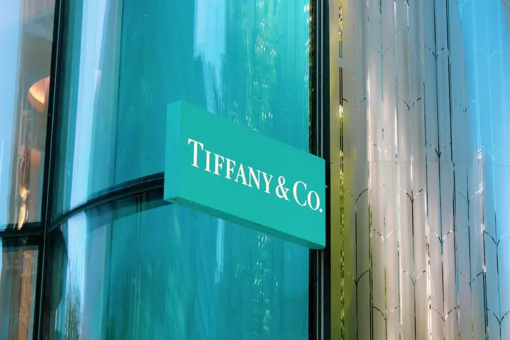
And neither of these brands is a realistic model for a small business anyway.
What is realistic is owning a combination of the same colours, always in the same proportions, consistently combined with the same font or shape.
New Zealand’s Whittaker’s chocolate is a good example. The gold and brown, combined with the logo and packaging format, are instantly recognisable to anyone who lives here—but would mean nothing on their own.
This also shows that distinctiveness can be limited to a certain audience. Nobody in Germany would recognise Whittaker’s, but that’s not the market anyway.

Further reading
My article on creating a unique brand colour palette goes deeper.
Typography
Like colour, typography usually sits low on fame and uniqueness when viewed in isolation. Fonts rarely become distinctive on their own. We experience them as part of the whole visual system. But used consistently over time, a typeface can become quite unmistakable.
Typography is also the most neglected asset for small businesses. Even after building a full identity together, some clients use random system fonts on social media posts or proposals. But every inconsistency pushes the asset back toward low fame.
I’ll admit typography is my favourite part of design. There are brands I can identify by their fonts alone. But it’s always within a specific context.
Air New Zealand’s use of Newzald by Klim Type Foundry is a good example. Having seen it on boarding passes, safety videos, and advertising enough times, I automatically associate it with Air New Zealand—especially in their typical white-on-black. Someone in Germany wouldn’t make that connection at all.
Distinctiveness is contextual. And that’s good news for small businesses. You don’t need your typeface to be recognised globally. You just need the people in your niche to start connecting it with you.
There’s another way to become highly unique, and that’s breaking category norms completely.
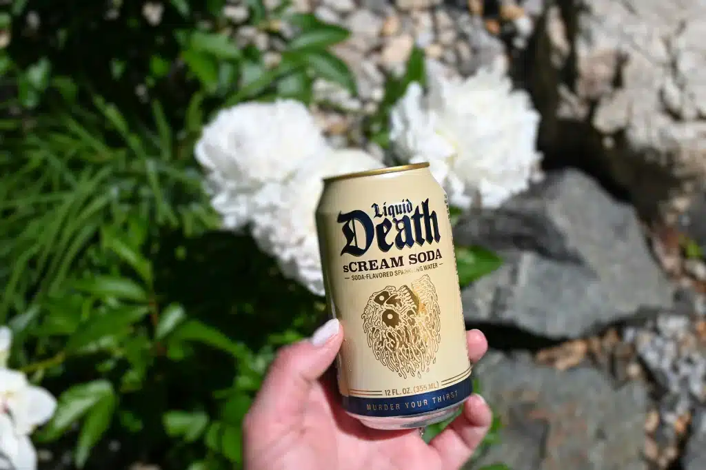
Liquid Death did this with its blackletter typography, which is usually known from medieval manuscripts and heavy metal bands. In a category full of clean, wellness-focused minimalism, that choice made the brand stand out even before most people had heard of it.
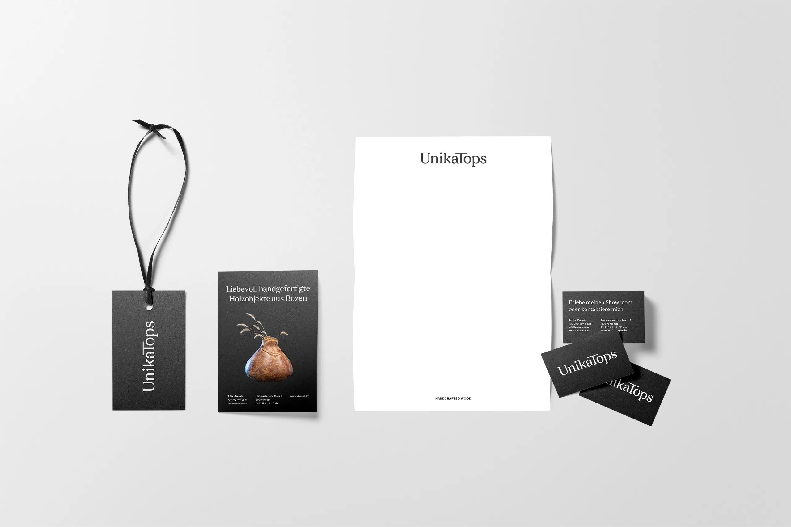
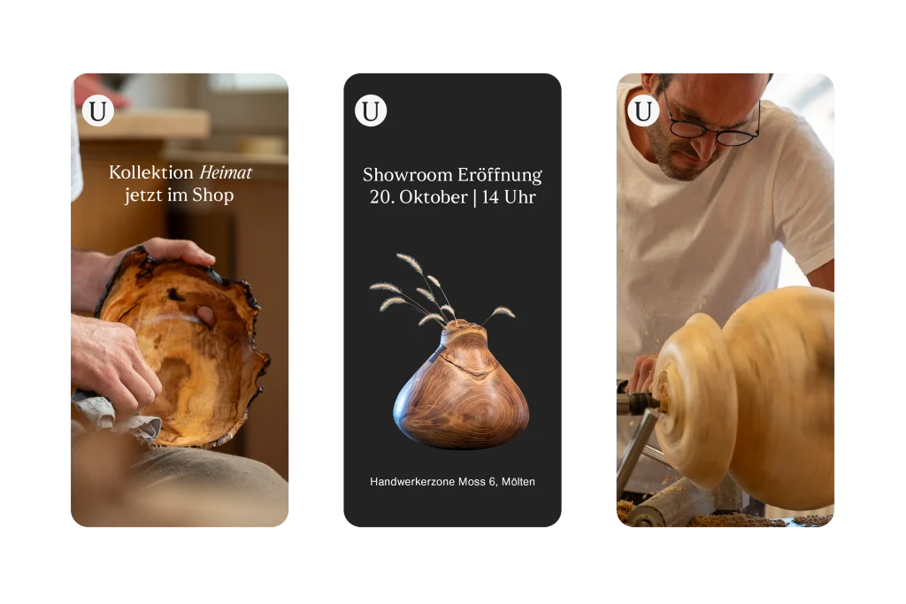
For UnikaTops, a maker of bespoke wooden objects from South Tyrol, our approach was more subtle. I wanted the brand to step back and let the objects take centre stage, but I still wanted something people would recognise alongside the photographs. Sfizia brought in just enough personality without competing with the work itself.
Further reading
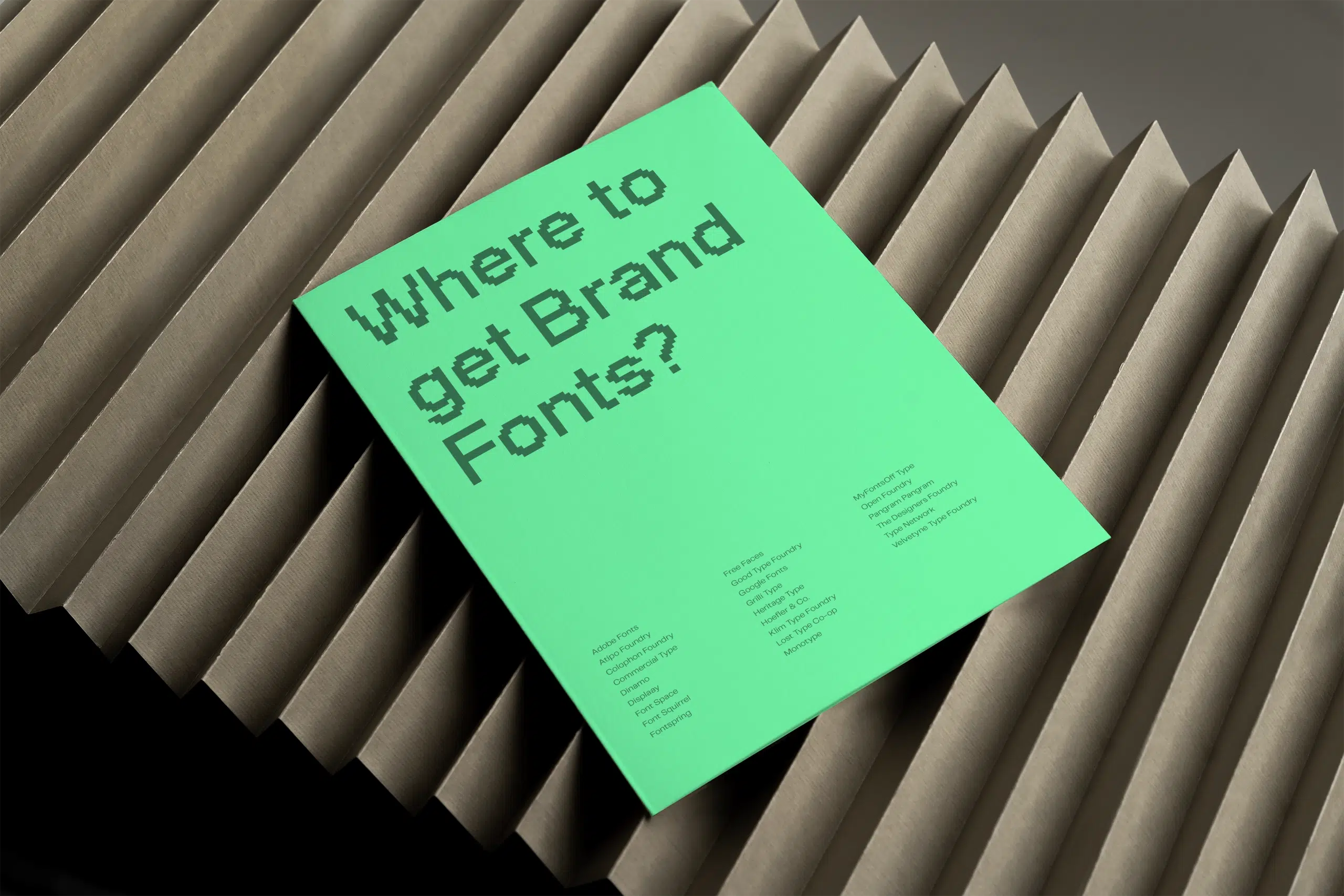
My guide to choosing brand fonts covers what to look for. And if you’re not sure where to find good fonts, this list is a good starting point.
Other visual elements
While Romaniuk’s research doesn’t focus on them, patterns, illustrations, icons, and photography styles can all help make your brand distinctive too—especially when they’re rooted in something specific to your brand rather than just decorative.
- Mailchimp’s quirky, black-and-white illustration style is characteristic enough to be recognisable even without the logo.
- Apple’s minimalist product photography on white backgrounds is so consistent that it’s become inseparable from the brand.
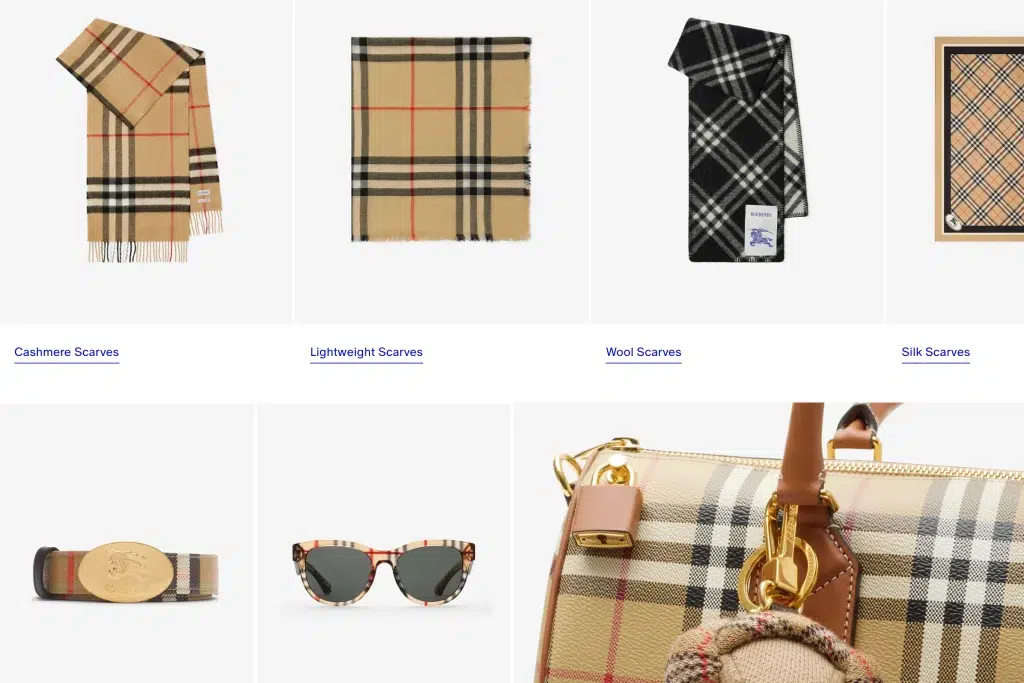
- Burberry’s check began as a coat lining and evolved into a distinctive asset through decades of consistent application. Though as fame grew, copying eroded its uniqueness.
When I designed Akoako’s brand identity—a te reo Māori language educator working with organisations across New Zealand—the challenge was that the founder isn’t Māori herself, and neither are most of her students. So, using the traditional red, white, and black felt wrong.
Instead, we drew inspiration from New Zealand’s landscapes for the colour palette and developed a pattern inspired by Māori culture, but not copied from it. The result could only belong to this brand, which is exactly the point.
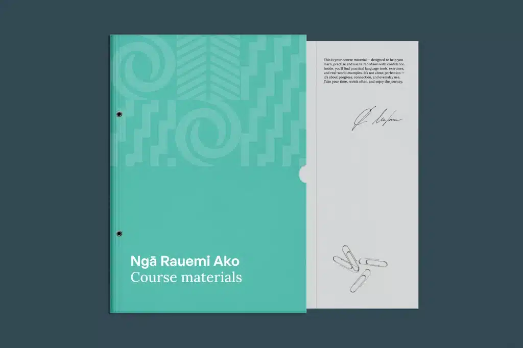
The more specific your visual elements are to your brand’s story, the harder they are to copy, and the more naturally they reinforce each other as a cohesive system.
Packaging and product shape
Packaging and product shapes can become incredibly distinctive, taking different forms—the whole packaging shape, like Toblerone’s triangular box; a specific detail, like the curved neck of the Duck toilet cleaner bottle; or the product shape itself, like the Mini Cooper’s silhouette.
The caveat with product shapes is that people usually only encounter them after purchase, so they’re better at reinforcing recognition than building it.
TWYG is a good example. It’s a New Zealand luxury skincare brand designed by Auckland studio Seachange. The deep orange glass bottles reference the heartwood of the Tōtara tree—the main ingredient—while the oversized caps, with their stacked concentric half spheres, reference the rings of the Tōtara trunk. Next to each other, they’re designed to look like a forest of skincare. The result is completely unlike anything else in the category.
When Beyoncé’s Cécred haircare line launched in 2024, the packaging was widely accused of copying it. There’s not much you can do to prevent imitation. But when your design is based on a genuine brand story, the original always feels more authentic.
For small businesses with a physical product, sometimes just choosing a different format within your category is enough. For service businesses, the same principle applies. Your website experience or even a non-standard business card can become recognisable over time.
Faces and characters
Romaniuk groups this asset type into three categories: mascots, celebrities, and spokespersons.
- Mascots offer the most control. A well-designed character never has a bad day, never ages, and never gets caught in a controversy. Michelin’s Bibendum has been in use since 1898. I still remember seeing it painted on the wall of the tyre shop where my uncle worked as a kid.
- Celebrities bring fame but no uniqueness. And they risk the vampire effect. Their personality and the associations with it might overshadow the brand.
- Spokespeople are more effective because their association with the brand grows over time rather than borrowing someone else’s existing fame.
Founders can also be their own spokespersons, and personal brands are more powerful than ever. With platforms like LinkedIn and Instagram, it’s now possible to build recognition around a person rather than a logo.
This is great for small businesses, because people buy from people. But the recognition is tied to you personally. If you ever want to step back or sell, it goes with you. That’s why it’s a good idea to build visual assets that don’t rely on your face, even if you’re the face of the brand right now.
Rhode is a good example of getting the balance right. Hailey Bieber launched and grew the brand. But the visual identity, with its unique cases and muted palette, became distinctive enough to stand on its own. When a stake in the brand was sold in 2025, it was valued at around $1 billion.
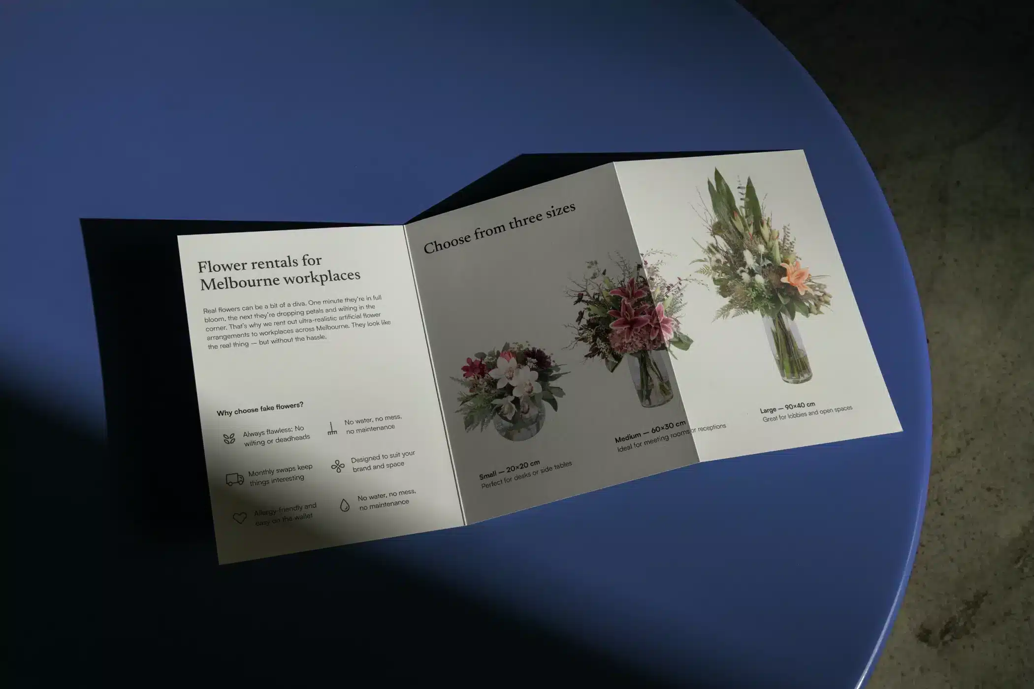
For Office Flower Solutions, I developed an illustrated character inspired by the founder, Benjamin. This gives the brand a face that carries his personality without depending on him. And since the category is dominated by script fonts and pink backgrounds, the character really stands out.

Stories and rituals
Romaniuk identifies three ways brands build distinctiveness through recurring narrative cues.
- Styles are recurring themes that run through everything. Red Bull’s wings motif appears in every ad, sponsorship or piece of content. The central idea “gives you wings” gives the whole system coherence. Without it, the extreme sports footage is just a collection of clips.
- Moments are signature actions tied to a specific point in time. Guinness’s two-minute pour started as a perceived weakness. But reframed as “Good things come to those who wait,” the liability became a distinctive asset.
- Components are specific physical cues, like the lime in a Corona, Apple’s white earbuds or the grey cat on a Whiskas pack.
I’d say, stories and rituals is the most underused asset type for small businesses. Rituals are particularly interesting in this context. They don’t have to happen after purchase. A recurring content format or even a particular object that always appears in your content can become a recognisable cue before someone has even worked with you.
There’s a UX designer I came across on Instagram—but can’t find again—who always lights a candle before talking through her thoughts. She sets a certain mood that’s instantly recognisable.
Further reading
My articles on brand culture and brand storytelling go deeper.
Taglines and brand voice
Words are the hardest assets to make distinctive. Because they already carry meaning, uniqueness is hard to achieve.
A tagline has to fight through everything people already associate with the language it uses, and still be memorable enough to link back to your brand specifically. Nike’s “Just Do It” only works so well because of nearly four decades of consistency and a large advertising budget.
But there’s a car-sharing brand here in New Zealand that has a great tagline—Mevo. “Go with Mevo” is short, includes the brand name—and therefore reinforces it—tells you what it does, and is printed on every car, so the repetition is built into the business model. I think it’s brilliant.
The question for a small business is always whether you can repeat a tagline enough to make it stick. If you can’t, your business probably doesn’t need one yet.
If you do decide you need one, a few things that help taglines cut through are keeping them simple, including the brand name and pairing them with a sound.
Further reading
A brand voice is rarely a distinctive brand asset in Romaniuk’s sense. It’s unlikely to make someone think “that’s definitely brand X.” But it’s still really useful, because a consistent voice makes your brand feel familiar and builds a connection with your audience over time.
Sound and other sensory assets
Sound is more accessible than most small businesses realise. A consistent intro on your podcast, a signature audio clip on your videos, a specific song you always use in your reels, can all build recognition over time.
Romaniuk categorises brand sounds into five types: non-vocal cues like Intel’s five-note bong; vocal cues like a distinctive spokesperson voice; jingles like McDonald’s “ba da ba ba baa”; music associated with a brand and rhythmic patterns like Mastercard’s heartbeat.
If you’re already producing audio or video content, a sound asset is worth thinking about. If you’re not, ignore it for now.
Other assets like scent, taste, and touch work differently. You almost always encounter them during or after a purchase, which limits how well they build recognition.
That said, they can create a strong atmosphere around your brand that reinforces loyalty. It’s a different job, but still worth thinking about.
Further reading
How to know where your distinctive brand assets sit on the grid
Formal brand asset testing involves showing unbranded stimuli to a sample group and measuring how many correctly link each element to your brand. It requires a budget and sample size that most small businesses don’t have.
But you can get a meaningful read yourself.
Cover your logo and name on your main marketing materials. Does anything else identify the piece as yours? If nothing does, your assets are in the low-uniqueness quadrant, regardless of how long you’ve been using them.
Ask a few people from your target audience. What do they say makes them recognise your brand? Those are the ones that have started building fame within your specific audience.
Go through every touchpoint a client encounters and look for visual shift. Do you use different fonts, inconsistent colours or layouts that feel unrelated? Every inconsistency actively prevents assets from moving up the grid.
My brand guidelines article covers how to document your assets so they actually get used consistently, and my brand audit guide walks through the full process.
Where to start building your distinctive brand assets, and how long it takes
Pick three brand assets and make them as unique as possible. It’s not about taste or trends. Create what no one else in your field has.
One thing to keep in mind is that it still needs to fit your industry to a certain extent to be trustworthy. A wellness brand in pink might stand out, but if nobody associates that colour with calm, you’re working against yourself. The goal is to be unmistakably you, within a frame your audience can still trust.
The brands with highly distinctive brand assets have been using them for decades, in the same combinations and contexts. The Michelin Man is 125 years old. “Just Do It” is nearly 40 years old. Tiffany & Co.’s blue has been used since 1845. Fame accumulates through exposure, and that always takes time.
So when you’re starting to get sick of your own assets and they feel boring and obvious, your audience is probably only just starting to notice them. That’s the moment most small business owners try to change them up and rebrand.
That said, for a small business, the goal is often to appeal to a niche audience or a specific location, not a global market. The timeline is shorter in that case—especially when your aim is to build combinations of assets rather than a single one.
The most common mistake I see is treating a rebrand as a fresh start. Sometimes that’s necessary. But when I work on a rebrand, I always look at what’s worth keeping because it’s already built a connection to the brand—and whether it’s a connection we want to reinforce.
If you want to go deeper into the research, Jenni Romaniuk’s book Building Distinctive Brand Assets is worth reading in full. Consider buying through Bookshop.org to support independent bookstores.
If you’re not sure where your distinctive brand assets sit on the grid, a brand audit is a good place to start.
Frequent questions on the distinctive brand asset grid
What is the distinctive brand asset chart or grid?
It’s a a matrix developed by Jenni Romaniuk at the Ehrenberg-Bass Institute that plots your brand elements against two scores: fame (how many people link the asset to your brand) and uniqueness (how exclusively it points to you and not a competitor).
Each quadrant comes with a different instruction:
- High uniqueness but low fame means keep repeating it.
- High fame but low uniqueness means it’s working for your whole category, not you.
As a small business, high uniqueness with fame still to build is the spot you want to start from.
How do you measure or identify distinctive brand assets?
Formal testing shows unbranded elements to a sample audience and counts how many name the brand correctly. However, this needs a research budget most small businesses don’t have.
But here’s something you can do: Line up three or four of your touchpoints and check whether the same visual system runs through all of them. Then cover the name on each piece and ask someone in your target audience what told them it was yours. Whatever they point to is the asset that’s started building fame.
What makes a brand element highly unique on the grid?
An asset is unique when it belongs to your brand alone and doesn’t make people think of a competitor first. A wellness brand using muted sage green or a tech company using a clean sans-serif has low uniqueness, because those choices signal the category rather than the specific brand. Uniqueness usually comes from breaking a category norm, or from combining elements in a way no one else in your field does.
Can a small business really build distinctive brand assets?
Yes, and the smaller scale works in your favour. You’re not trying to be recognised by everyone, only by the people in your niche or area, so you need far less exposure to get your assets “famous”. You also have fewer touchpoints to keep consistent than a brand running regional teams and seasonal campaigns, which gives you tighter control over the one thing that actually builds these assets—repetition.