Have you ever wondered why some designs look so much better than others? Chances are, it’s all in the typography. Well-used typography can significantly enhance the quality and visual appeal of your work.
To help you improve your typography skills, I’ve put together 20 practical typography tips you can implement right away.
Whether you are a design professional, an entrepreneur wearing all hats, or just starting out, these tips offer actionable ways to improve your typography skills and take your designs to the next level.
1. Consider the Audience
Typography is not just about selecting the right font or text size; it has to convey the right message and emotions.
That’s why it’s so important to consider the audience you’re designing for.
The fonts you choose can hugely impact people’s feelings about your design. For example, sans-serif fonts give off a modern and sleek vibe, while serif fonts feel more traditional and refined.
Likewise, an extra-large headline can feel cutting-edge and experimental, which could be perfect for an architectural firm. But for a medical design, you might want to pick more modest font sizes.
2. Choose Professionally Designed Fonts
Professionally designed fonts are designed by experienced type designers and offer a wide range of styles and weights.
They go through a higher level of quality control to ensure consistency and readability across different platforms and devices.
Design tip
Many professional type-foundries offer free trial versions for designers. You can use this opportunity to experiment with different fonts.
3. Apply Hierarchy
Every design needs a clear information hierarchy to avoid overwhelming the viewer with too much information.
One way to achieve this is by using different font sizes, styles and colours. This will direct the reader’s eye and highlight the most important information.
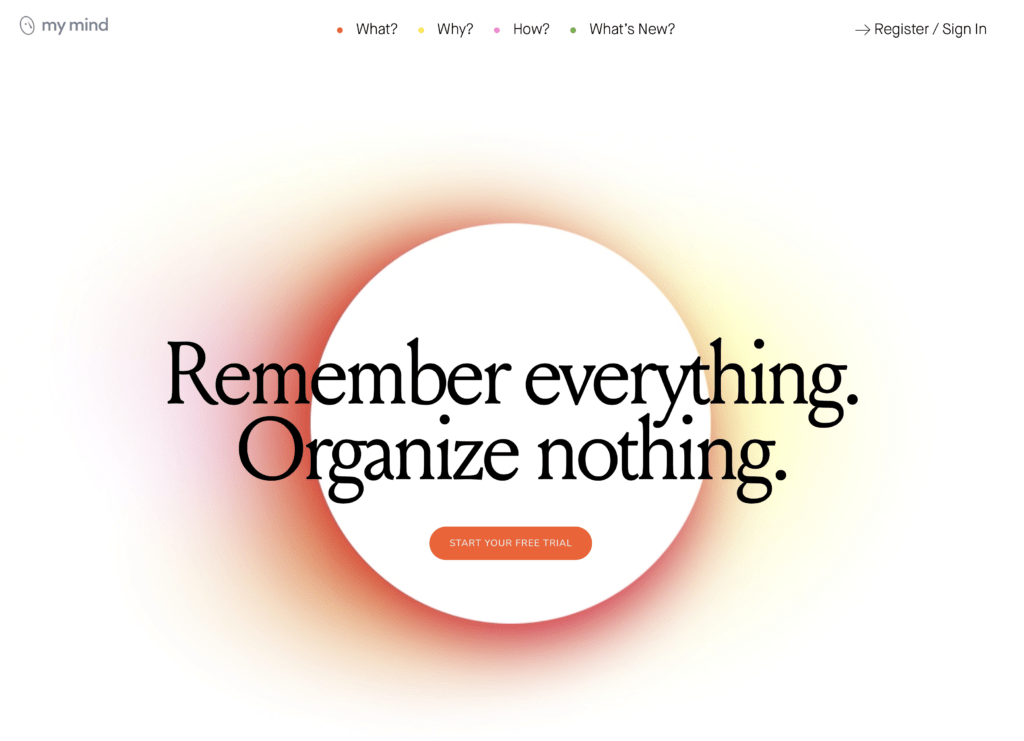
I love how simple yet effective this website hero section by MyMind is:
- The reader first notices the Headline,
- second the button
- and third, the navigation menu.
Design tip
Ask yourself in what order the reader should take in the information… and then start designing.
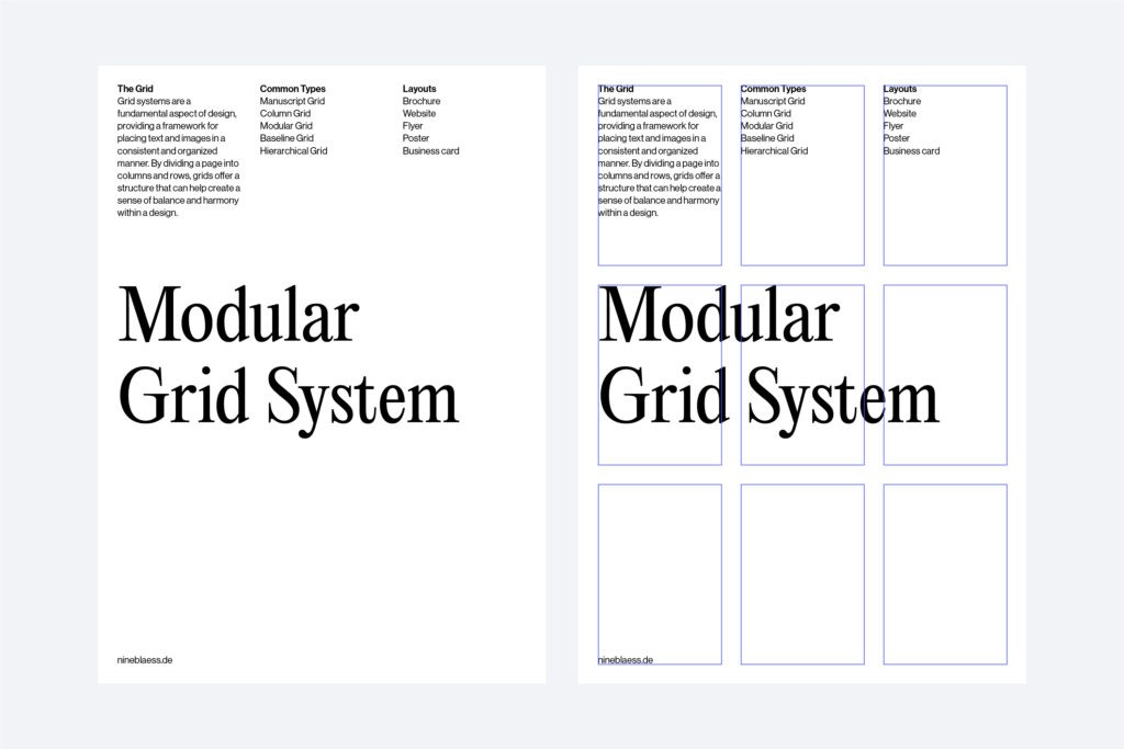
4. Use Grid Systems
Grids are a framework of columns and rows that create a structure for organising your content.
They help align text and images consistently and orderly.
There are different types of grids, such as:
- the manuscript grid,
- the column grid,
- the modular grid,
- the baseline grid,
- and the hierarchical grid.
Depending on your design, some grids are more suitable than others. For example, a manuscript grid is often used for book layouts, while a column grid works well for web designs.
Design tip
Take some time and experiment with different grid types to see which one works best for your project.


5. Break Out from the Grid
I know! I just told you to use grids. Now, I’m telling you to break out of them.
Grids can be valuable tools for creating a structured layout.
But if you stick too closely to them, your designs can become too rigid and predictable. Breaking the grid can add a surprising element to your design, making it more dynamic and appealing.
Design tip
Like everything in design, don’t overdo it. Just one or two elements breaking the grid are often enough to create a sense of tension.
6. Don’t Mix Too Many Font Styles
When choosing fonts for your design, less is often more.
If you use too many different fonts, your design can quickly become cluttered and unprofessional. “No more than three” is a good rule of thumb when combining fonts.
Design Tip
Fonts that are too similar don’t go well together. Try to create contrast by pairing a serif font with a sans serif font, for example.
If you’re interested in combining fonts, you can find some more font pairing tips in my article about brand fonts.
7. Use Contrast
I have touched on contrast before. You can create contrast by combining different fonts or using different font sizes, colours, and weights (e.g., bold vs. light).
Contrast helps create a clear information hierarchy and directs the reader’s eye.
One example I like is from the German chocolate company Jokolade. They placed a colourful shape beneath the typography to make the text stand out more.
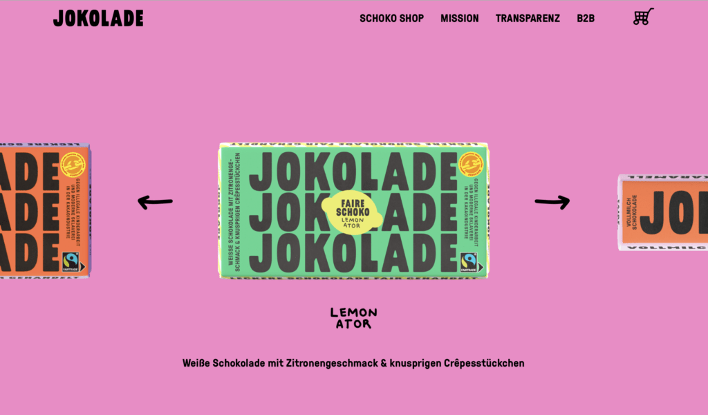
Design Tip
As you see, contrast can be created not only through typography itself but also through the use of other design elements such as shapes, images, and colours.
8. Use Whitespace
As beginners, we often neglect white space. But you don’t have to fill every inch of your canvas with text or images. Usually, less is more.
If you’re wondering, white space is the space around your design elements. If you use it intentionally, you can create a sense of balance and draw the reader’s eye to the elements you want them to notice.
Whitespace is particularly important in sophisticated designs. For example, look at how Aesop uses remarkably few design elements on its website.
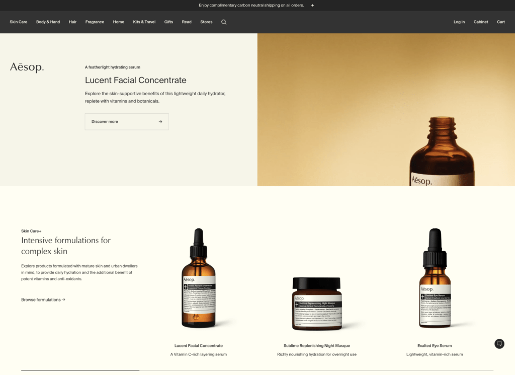
Design tip
Try to remove everything that is unnecessary and distracting when communicating your message. Then, slowly reintroduce your design elements. One at a time.
9. Avoid Pure Black and White
Did you know that pure black and white don’t exist in nature? Everything reflects subtle hints of the colours around it.
Sure, contrast is important. But especially for websites, using pure black text on a white background can quickly strain the eyes.
Take my website as an example. The black I use is #0D0E11, and the white is #FFFEFD. Hard to notice but it does make a difference.
Design tip
Try experimenting with different shades and hues to find the right balance for your design. Trust me, your audience will thank you for it.
10. Balance Type Elements Optically, Not Mathematically
Instead of aligning text mathematically, you should always align it optically—meaning by eye.
Type designers also use optical tricks to make letters appear balanced and pleasing to the eye. Why should font placement be any different?
Precise measurement doesn’t always feel balanced. Check out these examples to see what I mean.

Design tip
Trust your instincts and optically align text until it feels right. Over time, you’ll get better and quicker at it.
11. Use a Type Scale
A type scale can help you determine the sizes of headings, subheadings, and other text elements. This creates a visual hierarchy and makes your content easier to read.
Start by setting a font size for your body text, then use a specific scale to determine the size of all other text elements. Popular ratios include the golden ratio or the modular scale.
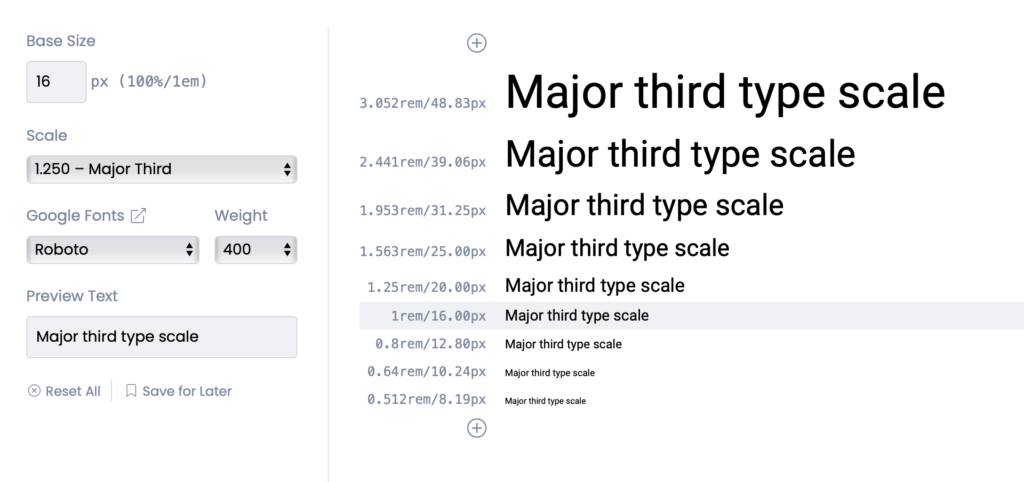
Design tip
Check out typescale.com for a handy tool that creates a font system for you. But don’t be afraid to adjust the sizes optically if they don’t feel right.
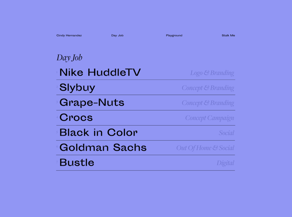
12. Use Display Fonts for Headlines
Display fonts are specifically designed to look sophisticated and elegant, which makes them the perfect choice for headlines.
With their bolder strokes and more intricate details, display fonts can add a refined touch to your designs. But remember to use display fonts only for large text, as they become illegible in smaller sizes.
Also, beware when choosing fonts for a website. Each extra font can increase the loading times of your site, leading to slower page speeds.
So, while it’s great to aim for elegance in your typography, it’s also important to consider practical considerations. In some cases, faster loading times might outweigh the benefits of using a particular font.
Below is an example of the font Freight Display Pro used by Cindy Hernandez. Do you notice the delicate details?
Design Tip
Display fonts are usually called something with Display but may also go by Headline, Banner, Poster or other names.
13. Adjust the Leading
Leading, or line spacing, is the vertical distance between lines of text. Choosing appropriate line spacing is super important for ensuring your text is legible.
The ideal leading strikes a balance between being neither too tight nor too loose.
Line spacing is influenced by various factors, such as the font itself, font size, and line length.
Longer lines generally need larger spacing than shorter lines, and headings need smaller spacing than body text.
Design tip
A leading value of 1.2 to 1.5 times the font size is always a good starting point.
14. Use Lead Paragraphs
Lead paragraphs are short, eye-catching summaries placed at the beginning of an article. They are designed to grab attention and give your reader a quick overview of what’s to come.
Lead paragraphs are especially useful for the web, where people tend to skim content. In this case, a lead paragraph can entice readers to delve deeper into an article, even if they’re short on time.
Plus, they can be a valuable tool for people to share content without reading the whole piece.
Design tip
Make your lead paragraphs stand out. Use a larger font size or a different font. You can also start with all caps or a drop capital.
15. Use Low-Stroke-Contrast Fonts for Body Text
When designing for accessibility (or anyone, really), make your body text as easy to read as possible.
Stroke contrast is one factor to consider. If you go for a typeface with high stroke contrast, such as Bodoni, its thin and delicate strokes fade away in small sizes, making it difficult to read.
16. Use Fonts With a Larger X-height for Body Text
Another factor to consider is the x-height of the font you choose.
Fonts with a larger x-height provide more space within letters such as e and o (apertures and counters), enhancing readability.
But be cautious not to choose fonts with an x-height that’s too large, either. We recognise word shapes rather than individual letters when reading, and overly large x-heights can make these shapes harder to distinguish.
Design Tip
To be on the safe side, you can choose a font with the word “text” in its name.
17. Use Italics Rather Than Bold to Highlight
Many people, including some of my clients, emphasise words on their websites by making them bold.
It makes me cringe, as this makes the text harder to read.
When certain words stand out too much, it can cause the reader’s eyes to jump around the page, making it hard to focus on something.
I recommend using italics instead of bold to highlight. This way, the emphasis is more subtle, and the reader can easier absorb the message without distractions.
18. Pay Attention to Kerning
Kerning involves adjusting the spacing between letters to enhance the appearance and readability of text.
This is especially crucial in logo design or large text, like headlines.
Well-executed kerning creates balanced and uniform typography—with letters that appear evenly spaced, whereas poor kerning can lead to awkward spacing that hinders readability.

Design Tip
If you want to practice your kerning skills, check out this kerning game.
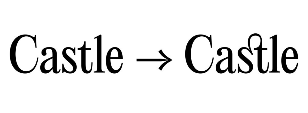
19. Use OpenType Features and Glyphs
Check out the OpenType features and glyphs. They can quickly enhance your designs and offer a variety of options.
Depending on your font, you might be able to use:
- Ligatures: Combine two or more letters into a single glyph for better aesthetics and readability.
- Alternate Characters: Provide alternative versions of certain characters for stylistic variation.
- Small Caps: Maintain typographic consistency by using uppercase letters that match the height of lowercase letters.
- Swashes: Decorative flourishes or extensions on characters for added elegance.
- Contextual Alternates: Substitute alternate glyphs based on surrounding characters for improved spacing and aesthetics.
- Fractions: Include fraction glyphs (like ¼, ½, ¾) for typesetting mathematical or measurement content.
- Stylistic Sets: Offer multiple stylistic variations of characters within a font to achieve different looks.
- Old Style Figures: Numerals designed to blend well with lowercase letters in text settings.
Design Tip
To access the OpenType features and glyphs panel in Illustrator, go to the “Window” menu and select “Type > OpenType” or “Type > Glyphs.”
20. Use Proper Punctuation
Punctuation may seem unimportant, but it distinguishes good from average typography.
Proper punctuation prevents confusion and ensures your message is conveyed clearly. Be sure to use punctuation marks such as commas, hyphens, and dashes correctly, with appropriate spacing.
To improve your punctuation immediately, here’s a brief guide to commonly confused punctuation marks:
- Use a Hyphen (-) to join words or break them at line ends.
- Use an En Dash (–) to indicate number ranges or connect related words.
- Use an Em Dash (—) to signify breaks in thought or to set off parenthetical statements.
- Use a Midpoint (·) to separate list items instead of bullets.
- Use proper quotation marks (“ ”) for direct quotations or specific word usage.
- Use an Apostrophe (’) for possessives or to indicate omitted letters.
- Use an Ellipsis (…) to show omitted words or trailing off of thought.
- Use correct symbols like ½ instead of 1/2.
Conclusion: How to Improve Your Typography Skills
Typography plays an essential role in the success of any design. In this blog post, we discuss 20 tips for improving your typography skills.
Let’s recap again.
You understood the importance of knowing the audience for whom you’re designing.
You learned that a clear information hierarchy is essential to quickly and visually appealingly convey information.
To achieve hierarchy effectively, consider these tips:
- Leave enough white space
- Use grid systems to align text
- Add contrast through font pairing, colour, or size
- Use a type scale to create harmonious sizes for your headlines
But when trying to create a hierarchy, beware:
- Don’t mix too many fonts
- Break out from the grid once in a while to create tension
You learned that it’s especially important to pay attention to readability when it comes to body text and website designs. Here are some tips:
- Adjust the leading
- Use a low-stroke-contrast font for body text
- Use fonts with a larger x-height for body text
- Use italics to highlight text rather than bold
You understood how details make all the difference when it comes to mastering typography:
- Pay attention to kerning
- Use OpenType features and glyphs
- Avoid pure black and pure white
- Use display fonts for headlines
- Balance type elements optically, not mathematically
- Use proper punctuation
Finally, you learned that professionally designed typefaces come with more styles and higher quality control. This gives you more flexibility and improves the readability of the text.
Follow these typography tips to take your typography skills to the next level, and your designs will improve significantly.
Are you interested in improving your typography skills even further?
Here are some resources for you:
- Numerous books and courses offer an excellent way to delve deeper into the subject.
- A valuable resource is also The Flawless Typography Checklist by Typewolf, which synthesises insights and expertise from various sources.
- Here I have compiled the best 25 websites to find fonts for your brand.
- And finally: practise, practise, practise! This article outlines eight cutting-edge font trends that might inspire you.
What’s next?
You might want to check out my collection of the best premium mockup sites to perfect the presentation of your work.