In this article, you will learn about the impact of brand fonts on our perceptions and discover practical tips and resources that help you choose your brand typography.
By the end, you’ll be able to make an informed decision and choose a font that fits your unique brand personality and excites your target audience.
The difference between brand font and brand typeface
Let’s first understand the difference between a brand font and a brand typeface. Although these terms are often used interchangeably, a brand typeface is what you should actually look for.
Why is that? A typeface is a font family that contains various styles. In contrast, a font only refers to one style of that typeface. For example, Futura is the typeface, and Futura Regular is a font.
When choosing your brand typography, consider flexibility and future growth. Selecting one or more brand typefaces will better accommodate your evolving needs over time.
What’s the purpose of brand fonts?
Like your logo, brand colour palette and other visual elements, your brand fonts should help express your brand’s unique personality and identity.
Consistency plays a critical role in this.
Imagine if you saw a different font every time you encountered a brand—that would be pretty messy, right?
By consistently using the same fonts across all brand touchpoints, you create a consistent experience for every interaction with your brand.
Over time, this consistency strengthens your brand recognition and makes it easier for people to identify it. It also conveys a sense of reliability and shows that the brand is a constant that can be trusted.
Characteristics of a good brand font
A good brand font strikes the perfect balance between uniqueness, legibility, and a harmonious fit with your overall brand identity.
Here are some factors to consider when choosing your brand fonts:
Alignment with brand identity
The font—or combination of fonts—should reflect your brand’s personality, values, and positioning.
Whether your brand is modern and innovative, traditional and reliable, or creative and playful, the font’s characteristics should match the intended brand image.
Distinctiveness
A good brand font should stand out clearly and be easily recognisable. A font can help people remember and identify your brand through its unique features, even when the logo and brand name are missing.
Air New Zealand and The New York Times fonts are good examples.
In this context, you might want to check out my article What makes a brand recognisable?, which draws insights from three research sources exploring brand recognition and distinctiveness.
Readability
But remember: Above all, your brand font must be easy to read. It should be legible on all media, in different sizes, and on all backgrounds.
Readability takes priority over distinctiveness, especially in body text.
Versatility
Your chosen font should work well in different applications, devices and screen sizes.
Also, remember that you need to be able to emphasise text, for example, by using italics. Choose a typeface that provides a range of weights and styles, if possible.
Pairing Capability
If you use multiple brand fonts, ensure they complement each other and create a harmonious pair.
We’ll go into font pairing in more detail later.
Timelessness
It’s tempting to follow design trends. But a good brand font is timeless.
Avoid fonts that can quickly become outdated. Your brand identity should stay relevant over time.
Accessibility
Make sure the fonts you choose meet accessibility standards so that your content is legible for all users, including people with visual impairments.
The Material Design Tool is a helpful resource when it comes to web accessibility.
Licensing
You should always have the proper license for your brand fonts to avoid legal issues.
As an alternative, you can also consider open-source or custom fonts. We will discuss this in more detail later.
Consistency
I can’t stress this enough: Consistency is the key to building a strong brand.
Decide on one or two brand fonts that you can use across all your brand’s touchpoints, whether digital or print—and stick with them.
Adaptable to growth
Choose brand fonts that can adapt well to the future growth of your business.
For example, some fonts support multiple languages and characters, such as Hebrew or Japanese. Is this relevant to your brand?
Since my clients are mostly from German-speaking countries or New Zealand, I always check if the fonts I chose include the German letters (ä, ö, and ü) or the Māori macrons (ā, ē, ī, ō, ū).
I usually look for larger font families (typefaces), so there are always a few extra weights on hand as the brand grows.
Understanding font personalities
Interestingly, fonts can influence our perceptions, feelings, and behaviour. The subtle features of type affect how we interpret and perceive text.
To create a successful brand identity, strategically choose your brand fonts. After all, the font should reflect the desired brand image.
Let’s take a look at different attributes to understand the different personalities of fonts:
- Serif vs Sans-serif
- High-contrast vs low-contrast
- Vertical stress vs diagonal stress
- Low x-height vs high x-height
- Condensed vs extended
- Rounded letterforms vs angular letterforms
Serif vs sans-serif
There are numerous classifications and sub-classifications, such as slab serif, Monotype, humanist sans-serifs, and script fonts … to name a few.
Let’s keep it simple and focus only on serif vs sans-serif fonts for now.
Serif fonts
Serif fonts date back to the 18th century when stonemasons carved letters into rocks. You can identify them by their decorative flourishes at the end of the letterforms—called serifs.
Because of their history, we perceive serif fonts as elegant, trustworthy and established. Law firms, wineries or newspaper brands might pick serif fonts to communicate their reliability and sophistication.
In the past decade, there has been a trend toward using serifs more playfully.
Some well-known serif typefaces are:
Open-source options include:
Sans-serif fonts
Sans-serif fonts emerged around 1800, but they only gained popularity in the 1920s –30s thanks to the Bauhaus movement.
While serif fonts convey a sense of tradition and sophistication, sans serif fonts have a modern and clean aesthetic.
These fonts fit seamlessly into “everyday designs” across various industries—from sports brands to tech companies.
Popular sans-serif fonts are:
Open-source alternatives include:
Tip
Don’t pair two fonts of the same classification.
Instead of two serif fonts, pair a sans-serif font with a serif font. This creates more contrast and makes the fonts compete less with each other.
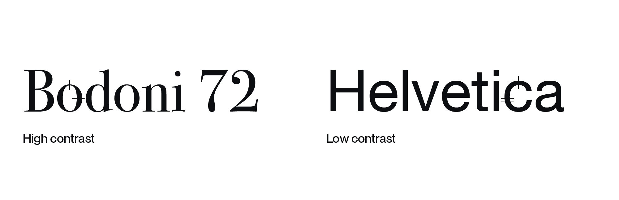
High contrast vs low contrast
Now, let’s talk about font contrast.
Contrast is the variation in stroke width within the letterforms. High-contrast fonts have noticeable variations, while low-contrast ones are more uniform.
High-contrast fonts exude sophistication.
They are often found in the branding of luxury labels or upscale hotels, where they indicate exclusivity and premium pricing.
Bodoni is a good example of a high-contrast font, and Prata is a good alternative if you’re looking for an open-source font.
Low-contrast fonts, like Helvetica, on the other hand, communicate sturdiness and trust.
Tip
Use high-contrast fonts only for headlines and large text. Their fine lines make them hard to read in body text and other small sizes.
Vertical stress vs diagonal stress
Let’s examine another aspect: the stress of the axis or the angle at which contrast occurs within letterforms.
To determine the stress of a font, look at the letter “O.”
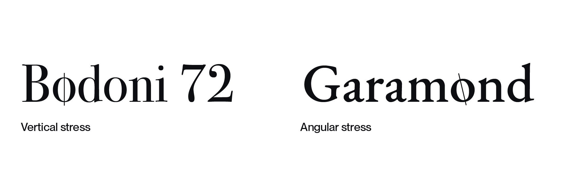
Typefaces with diagonal stress, such as Garamond, originate in the calligraphy of old-style Roman typography.
They have a warm and human appeal and are easy to read, which is why they are often used in body text.
Typefaces with vertical stress, like Bodoni, on the other hand, have a more modern, almost industrial and rigid feel.
Tip
Pair fonts with similar stress angles.
Low x-height vs high x-height
Let’s look at another factor: the x-height, the height of the lowercase letter “x” in a font.
It can influence the character and readability of a font.
A font with a low x-height, like Mr Eaves, can appear more delicate and premium, while a font with a high x-height, say Helvetica, can appear more robust.
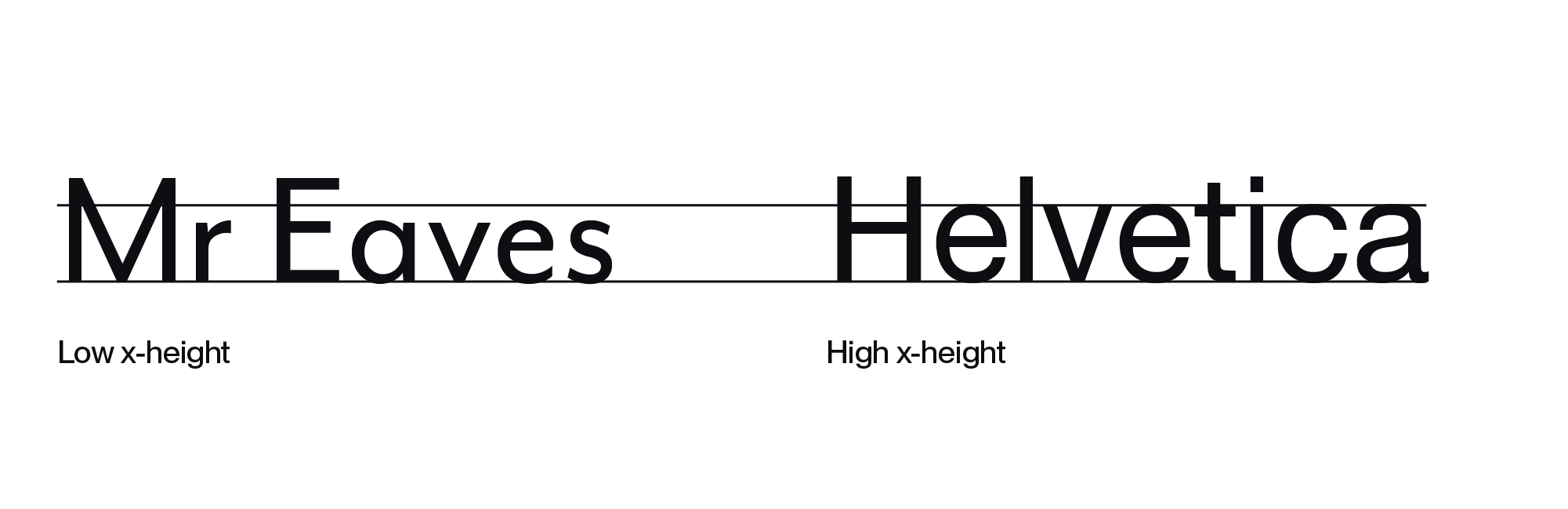
When working with body text, pay special attention to the x-height.
Fonts with a low x-height might cause problems at smaller sizes, as their counters (those enclosed spaces in letters like “c”) tend to fill up visually and may be read as “o.”
On the other hand, fonts with a high x-height have their own problems.
When reading, our brains tend to grasp the shape of whole words rather than individual letters. In fonts with an exceptionally high x-height, the eye may have trouble distinguishing these word shapes, making reading more difficult.
Tip
In font pairing, choose two or more fonts with a similar x-height to make them feel related.
Condensed vs extended
Next up are condensed and extended fonts.
Condensed fonts, such as Gotham Condensed, are narrow and have tight spacing, which makes them useful for fitting a lot of text into a small space. They are often used in newspaper headlines or other situations where space is at a premium.
Condensed fonts look precise and convey a sense of reliability and professionalism. They also have an energetic feel, which makes them suitable for sports brands, for example.
Extended fonts, like Franklin Gothic Wide, are wider and airier. They are often used in designs that convey positivity, lightness, and openness.

Tip
Superfamilies often have condensed and extended styles. You can pair them to create tension and interest.
Rounded letterforms vs angular letterforms
Now, let’s look at the last characteristic: the shape of the letters themselves.
Rounded letter shapes often have a positive association and evoke a feeling of happiness, comfort and friendliness. Their soft and playful appearance makes them suitable for brands aimed at children or families, for example.
A study has proven this: People associate curved, light and sans-serif fonts with positive qualities such as sprightliness, sparkle, dreaminess, and soaring.
More angular letterforms, on the other hand, convey a sense of strength, stability and authority. This quality makes them a common choice for corporate branding.
Free vs paid vs custom fonts—which is ideal?
Whether you choose free, paid, or custom fonts depends on your brand’s priorities, budget, and long-term goals. Each option has advantages and drawbacks.
Let’s have a closer look:
Open-source fonts
There’s a wide selection of open-source fonts. They’re a cost-effective option for startups and small businesses with limited budgets.
But because they’re so ubiquitous, they’re often not very original.
Pros
- Cost-Effective
- Easily accessible to all designers involved
Cons
- Often, they come with a limited number of weights and styles
- They are used frequently, which makes them less distinctive and original
- The quality of free fonts varies
- Some fonts may not be available in all required formats (web, print, desktop)
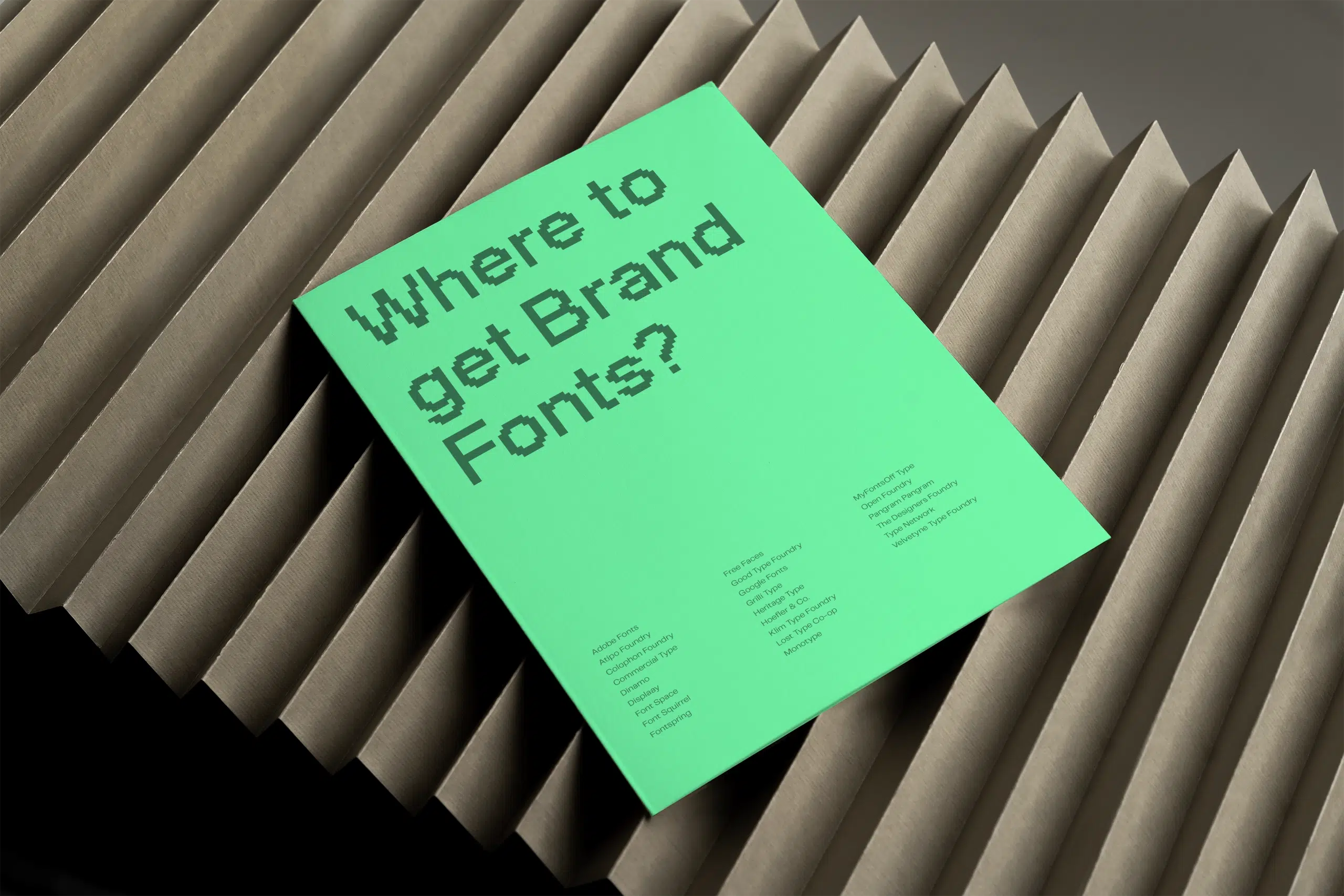
Where to find open-source fonts?
You can find open-source fonts on countless platforms, such as:
- Google Fonts
- Velvetyne Type Foundry
- Open Foundry
- Font designers on Behance
- Font Library
- Independent font designers, like Filippos Fragkogiannis
Paid fonts
Paid fonts offer a more comprehensive range of possibilities. They often feature higher quality and have more styles and weights.
Investing in paid fonts can also help your brand stand out.
And I think it’s only fair for a profitable business to pay font designers for their excellent work.
Pros
- Greater choice compared to free fonts
- Often, they come with a wider range of styles and weights
- Professionally design guarantees higher quality and consistency
- It’s less likely that other brands will use the same fonts
- There is a wide range of pricing options for every budget
Cons
- The cost of the fonts increases your branding budget
- Some fonts may not be available in all formats you need (web, print, desktop)
Where to find paid fonts?
You can get paid fonts from various platforms like font foundries or third-party vendors. Here are a few suggestions:
Foundries:
- Monotype
- Hoefler & Co.
- Linotype
- Commercial Type
- Klim Type Foundry
- Pangram Pangram
- Grilli Type
- Atipo Foundry
Others:
- Type Network
- MyFonts
- Creative Market
- Adobe Fonts
- Fontstand (font rental platform)
Custom fonts
You might not have considered this, but there is a third option: you can create your own custom brand font.
Custom fonts take your branding to the next level. They are designed specifically for your brand identity.
Creating a custom font can be costly initially. But it can be more cost-effective in the long run, especially on the web, where prices often increase with the number of users.
Pros
- Designed specifically for your brand
- Can be perfectly adapted to your brand’s identity, messaging and values
- Can increase brand recognition and identification
- Can become a long-term asset for your brand that can’t be copied
Cons
- High investment in time and budget upfront
- Integration of a custom font into various platforms and applications requires technical know-how
Where to get custom fonts?
Want to develop a custom font but unsure where to start? Your brand designer should be able to offer advice and guidance.
Additionally, the following info may be helpful too:
- Some foundries, such as Dalton Maag or TypeType, design custom brand fonts
- Freelance font designers
- Font design software like Glyphs
Further reading
For more ideas where to find fonts for your brand, check out this article.
Step-by-step-guide on choosing your brand fonts
I’ve put together a guide on how to choose your brand fonts in 12 easy steps:
1. Understand your brand
Before you select fonts, it is critical to develop a clear understanding of your brand. This foundation should guide your font choices.
Think about:
- What is your brand’s mission?
- What core values does your brand represent?
- Who is your target audience?
- What does the competitive landscape look like, and what differentiates your brand?
- What unique personality does your brand embody?
2. Define your font objectives
Set clear goals for your brand fonts.
Consider the following questions:
- What emotions do you want the font to evoke?
- How can it convey your brand’s personality?
- How does it fit with other brand elements, such as your brand voice?
- How can it differentiate your brand and make it recognisable?
- How can it appeal to your audience?
- What are your budget and priorities—can you get a paid or custom font?
- Is your brand digitally focused, and do you need to consider loading times on the website (the fewer fonts, the better)?
3. Reflect your brand personality
Your font choice should reflect the personality of your brand. For example:
- For playful brands, quirky brand fonts might be appropriate.
- Exclusive brands might opt for more classic fonts.
4. Get inspired by practical type resources
One of the best ways to refine your brand typography is to explore how others are using type—and to see what resonates with you.
Whether you’re looking for font combinations, inspiration, or practical guidance, there are plenty of resources worth exploring:
- FontPair helps you discover font combinations that work harmoniously for both headings and body text.
- Typewolf is excellent for inspiration for new fonts and font pairing.
- Fonts In Use is a platform that showcases how fonts are applied in real-world design projects, including branding.
- Butterick’s Practical Typography is a comprehensive online guide that covers various aspects of typography, from type anatomy to formatting techniques.
- My article shares 20 practical tips to improve your typography skills, including extra tricks and ideas I haven’t covered here.
- Type foundry websites let you explore professional fonts, often with real-use examples.
- Creative platforms like Behance, Dribbble, and Pinterest are great for browsing typography in action.
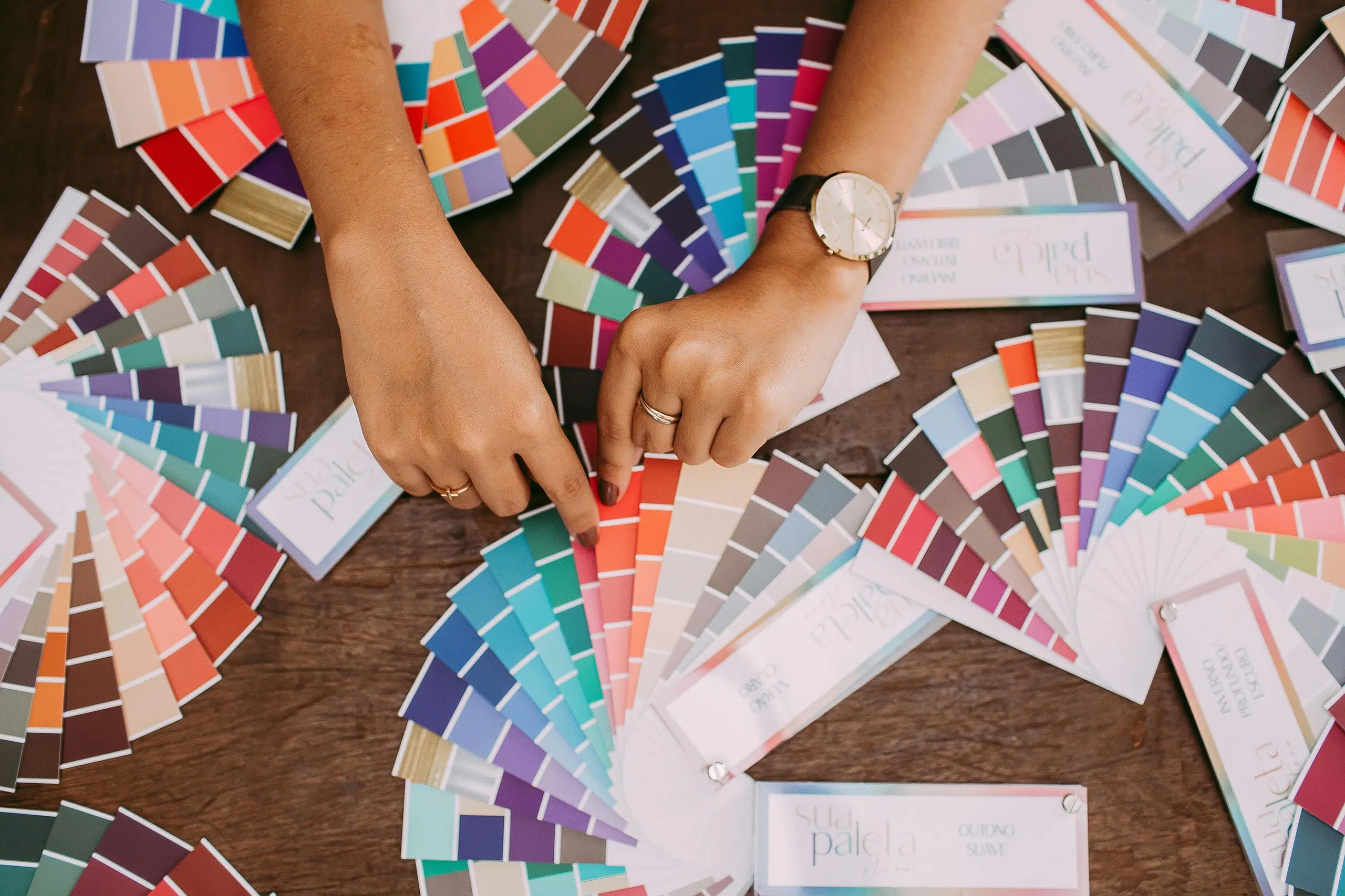
5. Choose font classifications
Fonts fall into four main categories: Serif, Sans Serif, Script, and Display. Each category has its own vibe:
- Serifs convey tradition and formality.
- Sans-serif fonts represent modernity and simplicity.
- Script fonts can be perceived as both elegant and handmade.
- Display fonts can be luxurious, decorative, and eye-catching.
6. Consider readability
While recognisability is important in branding, legibility is paramount. Make sure your brand fonts are legible in all media and sizes—especially in body text.
7. Pair fonts thoughtfully
We have touched on this topic earlier: Many brands use a mix of fonts to create variation, hierarchy, and recognition.
Consider choosing a dominant font for headlines and a complementary font for body text. Pair fonts that provide contrast but complement each other. For example:
- Combine different classifications, such as serif and sans-serif fonts.
- Choose fonts with equal x-heights.
- Choose fonts with a similar stress. Use different weights for better visual hierarchy.
- Combine fonts with similar properties—for example, fonts designed by the same type designer.
8. Test across applications
Fonts can display differently on different platforms and devices. Ensure consistency across all media, both on screen and in print:
- Test in different browsers, operating systems, and on different devices.
- Make sure readability remains constant from banners to mobile screens.
9. Avoid trends
While trendy fonts might seem appealing, they can quickly become outdated. Opt for timeless fonts that withstand the test of time and remain relevant over many years.
10. Legal considerations
Make sure you have the correct license to use the fonts. Font licensing terms can vary depending on the provider and the intended use (e.g., personal, commercial, web, print).
11. Ensure consistency
Ensure your brand fonts are used consistently, even when multiple designers are involved.
Create brand guidelines as a reference to specify the fonts and their usage.
12. Seek professional help
If typography and branding are not your expertise, hire a professional brand designer.
They can guide you through the process and ensure that your choices align with your brand’s vision.
If you’d like support with this, I’d be glad to help you, just send me a message.
Summary
As you can see, choosing the right brand fonts isn’t always easy. But armed with the insights from this article, you’re well on your way to finding fonts that truly reflect your brand’s identity—fonts that are distinctive, legible, versatile, and timeless.
With a thoughtful font choice, your brand typography can grow into a distinctive brand asset that sets you apart and deepens recognition over time.
Title image by Teona Swift