Whether you’re a brand designer or a small business owner, I hope this helps you feel more confident choosing brand fonts and creating a solid typography system that supports your visual identity.
Here are some of the questions you might have about typography in branding—along with my answers and tips.
What is brand typography?
Brand typography is the intentional selection and use of fonts that reflect and reinforce your brand’s personality and identity.
But it’s not just about choosing fonts that look good. It’s also about creating a consistent system for all your brand’s text—from headlines to body copy—to ensure everything feels cohesive and is easy to read.
This consistency helps people recognise your brand at a glance and builds familiarity over time.
Why is typography so important for a brand?
The importance of typography in branding cannot be overstated. As we discussed earlier, your brand’s typography plays a significant role in shaping how your audience perceives its personality.
A carefully selected typeface can evoke specific emotions and associations, reinforcing your brand’s identity.
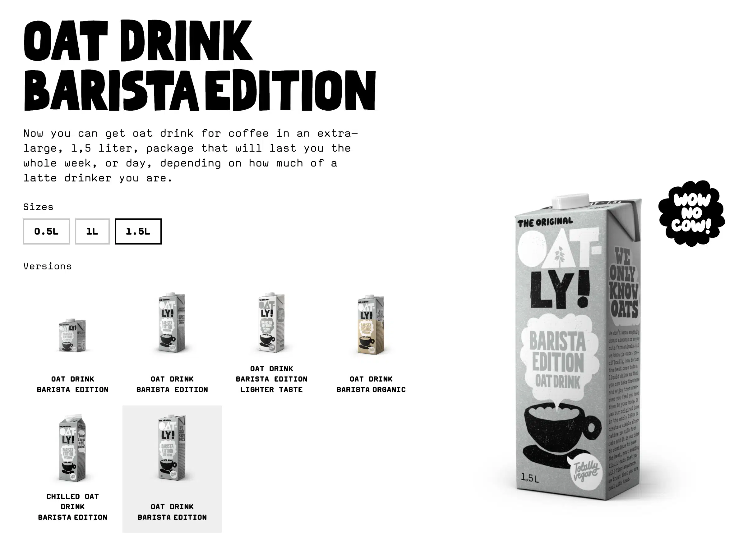
For example, consider Oatly’s typography. Its playful and unconventional style mirrors the brand’s rebellious and light-hearted personality. This visual language helps Oatly stand out in a crowded market.
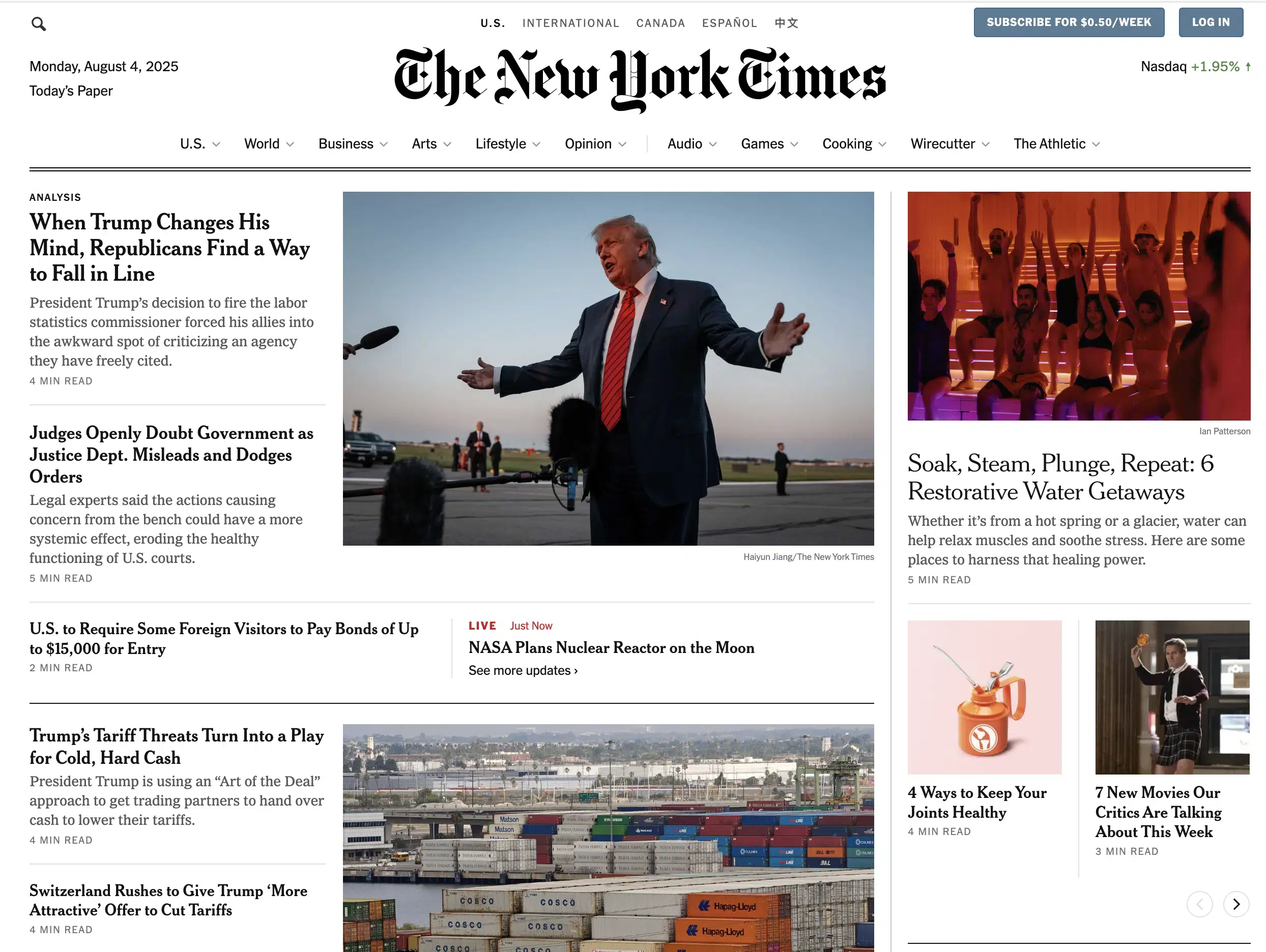
In contrast, The New York Times uses the classic serif font NYT Cheltenham. This choice communicates tradition, authority, and reliability, aligning with its readers’ expectations of a credible, established news source.
Consistent typography across all communication channels—both digital and print—ensures a cohesive brand experience. It establishes a clear visual hierarchy, guiding the viewer’s eye and making your content more digestible.
Typography also fosters professionalism and reliability, which are key to building trust and strengthening brand recognition.
But there’s more. Research by Jenni Romaniuk of the Ehrenberg-Bass Institute shows that typography, when used consistently, is a powerful brand asset.
It enhances brand recognition and contributes to what Romaniuk calls distinctiveness—your brand’s ability to stand out and stay memorable in people’s minds.
Further reading
If you’d like to explore this topic further, check out my article on building distinctive brand assets, where I dive into how typography and other elements work together to strengthen your brand identity.
You might also find my article on what makes a brand recognisable interesting, summarising key insights from three major research sources, including the Ehrenberg-Bass Institute.
What’s the difference between a font and a typeface?
Let’s pause here for a second and clarify one fundamental question: What’s the difference between a font and a typeface?
Although the terms font and typeface are often used interchangeably, they are not the same thing. A typeface is a family of fonts. For example, Helvetica, Garamond, and Times New Roman are all typefaces.
A font, on the other hand, is a specific variation within a typeface, defined by its weight, style, and size. For instance, Helvetica Regular, Helvetica Light, Helvetica Bold, and Helvetica Italic are all distinct fonts within the Helvetica typeface family.
So, while we often talk about brand fonts, what you’re actually looking for is a brand typeface.
Choosing a versatile typeface with a range of weights and styles gives you flexibility across various applications and brand collateral. It also ensures that your brand can grow and evolve without the need for a complete overhaul of your visual identity.
How does typography contribute to a brand’s overall identity?
Typography is a core component of brand identity design, and it should work in harmony with your other brand elements.
Just as your brand colours evoke specific emotions and your brand voice conveys character, your choice of typeface can also communicate who you are and what you stand for.
For example, a modern sans-serif font can convey innovation and approachability, making it a perfect fit for a tech start-up. On the other hand, an elegant serif font communicates heritage and sophistication, aligning perfectly with a luxury fashion brand.
To build a cohesive and recognisable brand, it’s crucial to apply your typography consistently across all touchpoints—whether it’s your logo, website, marketing materials, or packaging.
This consistency strengthens brand recognition, differentiates you from competitors, and reinforces the emotions you want your audience to associate with your brand.
What are the main font types—and what do they communicate?
Different font classifications can communicate different things about your brand. Here are some of the main categories and what they typically convey:
Serif fonts
Serif Fonts have small “feet“ at the end of the letter forms. They often convey reliability, authority, professionalism and a sense of history. Brands such as The New York Times and Dior use serif fonts to create this impression and make it appear trustworthy.
However, modern serif fonts, such as the customised version of GT Super used by WeTransfer, can also appear creative and sophisticated.
But keep in mind that this is a somewhat simplified view. There are many sub-classifications, each with their own characteristics:
- Old-style serifs, like Garamond or Caslon, feel traditional and humanistic.
- Transitional serifs, such as Times New Roman or Baskerville, strike a balance between the classic and the modern.
- Modern serifs, such as Didot or Bodoni, are more stylised, with strong contrast, and can appear elegant and distant.
- Slab serifs like Courier New have thick, block-like serifs and can feel sturdy, industrial, or retro.
Sans serif fonts
Sans serif fonts have a cleaner, more modern look. They often suggest simplicity, efficiency, and a contemporary feel. Companies such as Google and LinkedIn use sans serif fonts to project a modern, approachable image.
Again, there are different sub-categories:
- Humanist sans serifs, such as Gill Sans and Myriad, have a more organic, calligraphic feel and can appear warmer.
- Geometric sans serifs, such as Futura or Gotham, are based on geometric shapes and can appear modern and sleek.
- Grotesque sans serifs, such as Akzidenz-Grotesk, often have a more industrial and straightforward feel.
Display fonts
Bold, eye-catching display fonts are designed to grab attention in logos, headlines and titles. While their intricate designs make them unsuitable for smaller text, they can add a unique and memorable touch to a brand identity.
Display fonts come in a variety of styles, ranging from decorative and illustrative to bold and striking.
Script fonts
Script fonts resemble handwriting, giving them an elegant, creative and personal appearance. Brands such as Instagram and Coca-Cola use them to create an artistic, human feel. They’re also highly memorable.
There are two main types:
- Formal scripts like Petit Formal Script feel very elegant and traditional.
- Casual scripts, such as Brush Script have a more relaxed and informal feel.
How do you choose the right fonts for your brand?
Choosing the right fonts for your brand can feel overwhelming due to the sheer amount of options available. However, the process becomes much simpler when grounded in a solid brand strategy process.
Start by thoroughly understanding your brand’s landscape. This means analysing your competitors, getting to know your target audience, identifying your unique strengths, and understanding your market positioning. This foundational knowledge will help guide your font selection.
Next, define your typography goals by asking yourself:
- What emotions and associations should your fonts evoke?
- What overall feeling should your brand convey?
- What vibe does your audience expect?
- How can typography help your brand stand out?
Ultimately, your brand’s personality should be the central guide. Select fonts that genuinely reflect who you are and ensure they harmonise with the rest of your brand assets.
Throughout the selection process, always prioritise legibility. No matter how stylish a font is, it’s ineffective if your audience finds it hard to read.
Further reading
If you’re looking for more in-depth information, check out my article: Everything you need to know about choosing brand fonts
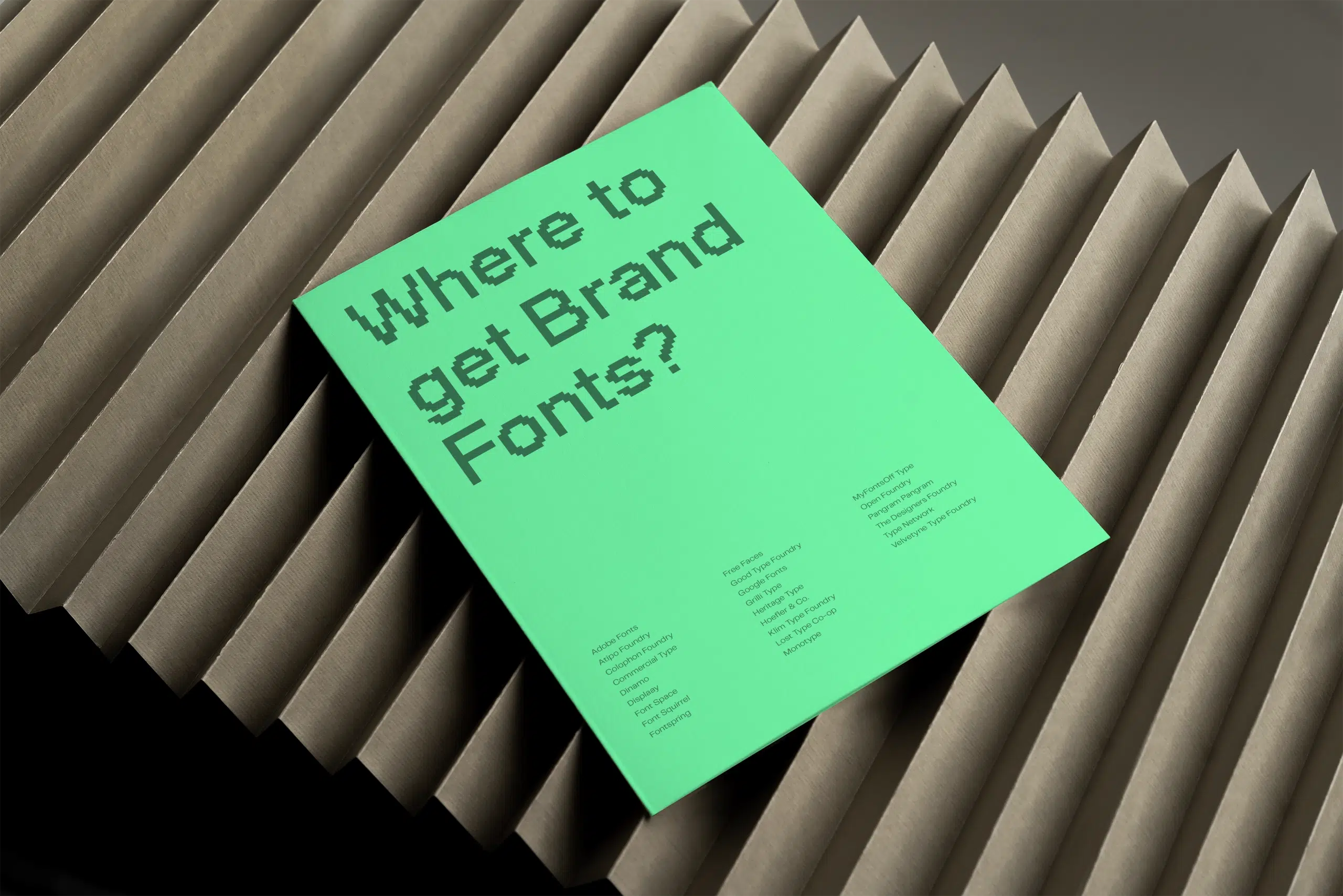
Where can you find fonts for your brand?
When it comes to sourcing fonts for your brand, you have three main options: free (open-source) fonts, paid (commercial) fonts, and custom-designed fonts. Each has its own benefits and considerations.
Free (open source) fonts
Free fonts can be a great option, especially for smaller businesses or those on a budget. They offer a wide variety of styles and are usually free for both personal and commercial use. However, quality and uniqueness may vary.
Examples of free font resources:
Paid (commercial) fonts
Investing in commercial fonts often gives you access to higher-quality designs, more extensive font families with various weights and styles, and broader licensing options. These fonts are created by professional type designers and foundries.
Some reputable paid font sources include:
Custom-designed fonts
For a unique typographic identity, a custom font might be another option. This allows you to create a typeface that truly reflects your brand’s personality and is exclusive to you. While a custom typeface is a significant investment, it can be invaluable for brand recognition.
Most foundries also offer custom typography solutions.
Further reading
If you’re looking for more great places to find fonts for your brand, you might be interested in my article: The 25 best websites to find fonts for your brand.
What should you consider when pairing brand fonts?
Strategic font pairing can help create an effective and balanced typographic hierarchy in your brand communications.
Here are some font pairing tips to bear in mind:
- Create contrast by avoiding the same classifications: Generally, it’s best to avoid pairing two fonts from the same classification. For example, pairing two serif fonts or two sans-serif fonts can make them compete visually. A better approach is to combine a serif font with a sans-serif font. This creates contrast and ensures that the fonts work together without competing for attention.
- Seek harmony through similar x-height: The x-height (the height of the lowercase ‘x’) affects how fonts look together. Pairing fonts with similar x-heights can help them appear visually related and harmonious. Fonts with too large of a difference in x-height can feel disjointed.
- Consider similar stress angles: The stress angle refers to the direction of thickening in the curved strokes of a letter (like in the letter o). Pairing fonts with similar stress angles (whether vertical or diagonal) creates a more cohesive and unified look. For example, combining two fonts with vertical stress angles can tie them together effectively.
- Explore superfamilies: A font superfamily includes a variety of related styles, such as both sans-serif and serif versions of a typeface (e.g., Roboto and Roboto Slab). These families are often designed to work well together, giving you a range of options while maintaining visual harmony.
How can you ensure consistency in your brand typography?
Consistency in typography ensures that all brand communications, whether digital or print, are cohesive—no matter who’s designing them.
Here’s how to ensure consistency in your typography:
Create clear brand guidelines
One of the most effective ways to maintain consistency is by developing clear brand guidelines that specify the usage of all brand elements, including typography.
Use pre-designed templates
For smaller companies or businesses without a dedicated in-house design team, using pre-designed templates can help.
This allows you to maintain visual consistency—across different materials, such as social media posts, presentations, and website pages, even if different people are creating content.
Train your team
Ensure that everyone involved in creating brand materials understands the importance of adhering to typography guidelines.
What are brand typography guidelines?
Brand typography guidelines are a vital part of your overall brand guidelines. They ensure your brand fonts are used consistently across all touchpoints—from your website and social media to printed materials and presentations.
These guidelines provide practical instructions for designers, developers, and anyone creating branded content. Here’s what they typically include:
Font usage
- Primary and secondary fonts: Define which fonts to use for different purposes, such as headlines, body text, captions, and calls to action.
Font pairing: Outline acceptable combinations and explain how to create contrast and harmony without clashing.
Typography specifications
- Font sizes: Recommend font sizes for headings, subheadings, and body text to support visual hierarchy and readability.
- Font weights: Indicate appropriate weights (e.g. bold for emphasis, regular for paragraphs) to keep things consistent.
- Line spacing (leading): Suggest ideal spacing between lines to improve legibility and overall aesthetics.
- Letter spacing (tracking): Define consistent spacing between characters to maintain clarity and structure.
Font colours
Offer guidance on acceptable text colours and contrast ratios to ensure accessibility and visual coherence across different backgrounds.
Visual examples
Typography guidelines work best when they’re visual. Include mockups or real-world examples to show both correct and incorrect applications. These visuals help internal teams and external partners apply the typography with confidence and clarity.
By providing clear, actionable typography rules, you help everyone maintain a cohesive brand presence. This consistency not only strengthens brand recognition but also builds trust and professionalism in every touchpoint.
What’s different about designing typography for digital vs print?
While some principles of good typography apply across all mediums—like legibility and consistency—digital platforms and print materials each come with their own unique demands. Here’s how to tailor your typography to suit both.
Considerations for both digital and print
- Legibility: Your fonts should be clear and easy to read at different sizes and in various contexts.
- Brand alignment: The typography should consistently reflect your brand’s personality, values and identity.
- Hierarchy: Use size, weight, and spacing to guide the reader through content in a logical and engaging way.
- Consistency: Stick to your brand fonts and typographic styles across all touchpoints to build recognition and trust.
- Licensing: Ensure you have the right font licences for the intended use—web, print, or both.
Specific considerations for digital platforms
- Web performance: Too many web fonts slow down loading times. Use only what’s necessary.
- Responsiveness: Choose fonts that scale well across different screen sizes and resolutions.
- Accessibility: Prioritise colour contrast and readable font sizes to make your content inclusive for all users.
Specific considerations for print materials:
- Font reproduction: Not all fonts print well. Opt for those that retain detail and legibility at the required sizes.
- Paper and ink: Paper texture and colour affect how your type appears. Always test your fonts in print to avoid surprises.
What are some good resources for brand typography?
Fortunately, there’s no shortage of excellent resources to help you build a strong foundation in brand typography—whether you’re just getting started or refining your skills.
Here are some go-to resources I recommend:
For learning typography
- Flawless Typography Checklist by Typewolf
- Typography 01 by the Futur
- Stop Stealing Sheep & Find Out How Type Works by Erik Spiekermann
- Thinking with Type by Ellen Lupton
For font inspiration
What are the risks of inconsistent brand typography?
Inconsistent typography undermines your brand’s credibility and confuses your audience.
When fonts change from one touchpoint to the next—for example, if your website uses one style and your brochures use another—it becomes harder for people to identify and remember your brand. This inconsistency weakens the visual connection between your communications.
It also signals a lack of attention to detail. If your typography appears sloppy or inconsistent, customers may question your professionalism and turn to more polished and reliable-looking brands.
Conclusion
I hope this article has helped you understand the importance of brand typography and answered your key questions.
By selecting and using typography intentionally, you create a visual language that expresses your brand’s personality, supports recognition and cohesion, and builds trust with your audience.
So if you’re ready to create a font system that’s unmistakably you, I’d love to help. Get in touch to find the right type direction for your brand.