I see this all the time with small businesses. Most people don’t set out to pick the wrong fonts—they just use whatever came with their website template or whatever looked good in Canva that day. The trouble is, the brand ends up feeling disjoined and forgettable.
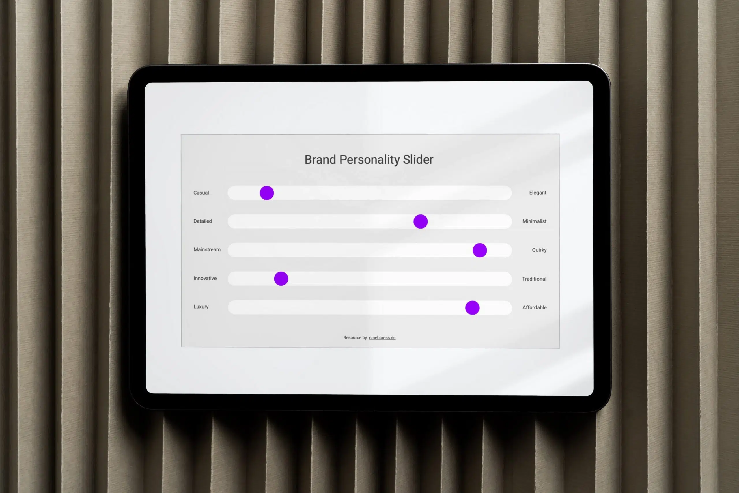
Before they read a single word, people subconsciously notice your typography. In a split second, your font choice tells them whether your business is traditional, reliable, innovative, or a bit quirky.
The right fonts help you build trust and establish your brand’s tone from the very start. When you get your fonts right and stick with them, your brand becomes instantly recognisable—which means people can identify it even without your logo. Your fonts become your signature distinctive brand assets.
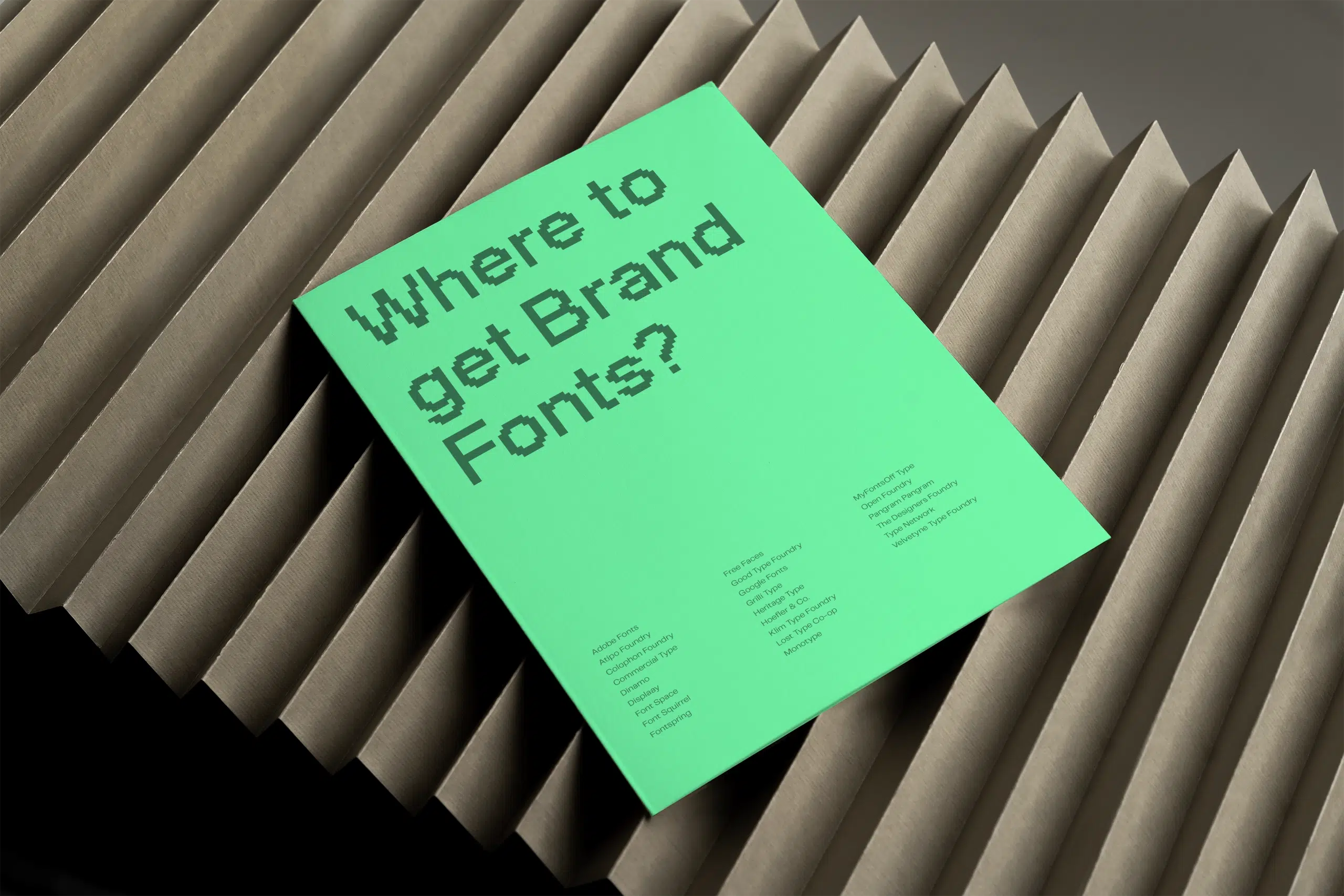
In this article, I’ll share the 27 best websites for finding fonts. You’ll also find out what you need to know about font licensing in 2026 and discover how I, as a brand designer, select fonts for my clients. Feel free to jump straight to the section that interests you, or read the whole article.
Quick comparison—where to find free vs paid fonts?
Free
Completely free:
- Fontshare
- Google Fonts
- Velvetyne
- Open Foundry
- Free Faces
- Font Space
- Font Squirrel
Free & flexible pricing:
- Atipo (pay-what-you-want)
- MyFonts (free and paid options)
Paid
Lifetime licensing, no subscription:
- Commercial Type
- Creative Market
- Dinamo, Displaay
- Fontspring
- Good Type Foundry
- Gradient Type
- Grilli Type
- Heritage Type
- Klim
- Lineto
- Off Type
- Pangram Pangram
- The Designers Foundry
- Type Network
- YouWorkForThem
Subscription-based:
- Adobe Fonts (included with Creative Cloud)
- Monotype
The 27 best websites to find fonts for your brand (A–Z)
Adobe Fonts comes with any Creative Cloud subscription and gives you a huge library to test during the design phase.
For better website performance, I recommend buying and self-hosting your final font directly from the foundry once you’ve made your choice.
Atipo offers contemporary typefaces with lots of personality. Their pay-what-you-want model is great if you’re on a tighter budget.
The selection isn’t huge, but if you want something distinctive without breaking the bank, it’s worth a look.
Commercial Type is one of the most respected foundries in the industry, and behind classics like Graphik and Neue Haas Grotesk.
Their clients include Bloomberg, Vogue, and the Financial Times, which speaks volumes about their standards.
Creative Market is a marketplace for unique fonts. Because it’s an open platform, the quality can vary, so you’ll want to choose carefully. That said, it’s a great place to support indie creators while finding a font with a distinct personality.
Just pay close attention to their licensing structure. They split fonts into Desktop, E-pub, App, and Web, which can get expensive if your brand is present across different platforms.
Dinamo is a premium Swiss type studio. Their fonts have a lot of character and stand out from the crowd. They’re best for brands with a serious typography budget, though.
This independent foundry offers beautiful, contemporary typefaces you won’t see everywhere.
Their fonts have been used by brands like Nike, YouTube, and Facebook. You can buy retail fonts or commission a custom font.
FontSpace lists over 130,000 free fonts, with about 18,000 cleared for commercial use. It’s a long, uncurated list, so you’ll need a sharp eye to find something that really fits your brand.
Still, it’s worth a browse if you have the patience. Just make sure to check the licence before you download anything.
Font Squirrel is similar to FontSpace, with a big archive of free fonts. The difference is that Font Squirrel checks all its fonts for commercial use, so you don’t have to worry about licensing.
Their Font Identifier tool is genuinely useful too: upload an image of any type, and it finds similar fonts for you.
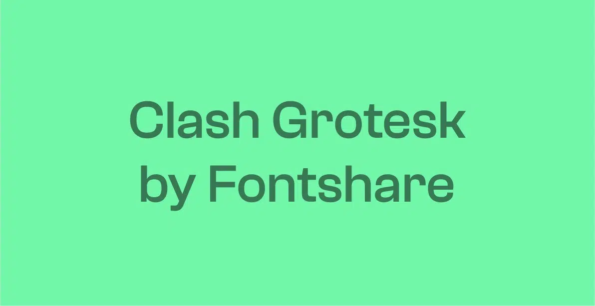
Fontshare is one of my favourite websites for finding free fonts.
Run by the Indian Type Foundry, it offers a carefully curated selection of high-quality fonts like General Sans, Clash Display, and Supreme—all in multiple weights, with pairing suggestions built in.
Fontspring partners with major foundries and offers over 69,000 fonts. Their licensing is refreshingly simple: pay once, use the font for life, and no subscriptions are needed.
Free Faces is a curated gallery of fonts under various free licences. It’s a good starting point if you’re feeling overwhelmed by choice. Just remember to check each licence before using any font commercially.
Good Type Foundry offers high-quality original typefaces with a playful, modern edge. If you want your brand to show personality without shouting, this is a great place to look.
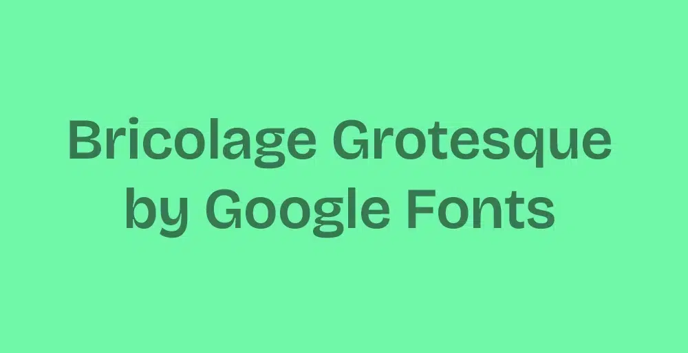
Google Fonts is the world’s most popular open-source font library. The quality is surprisingly good for a free resource. The downside is that almost everyone uses them. So if standing out is important to you, they can feel a bit too safe and generic.
That said, you can strike a balance by combining them beautifully with a distinctive display font from another foundry for your headings, whilst using a simple Google Font for the body text.
I’ve often used Google Fonts in this way, or for small brands that couldn’t afford premium fonts.
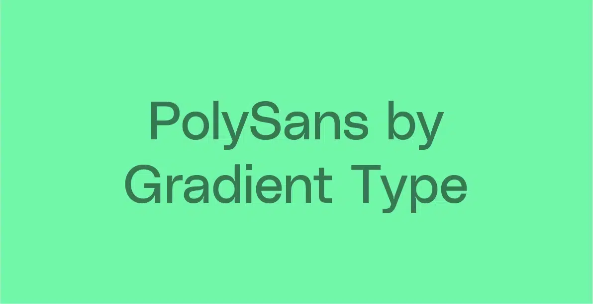
Gradient Type is an independent Norwegian foundry that blends traditional craft with experimental ideas. Their work stands out and feels genuinely fresh. I even considered them for my own brand before choosing Pangram Pangram.
Grilli Type is a Swiss foundry known for versatile typefaces that balance function with personality. GT Sectra and GT Alpina are standouts, and their fonts are used by brands like WeTransfer, Pinterest, and TikTok.
Heritage Type Co. specialises in authentic vintage and nostalgic typefaces. It’s a very specific look, but if that’s what your brand needs, it’s a charming foundry worth exploring.
Klim Type Foundry is based here in New Zealand and creates typefaces that blend historical depth with a modern sensibility.
They’re one of my go-to foundries when I’m looking for something distinctive. I just haven’t had the right project to use them yet.
Their custom work is equally impressive, with clients like The Financial Times, PayPal and National Geographic.
Lineto is the go-to source for Swiss digital design: precise and functional. Their typefaces are modern classics. LL Brown is used in the Airbnb logo, and LL Circular defines Spotify’s branding.
If you’re looking for technical craftsmanship and a timeless look, you should definitely check them out.
Monotype holds iconic families like Helvetica, Univers and Frutiger. Access is now subscription-based, so it’s usually better suited to large agencies or studios than small brands.
MyFonts is a massive marketplace with strong filtering and the excellent WhatTheFont? identifier. It’s great for finding fonts from screenshots or existing designs.
Off Type is playful, whimsical, and genuinely distinctive. If your brand personality leans unconventional or irreverent, it’s worth a look.
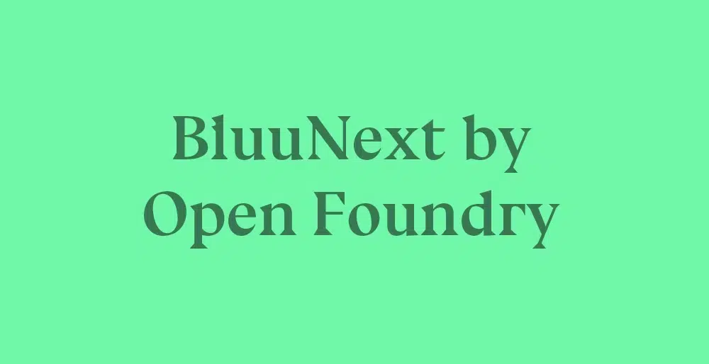
Open Foundry offers curated open-source fonts with character, which is rarer than you’d think among free font websites. It’s a good middle ground for budget projects that don’t want to compromise on personality.
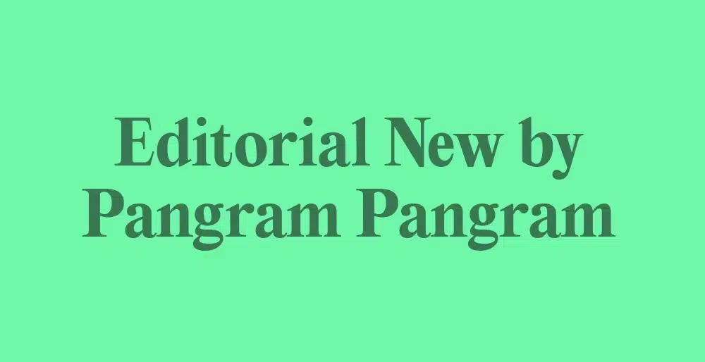
Pangram Pangram is one of my favourite foundries for modern branding. Neue Montreal—the font I use on this website—and Editorial New are among their most popular.
Their Font Starter Pack is an affordable way to access professional type, and like most foundries in this list, they offer trial fonts, too.
The Designers Foundry is a well-curated collection of work by independent designers. The site is easy to browse and offers some strong contemporary options, as well as custom work.
Type Network brings together fonts from multiple independent foundries in one place. It’s a good way to support indie type designers while still having a solid range to browse.
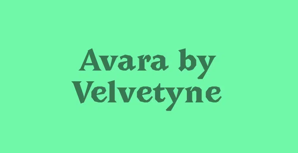
Velvetyne Type Foundry is a collective offering free, open-source fonts with real soul and originality.
Don’t let the position on this list fool you. The quality is impressive and unlike anything else at this price point.
YouWorkForThem offers over 218,000 fonts from foundries worldwide. Licensing is straightforward: You pay once and use them for life, with subscription needed. YouWorkForThem is great for their sheer range and straightforward commercial licensing.
Pro tip:
Don’t just look at fonts as placeholder text. Test them with your brand name and tagline. That way, you’ll notice any unattractive letterforms or spacing that often go unnoticed in ‘The quick brown fox’ demos.
This is precisely why most professional type foundries offer free trial versions. If a foundry doesn’t allow you to test the files in your layouts first, I’d take that as a sign to look elsewhere.
Why typography is a strategic decision
Typography is the visual voice of your brand. Before anyone has even read a single word, they have already formed an impression of your brand—solely based on its look and feel, which is largely shaped by your choice of fonts.
- A serif font, with its small decorative feet, usually signals tradition, authority, and reliability.
- A geometric sans-serif reads as modern, clean, and efficient.
- Script fonts can feel personal and warm, or dated and precious, depending on execution.
If your fonts don’t match your brand personality and message, people will notice, even if they can’t quite put their finger on why.
Choosing your fonts is therefore not just a design decision, but a strategic one. If you haven’t yet defined your brand positioning and brand voice, you should do so before you start your search.
Further reading
To help you get started, you might find these brand positioning examples inspiring. Or dive into the strategy behind them with my guide to brand positioning.
Font licensing explained
Licensing is the part most people skip, but it can cause real problems. You need the right licence for every commercial project. If you use a font without a licence, or with the wrong one, this could have legal consequences for your brand.
Nowadays (as of 2026), most type foundries distinguish between:
- Desktop licence: For logos, print materials, and static design files.
- Web licence: For embedding fonts in your website, usually priced by monthly pageviews.
- Social Media licence: A newer standard for commercial posts on Instagram, TikTok, or YouTube. Many foundries now scale this price based on your follower count.
- App licence: Required if your mobile app uses the font in its interface.
- Advertising licence: Specifically for paid campaigns (like Meta or LinkedIn Ads)
So be careful—this is where your font choice can get expensive if you aren’t paying attention. Personally, I’m not a big fan of subscriptions. I prefer foundries that offer a lifetime licence, so that you actually own the fonts.
How I source fonts for clients
When I’m looking for fonts, I start with Pinterest for inspiration—focusing on the qualities the brand strategy calls for, not just what looks good at first glance.
I check my own library first, then browse foundries like Klim or Pangram Pangram for something more distinctive. If the budget is tight, Fontshare and Atipo are my first stops. Like I said, most professional foundries offer trial fonts before you commit, and I always take advantage of that.
But I’m also a big believer that type designers deserve to be paid for their work. Free fonts are everywhere, but they often come with fewer weights and less refinement. Since your brand is your business, investing in good fonts is worth it in my opinion.
This brings us to another suggestion: For a truly unique look, you can also buy directly from independent designers, like:
Or browse Creative Market and Behance to discover more independent designers.
Font-pairing tips
To close off, here are some font pairing tips to make the most of your selection. Most brands use two typefaces—for example, a distinctive display font for headings and a legible UX font for body copy.
The goal when pairing is to create contrast and cohesion. You want them different enough to create hierarchy, but related enough to feel intentional.
And this is how you can achieve that:
- Don’t pair two fonts from the same classification. Two serifs or two sans-serifs compete with each other. Instead, pair a serif with a sans-serif for natural contrast.
- Match x-heights where possible. The x-height is the height of the lowercase letter x. Fonts with similar x-heights feel related even when they look different.
- Look for similar stress angles. The stress is the angle at which contrast occurs in the letterforms. You can see it in the letter “O”. Similar angles feel harmonious.
- Use weight for hierarchy, not a third font. Instead of adding a third typeface, use different weights, like Bold and Regular, within your existing two to create variety and emphasis.
Pro tip:
If you want to play it safe, opt for a versatile superfamily and make use of its various weights and styles for your brand. As these typefaces share the same ‘DNA’, they are guaranteed to work harmoniously together.
A classic example is Joshua Darden’s Freight Collection—a typographic system that covers the whole spectrum:
- Freight Big & Display: High contrast and elegant for large headlines.
- Freight Text: Legible for long-form reading like body copy.
- Freight Sans: A humanist sans-serif that feels warm and modern.
- Freight Micro: Specifically designed to stay legible at tiny sizes, which is perfect for UI or captions.
For a deeper dive, read my full guide on choosing brand fonts.
Frequent questions
Can I use Google Fonts commercially?
Most Google Fonts are licensed under the Open Font Licence, which allows commercial use in logos and websites. But it’s always better to check the individual licensing to be sure.
What’s the difference between a font and a typeface?
A typeface is the family (Helvetica). A font is a specific weight or style (Helvetica Bold). In everyday language, people use them interchangeably, and that’s fine, as long as you’re aware of it.
Do I need a web licence and a desktop licence?
Usually, yes, if you’re using the font in both your brand identity and on your website.
What’s the safest free option for commercial use?
Both Fontshare and Font Squirrel are reliable. Font Squirrel specifically checks all its fonts for commercial use.
Last words
Choosing the right fonts gets much easier once you know what your brand stands for. Start with a clear brand strategy and defined personality. When those are in place, the right typeface will usually present itself.
Whatever brand fonts you choose, check the licence, stay consistent.
If you need help defining your brand from scratch, take a look at my branding services. If you prefer to DIY, my collection of branding resources is a good place to start.
Title image by Mockp by SédShop.Co, also available through Mockupcloud
This article contains a few affiliate links. If you make a purchase through these links, I may earn a small commission at no extra cost to you.