Here are the questions or misconceptions I hear most often and how I’d answer them—sorted by topips.
Understanding the basics
What’s the difference between a font and a typeface?
A typeface is a family, like Helvetica, Garamond or Neue Montreal. A font is only one specific style or weight within that family, such as Helvetica Bold or Garamond Italic. Most people use the terms interchangeably, and in daily life, that’s fine.
But when you’re building a brand, what you’re actually looking for is a typeface—a full family with enough styles to cover every situation, from headlines to captions, while leaving enough room to grow.
What is brand typography, and why does it matter?
Brand typography is the intentional selection and consistent use of typefaces across everything your brand puts out. It’s used not not just your logo, but across your website, proposals, social posts, packaging, and whatever else is relevant to your brand.
Fonts, together with your colours, shapes and images, make an impression in just a few seconds, before anyone really understands what you do. They’re already shaping their judgement from the first moment.
Just like you get a read on someone from what they wear, your typeface signals how to read your brand—whether it’s modern or traditional, warm or distant, premium or accessible.
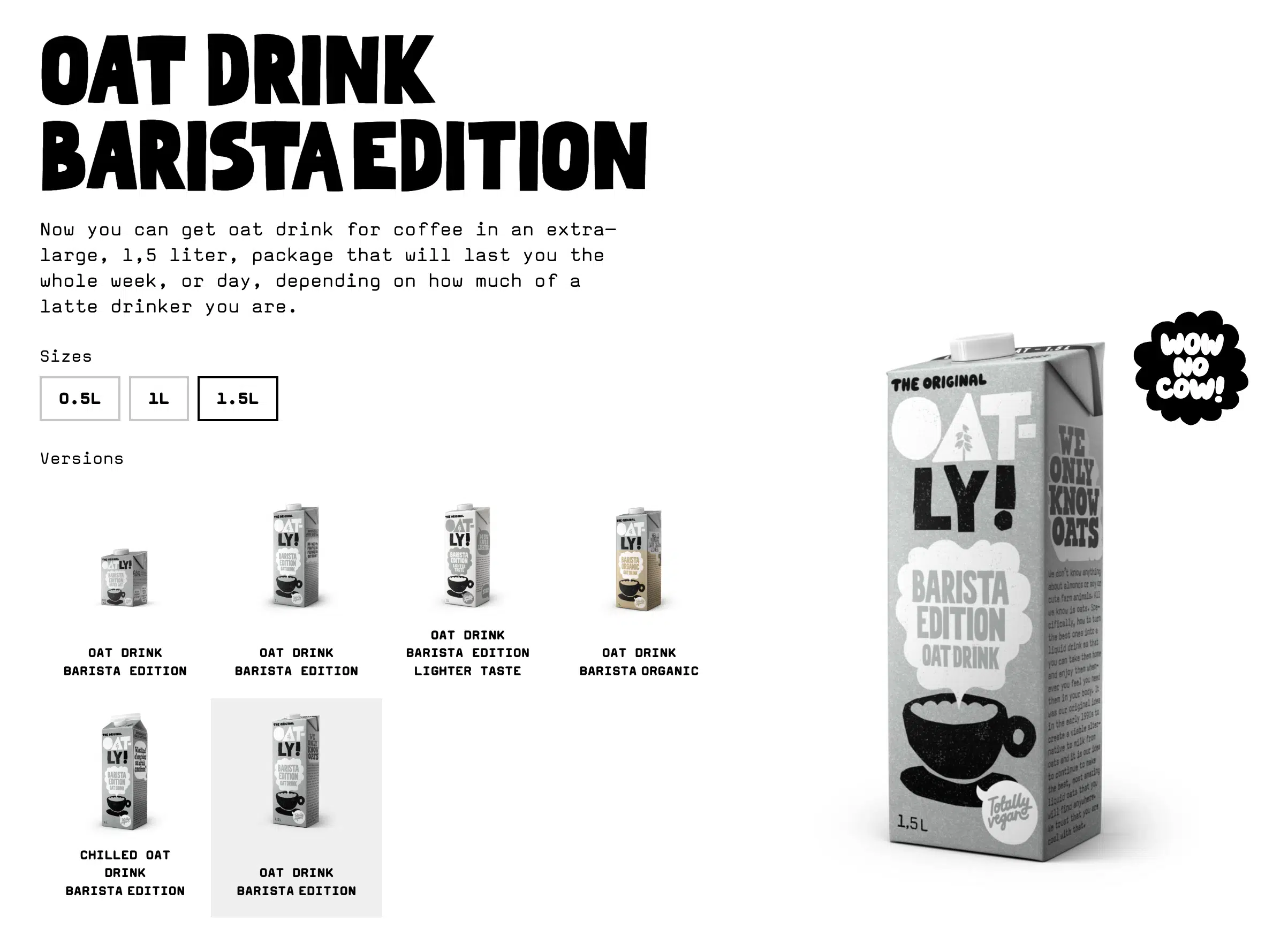
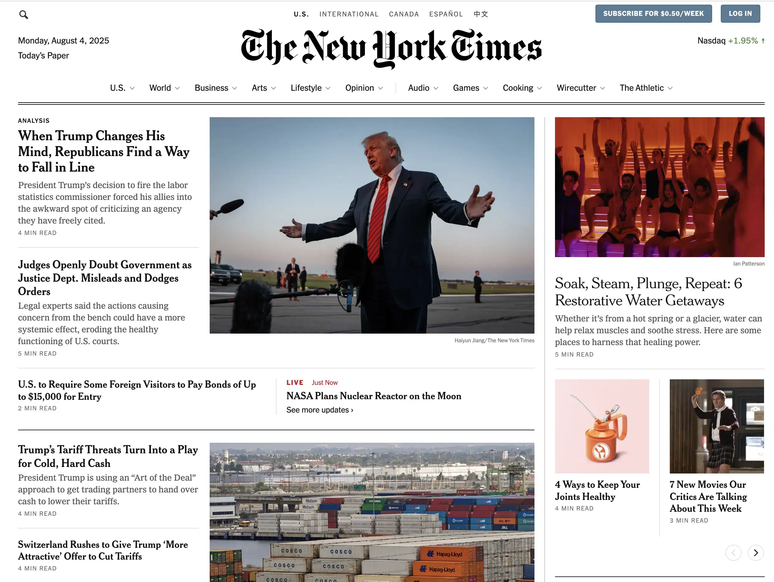
For example, Oatly’s wonky, hand-drawn typography signals rebellion and irreverence, whereas the New York Times’ classic serif signals authority and permanence. Neither of the two is accidental.
Consistent typography also builds recognition over time. Research by Jenni Romaniuk at the Ehrenberg-Bass Institute shows that when used persistently, brand typography becomes a distinctive brand asset—something that brings up your brand name even without seeing your logo.
Read more:
You might like my scientific breakdown on what makes a brand recognisable.
Choosing your fonts
How many fonts should a brand have?
Two typefaces is a good number for most small brands—one characterful one for headlines and a legible one for body text.
If you use more than that and want to manage it yourself, it gets messy quickly. More fonts can work, but they usually require a more experienced eye to pull off.
That said, you don’t always need two typefaces at all. Some brands use a single typeface and switch up the weights. They might use bold for headlines and regular for body, that’s it. This works well if the typeface is flexible enough.
I’d avoid three or more unrelated typefaces, or reaching for a new font every time you want emphasis. Use weight instead.
My own brand only uses a single weight, Neue Montreal Medium. I’m cheating a bit with false bolds—which is technically a no-go—but it works for me as it loads faster on the web.
Should my logo font be the same as my headline font
Often, no. Logo fonts are usually chosen for personality and impact and can be too heavy or decorative to use everywhere without feeling like too much.
Other logo fonts, especially when used alongside a symbol might be too plain. In that case, you might want a headline font with a bit more character.
Whatever you choose, ask yourself: Do your logo font and brand fonts feel like they belong to the same world? They don’t have to match exactly, but they should share certain similarities while also creating enough contrast.
How do I choose the right fonts for my brand?
Start with your brand strategy. The right font for a Sydney law firm is nothing like the right font for a Wellington streetwear brand. It’s not about your taste but about what your audience expects and what you want to signal to them.
Once you know your positioning and brand personality you know what these fonts should say about you. What does your audience already trust? What would feel wrong in their world?
Then test your actual brand name, tagline and copy in that font, not just placeholder text. For logos especially, it’s about the specific letterforms.
Even if another logo might look great in a certain font, it doesn’t nessecarily mean, yours would, too. It has a different letter combination and might require a different font.
For example, Neue Montreal looks quite plain at first glance, but it has a special ligature for “ss” that worked really well for my Nine Blaess logo.
Some fonts also have awkward letterforms or spacing that a generic demo won’t show you—especially free or cheap ones. That’s manageable in a logo, where you can kern individual letters, but not so great for headlines across your whole website.
Can I use Google Fonts for my brand?
Of course, but with caveats. Most Google Fonts are licensed for commercial use, so legally your should be covered—though it’s always worth double-checking. A lot of Google Fonts also have surprisingly good quality for being free.
The issue, though, is overuse. Google Fonts are everywhere, which makes it harder to stand out, and standing out is the whole point of creating your brand.
That said, Google Fonts genuinely useful for body text or when your budget is tight.
When clients don’t want to invest in paid fonts, I usually try to convince them to pair a distinctive high-quality display font with a reliable Google Font for body copy. That way, they get the best of both worlds without breaking the bank.
If you do go the Google route, dig a bit deeper. There are some lovely, distinctive options in there, like Bricolage Grotesque, which I used for the GenEM branding, or Newsreader, which we used for Office Flower Solutions. Both businesses had very limited font budgets, but neither looks like it.
Do I need to buy a font licence?
Yes. If you’re using a font commercially, you need to pay for it, unless it has an Open Font Licence, which covers most Google Fonts and options like Fontshare.
Most people skip this part, and it can cause real problems later.
Most quality foundries distinguish between:
- a desktop licence (for static files, print, logos),
- a web licence (for embedding on your website, usually priced by pageviews or unique users),
- and a social media licence for commercial posts.
If you’re using a font on your website and in print, you likely need both as they’re usually sold separately.
I personally prefer lifetime licences over subscriptions. You pay once, and it’s yours.
Fontshare and YouWorkForThem both work that way. Klim and Pangram Pangram, two of my favourites, are similar. They offer one-off payments with no recurring fees, though you’ll need to upgrade your web licence if your traffic grows past certain pageview thresholds.
Making your brand fonts work together
What do different font types communicate?
- You’ve probably heard the basics:
- Serifs feel established and authoritative
- Sans-serifs are modern and clean
- Scripts feel personal and handmade
- Display fonts create impact and personality
While these can all be true, the category alone won’t tell you much.
Futura feels nothing like Gill Sans. Bodoni feels very different from Garamond.
The sub-classification matters just as much as the broad label, and the small details often tell you more about the fonts personality. Look at the stress angle, the x-height and the contrast level.
Read more:
If you want to go deeper, my guide on how to choose fonts for your brand covers all of it in more detail.
How do I pair fonts without it looking wrong?
Font pairing is one of those things that sounds straightforward until you try it. Here’s what to look for:
- Don’t pair two fonts from the same category. Two serifs compete. Two sans-serifs compete. A serif with a sans-serif gives you a good natural contrast.
- From there, look for similar x-heights. Fonts where the lowercase letters sit at the same visual height feel related even when they look quite different.
- Check the stress angle too—the angle at which contrast occurs in curved letters like the “o”. Bodoni has a vertical stress and feels rigid and modern. Garamond has a diagonal stress, which feels warmer and more organic. Fonts that share a stress angle feel like they belong together.
When you want to create hierarchy, try to reach for weight before you reach for a third typeface. Bold and regular within your existing two fonts will be much easier to get right.
If pairing still feels daunting, start with a superfamily—a typeface that includes both a serif and a sans-serif designed to work together, like Freight or Questa. Or try pairing fonts from the same designer. They tend to share underlying characteristics, even when they look different on the surface.
Staying consistent
What needs to go into typography guidelines?
In your brand guidelines, cover the basics:
- Which typefaces you use
- Which weights go where (headlines, subheads, body, captions, calls to action)
- Sizes and line spacing
- Acceptable text colours and contrast ratios
- What not to do (substitutions, random weights, different fonts on your website vs your social posts)
Visual examples are always better than written rules. Show what’s right and what’s wrong side by side. People absorb it much faster, and they’re less likely to go off-brand when they can see exactly what “right” looks like.
Why does my branding still look inconsistent even when I use the same fonts?
Usually, that’s because the system isn’t being applied consistently. Different people make different calls on sizes, weights and spacing. And without clear rules, you can’t really them. They just don’t know what’s expected and decide by gut feeling.
However, sometimes the guidelines exist and simply aren’t being followed. I have one client where, even after building out a full brand identity together, random fonts keep appearing in their social posts. They use different serifs or different weights—even though we chose a humanist Sans-Serif for their brand.
Templates are the most practical fix for this. If the template is already set up with the right fonts, people can just use it.
What’s different about typography for digital vs print?
The principles stay the same. Your brand typography is always about legibility, hierarchy, consistency and distinctiveness. But the constraints change.
On screen, fonts need to load fast, scale well across devices and stay readable at small sizes. I try to use as few weights and variants as possible as it keeps loading times down and licence costs lower. I also use the CSS clamp() function to create fluid type that scales between mobile and desktop without manual tweaking at every breakpoint. And I always make sure I’ve got the right web licence. When desktop and web are sold separately, it’s an easy thing to miss.
And the same goes for print. Licensing for commercial print use is often a separate thing, so worth checking upfront.
For print, always test before you commit. Paper texture and ink affect how type looks in the final result, especially with high-contrast fonts where thin strokes can disappear completely. What looks right on screen can look very different in a brochure. Premium mockups are a good way to get a realistic preview before you go to print.
Typography is one of those things most people can’t articulate, but still feel. It really makes or breaks a design.
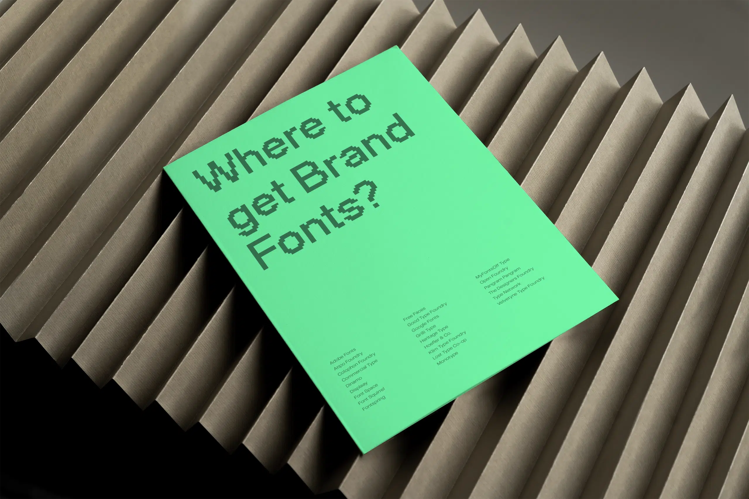
If you want to keep building your skills, my article on 22 tips to improve your typography is a good next step. If you’re still looking for the right fonts, here are the 27 best websites to find fonts for your brand.
And if typography is just one piece of a bigger puzzle, my guide to branding for small businesses covers the full picture.
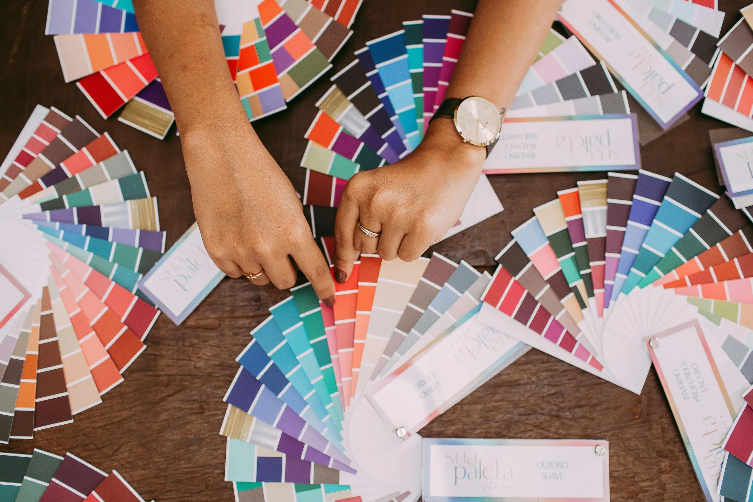
Title image by Teona Swift