It’s not about looking good on a mood board. Your palette needs to work for your business in real life.
In this guide, we’ll look at:
- How many colours a brand needs to function
- The difference between colours for recognition and navigation
- Real-world examples from my work
- 10 examples from global brands, ranging from 3 colours to 102
The “magic number” for success
Most strong brands often use at least three to five colours: one main colour, two neutrals, and an usually accent colour. There’s no strict rule, but this setup gives you enough flexibility without making things complicated.
Your colours help people decide quickly if your brand is for them.
In fact, research shows that between 62 and 90% of snap decisions about products are based on colour alone.
If your palette feels messy or inconsistent, people might switch off before they even know what you offer—or not recognise your brand at all.
Why a brand needs at least three colours
At a minimum, a functional brand system needs a clear hierarchy to stay organised:
- One primary colour: This is the core colour people will recognise and remember first.
- Two neutrals: These include a light background colour and a dark text colour. Neutrals ensure your content is readable and professional while remaining on-brand.
Optional fourth colour
If you’re building a website, you’ll probably need a fourth colour. An accent helps guide people to your call-to-action buttons and links.
If you use your main brand colour for everything, you lose contrast. That’s why it helps to have a dedicated accent to make the next step obvious.
Understanding your colour hierarchy
Primary colours
Your primary brand colour—or sometimes a combination of two or more—leads your visual identity.
Use it across all brand touchpoints where people see you, especially in your logo, favicon, social media icon and so on. That’s how you build instant recognition.
Secondary, tertiary, and neutral colours
- Secondary colours: Pick two to four that work with your main colour. These give you options for things like backgrounds, highlights, or extra details.
- Tertiary colours: Only add these if you need them for complex things like infographics or charts, where you have to show lots of differences at once.
- Neutrals: These give your main colours space to stand out and keep your design from feeling crowded.
Are more colours always better?
More colours aren’t always better. Of course, too few can feel flat and limited, but too many and your brand starts to look cluttered and forgettable.
Since you have to teach people to spot your brand by its distinctive brand assets—the colours, typography, etc.,the more colours you add, the harder it is for them to recognise and remember you.
A simple palette helps people connect with your brand faster. It’s also easier to manage and roll out across everything you do.
But as your brand grows or gets more complex, you might need more than just a handful of colours.
If you have a wide product range or a complex offer, you’ll probably need more colours to help people find their way.
You might need to expand your palette if you deal with things like:
- Segmented services: If you offer distinct pillars like consulting vs. training, giving each a dedicated accent colour helps your audience instantly know which department they are in.
- Digital interfaces & dashboards: If your brand is a tool, you need colours for UI States (Success, Error, Warning, Active, and so on) so users can navigate the interface without reading every label.
- Data visualisation: Brands dealing with analytics or reporting need a wide range of secondary and tertiary palettes to make charts and graphs readable and distinct.
- Sub-brands, collections & product ranges: If you manage a more complex brand architecture—let’s say a premium skincare line with three distinct collections for ageing, hydration, and sun care—colour becomes the thread that connects them while allowing each to have its own personality.
Tip
If your offer is straightforward, fewer colours make your brand easier to spot. If you have many services or sub-brands, a larger palette can help with organisation and navigation.
Strategic colour palette examples from my freelance work
1. Gen EM
The GenEM team designed an on-demand course to boost junior doctors’ confidence and skills as they transition into the high-pressure environment of the Emergency Department.
The challenge
Gen EM is led by three founders, each with a distinct personality and area of expertise. They needed to represent three individual voices across social media, podcasts, and the course itself without the brand feeling fragmented or messy.
The strategy
Each founder got their own main colour: orange, blue, or red. We created lighter and darker versions of each to keep things flexible. The neutrals—beiges and dark blue—tie everything together for text, backgrounds, and shared brand moments.
The result
The logo is a bird with three feathers, each one for a founder. Each doctor owns their colour, which shows up in their social media and even the clothes they wear on camera. For students, it’s a simple way to know who’s speaking and makes it easier to follow along with complex topics.
2. Office Flower Solutions
Office Flower Solutions is a Melbourne-based subscription service providing ultra-realistic floral arrangements to high-end offices and reception areas.
The challenge
In the floral industry, many brands use pink or colourful paired with black.
Furthermore, artificial flowers have a reputation for being tacky or outdated. We needed to shift perceptions and position the brand as a sophisticated, modern alternative to fresh flowers—without losing the founder’s witty, personal energy.
The strategy
We skipped the usual floral colours and went for deep greens and warm beiges—tones you’d find in nature. This gives the brand a fresh, high-quality feel. To add some personality, we used a bold purple as an accent.
The result
The greens and beiges give the brand a polished, editorial look, letting the flowers stand out. The purple is used for call-to-action buttons and highlights. It’s a modern, premium approach that shows artificial can be both elegant and contemporary.
10 Real-world brand colour examples
To show you that anything is possible, here’s how ten well-known brands handle their colour systems:
1. Hulu (3 colours)
Hulu relies mainly on its Hulu Green to dominate its digital interface.
By sticking to this minimal palette, they ensure instant recognition in a sea of app icons.
Source: Hulu colour guidelines

2. New Balance (3 colours)
New Balance focuses on three brand colours: Red, Black, and White. But as with Hulu, I noticed New Balance also uses some grey tones.
Source: Branding Style Guides

3. Instagram (5 colours)
Instagram uses a yellow-to-purple gradient to reflect the creativity of its users. The branding stays vibrant without overcomplicating the UI.
Source: Instagram

4. Ogilvy (8 colours)
As a global agency, Ogilvy needs a wider range of colours to support sophisticated, high-end design in its editorial reports, including graphs and other visuals.
Source: Branding Style Guides

5. Uber (9 colours)
Uber uses colour as a functional tool. Their 9-colour system helps users distinguish ride types such as UberX, Comfort, and Lux in-app.
Source: Branding Style Guides

6. Fiat (11 colours)
Fiat uses a broader secondary range to distinguish its diverse car models and product lines under a single primary brand.
Source: Branding Style Guides

7. Skoda (15 colours)
With 15 hues, Skoda uses colour for technical precision, particularly in its car configurators and engineering diagrams.
Source: Branding Style Guides

8. Zoom (17 colours)
Zoom’s palette is built for the interface. They use specific tones for their mute, share, and record states so the user never has to guess a button’s function.
Source: Zoom colour guidelines

9. Warner Brothers (26 colours)
A film studio needs a bit more of a flexible vibe. With 26 colours, they can adapt their branding to suit any genre, from horror to romantic comedy.

10. IBM (102 colours)
IBM is the ultimate example of a complex brand. Their 102 colours enable complex data visualisation while keeping the main blue visible. In fact, the blue is mixed into any of the other tones.
Source: IBM brand colour guidelines

Tips for creating your colour palette
- Start with purpose. Get clear on your mission and values before you pick any colours. Your palette should be a reflection of your strategy, not a random choice.
- Think about the feeling. The right palette helps you connect with your audience instantly. Consider the psychological impact of your colours before committing.
- Respect the hierarchy. Don’t treat every colour the same. Decide which ones should lead and which should support, so your brand feels intentional.
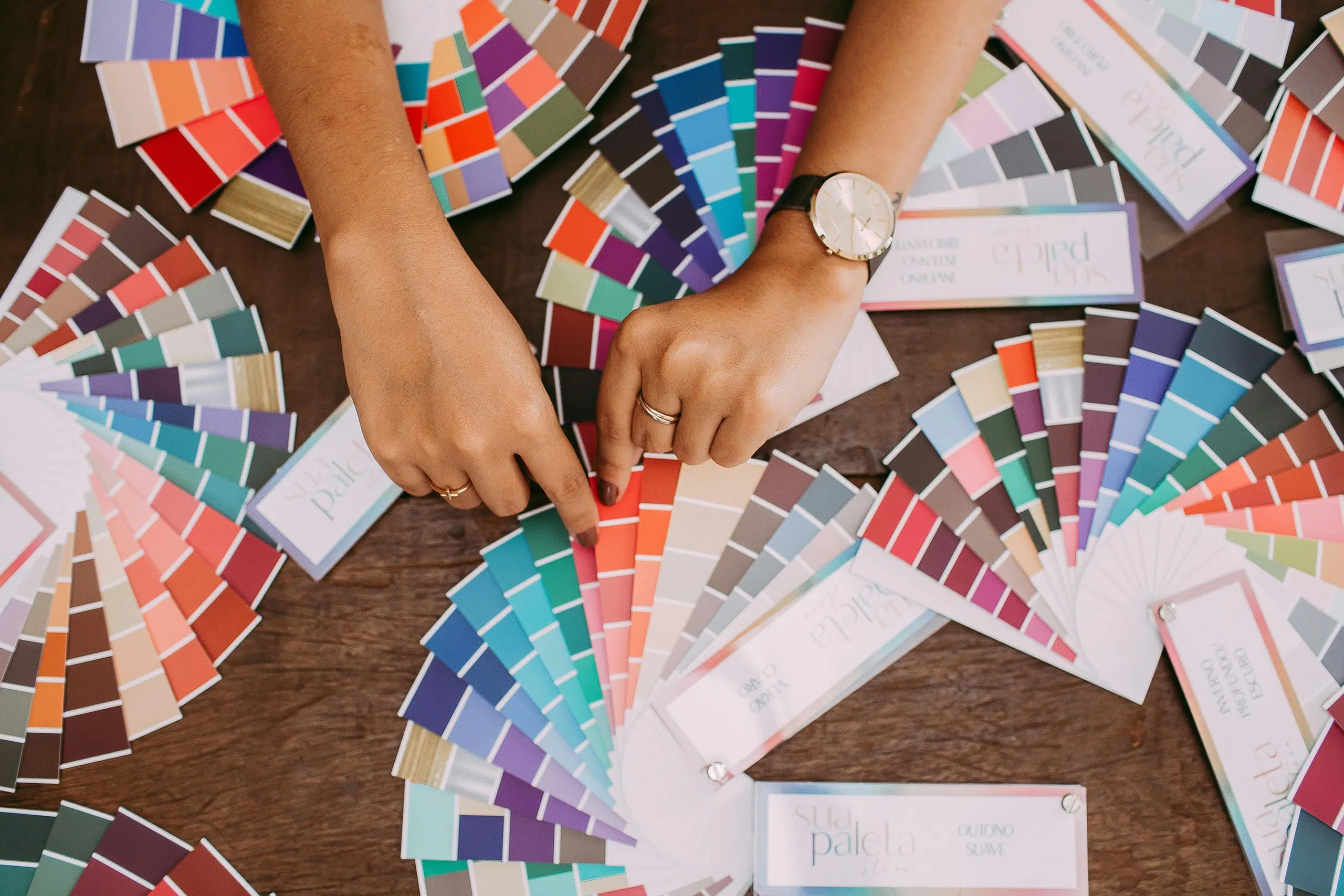
- Define your shades. You might want to create a few variations of each main colour—tools like Coolors can help. This gives you much more flexibility for digital designs and backgrounds.
- Skip pure black and white. These can be harsh on the eyes. Using softer, slightly “branded” colours makes your brand feel more thoughtful and on-brand.
- Check for accessibility. Ensure your colours work everywhere and are easy to read. High contrast is non-negotiable—for websites and digital interfaces especially.
- Document your codes. Clear brand guidelines (HEX, RGB, and CMYK) make it easier to stay consistent as your business grows and you bring on new team members.
Further reading
If you like these tips, you can find a comprehensive article on creating your unique brand colour palette here.
Conclusion
As you see, there is no single answer to how many colours your brand should use. The ten global brands above use an average of 10.8 colours, but each one feels cohesive in its own way.
As a general rule of thumb:
- If you’re a solo entrepreneur, stick to 3 to 5 colours. A small palette helps people recognise your brand more quickly.
- If you have a SaaS platform or brand with a complex offering, you may need ten or more colours to label different parts of your dashboard or interface, for example. Just make sure you still have a strong brand colour or combination to ensure brand recognition.
Whether you use 3 colours or 30, focus on helping people connect and navigate with your brand—not just following the rules.
The optimal number for you depends on your brand’s unique personality, positioning and usage.
Feeling overwhelmed by your brand palette?
Feeling overwhelmed by your brand palette? You don’t need 102 colours like IBM to look professional—you just need the right ones.
If you’re ready to define your unique brand assets and be seen as an expert in your field, contact me here.
Title image by Helena Lopes
This article contains an affiliate link, meaning I earn a small commission if you decide to subscribe to Coolors. However, I only ever recommend tools that I trust.