They matter even more now than they did then. AI tools are changing how we design, and lots of jobs that used to go to junior designers are now done by algorithms. So put your energy where the tools fall short. AI can place pixels perfectly within a grid, but it can’t tell when a ragged line isn’t set well, or why one typeface works for better for a certain audience. That’s where your trained eye can make all the difference.
Here are 22 typography tips that go beyond the basics, the details that separate type that was set from type that was merely placed.
1. Consider your audience
When analysing your target audience, think beyond age and location. Get to know their world. What feels familiar to them? What signals quality? And what doesn’t work for them?
A typeface that works in a Copenhagen design studio might feel completely wrong for a family business in rural New Zealand. AI can analyse data, but it doesn’t have that cultural intuition you do.
So before you start, ask yourself:
- Who is this for?
- What matters to these people?
- How should this design feel to them?
Design tip
Don’t just think about who your target audience is, but also who they already trust. Choose fonts that connect with that world.
You can find out more in my article, where I explain why it’s important for businesses and brands to know their target audience.
2. Choose professionally designed fonts
Free fonts can work well, but they can be overused. Professional fonts often offer more uniqueness, a wider range of weights and styles, and complete character sets.
I work in German and in te reo Māori, and while umlauts sit in the basic Latin set that almost every font covers, macrons like ā and ō do not. A font that looks complete can leave you without half the vowels a language needs.
Variable fonts are also worth considering. They combine multiple weights and styles into a single file, which makes them load faster on websites. However, if you only need one or two weights, individual files might still be the better choice.
Design tip
If you want your design to stand out, invest in a high-quality font.
In this article, I’ll introduce you to the best websites for finding fonts—both open-source and paid ones. Many foundries offer trial versions, so be sure to test fonts before you commit.
3. Apply hierarchy
Every design needs a clear hierarchy to guide the reader’s eye. Since most people scan a page before reading it, if the information isn’t laid out clearly, your message will get lost. And if readers can’t find what they’re looking for quickly, you’ll lose them.
Size, font weight, colour and font style all help to create hierarchy and guide the eye.
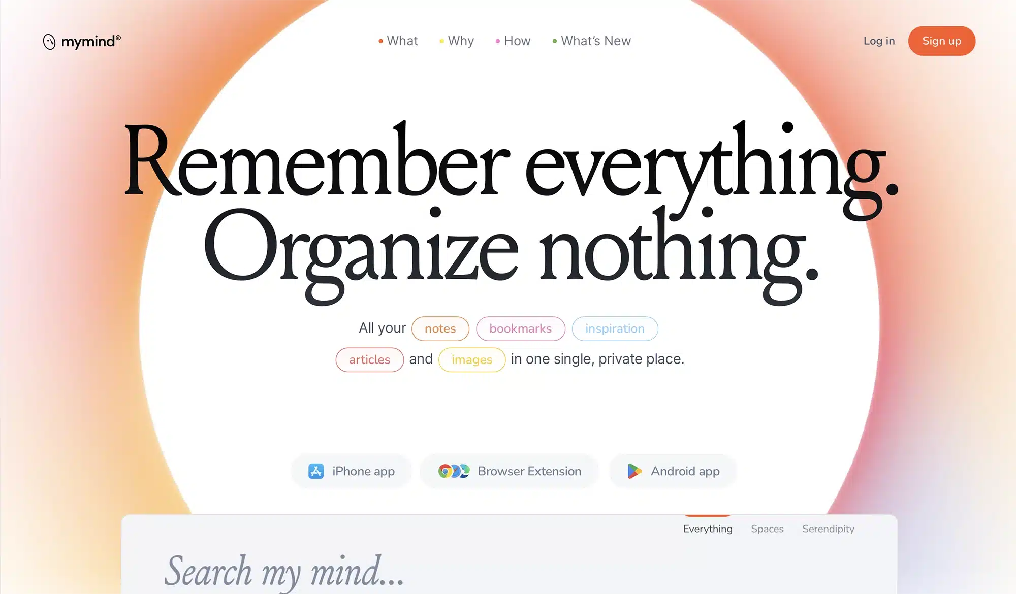
On the MyMind website, for instance, your gaze is initially drawn to the headline, then to the button and finally to the navigation bar. Even the shapes help guide you to the centred headline.
Design tip
Before you start designing, decide what you want people to notice first, second and third, and then structure your layout around that. It’s one of those simple typography tips that makes a big difference to the final design.
4. Use grid systems
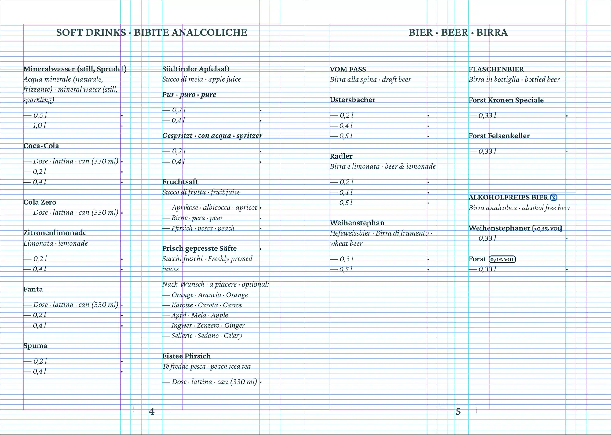
Grids add structure. They align content in columns and rows, ensuring nothing feels out of place.
There are many different types of grids, and a few common ones are worth knowing:
- The manuscript grid has one main text column and is ideal for books and long-form reading.
- The column grid, with multiple columns, is standard for websites and magazines.
- The modular grid combines columns and rows, making it useful for complex layouts with extensive content.
- A hierarchical grid is freeform and follows the content rather than fixed columns.
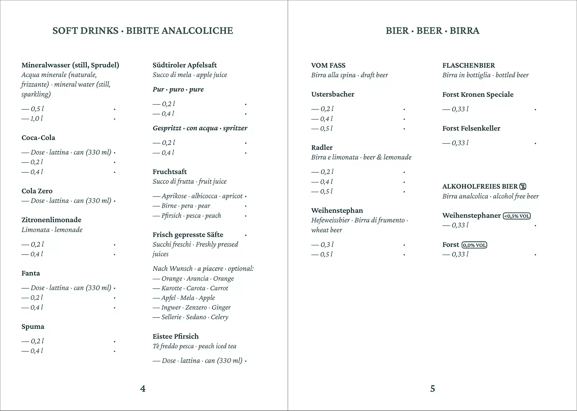
A baseline grid is different again. It sits underneath whichever grid you choose and aligns your text to a consistent vertical rhythm, which makes multi-column layouts feel more cohesive—especially in print where the back of the page might shine through.
Design tip
If you stick too closely to a grid, your design can end up looking too rigid. By allowing some elements to break out of the grid, you create visual interest. But don’t overdo it.
5. Don’t mix too many fonts, and pair them well
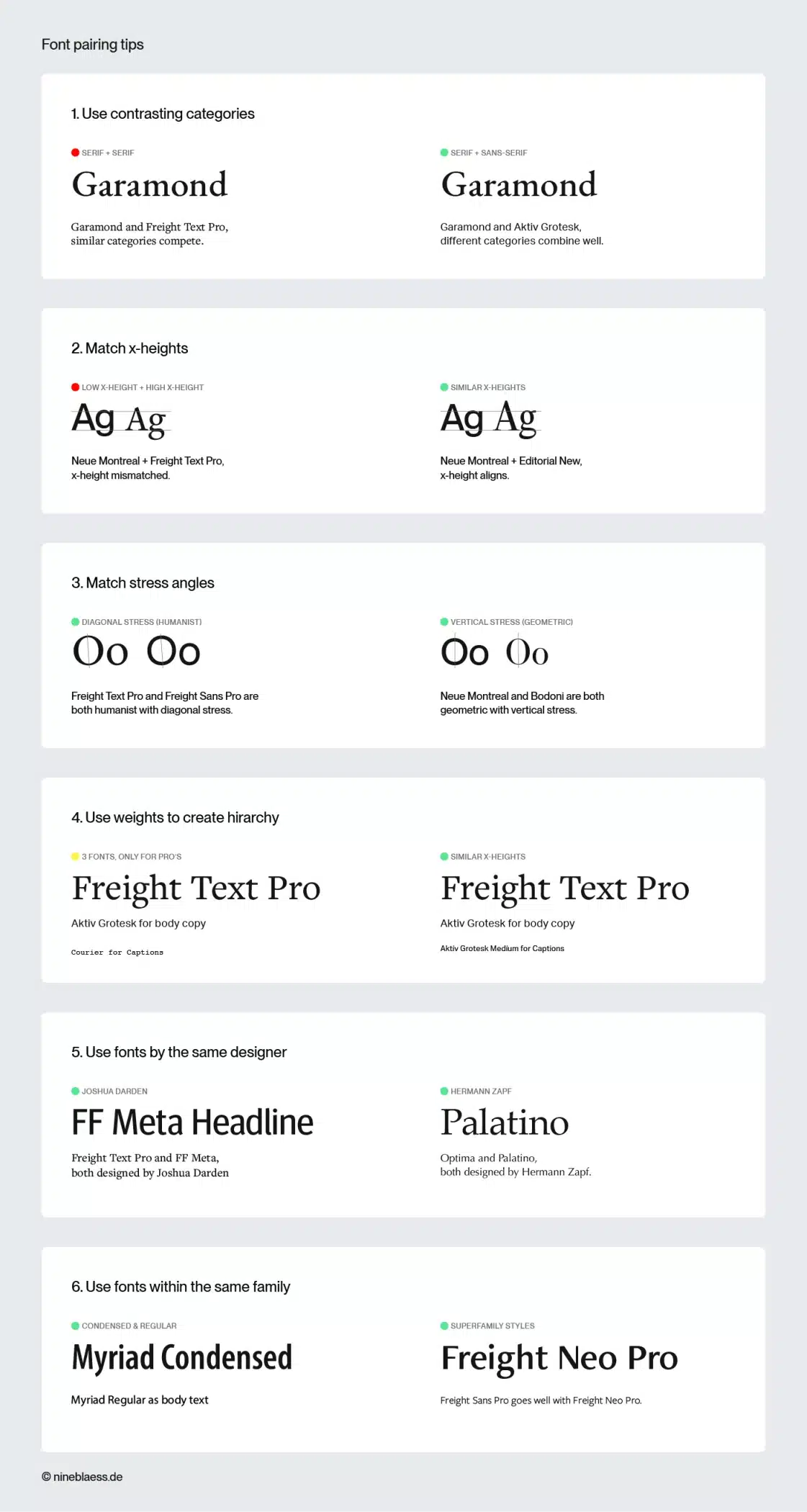
As a rule of thumb, stick to two or three fonts. Any more than that and your design will start to look cluttered—unless you know what you’re doing. If you want to combine different typefaces, these tips should help:
- Don’t pair two fonts from the same classification. For example, pick a serif font and a sans-serif font to create contrast and stop them competing with each other.
- Keep an eye on the x-height. Fonts with a similar x-height go better together.
- Try combining fonts that have a similar stress angle—either vertical or diagonal—to create a sense of cohesion.
- Create a hierarchy using different weights, before you add more fonts.
- Pair fonts of the same designer as they often share similar proportions and work well together.
- A lot of typefaces have narrow and wide versions (condensed and extended). Mix and match them to create visual interest within a family.
- Pick one typeface to use for headings and another, complementary one for the body text. Don’t treat them both the same.
6. Use contrast
Contrast helps to create a visual hierarchy and ensure that content remains readable. You can use size, weight, colour, style or even backgrounds to create contrast—as Jokolade’s example shows.
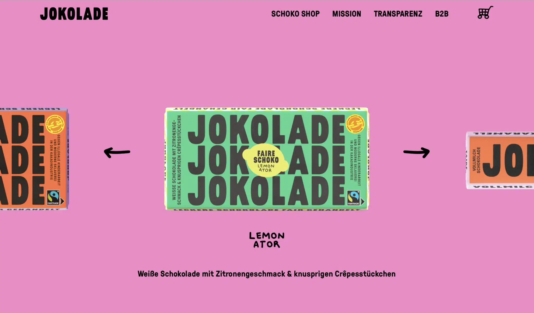
As you can see, you can also create contrast by using different colours or shapes behind the text. Just make sure the text remains clearly legible on the background’s colour.
Design tip
If you’re unsure about readability, check the contrast ratio. WCAG asks for 4.5:1 on body text and 3:1 on large text, which means anything from 24px, or 19px if it’s bold. There are tools like Coolors that can help you test this ratio for your specific hues.
7. Use whitespace
As beginners, we often underestimate white space. You don’t need to fill every inch of your layout with text or images. Most of the time, less is more.
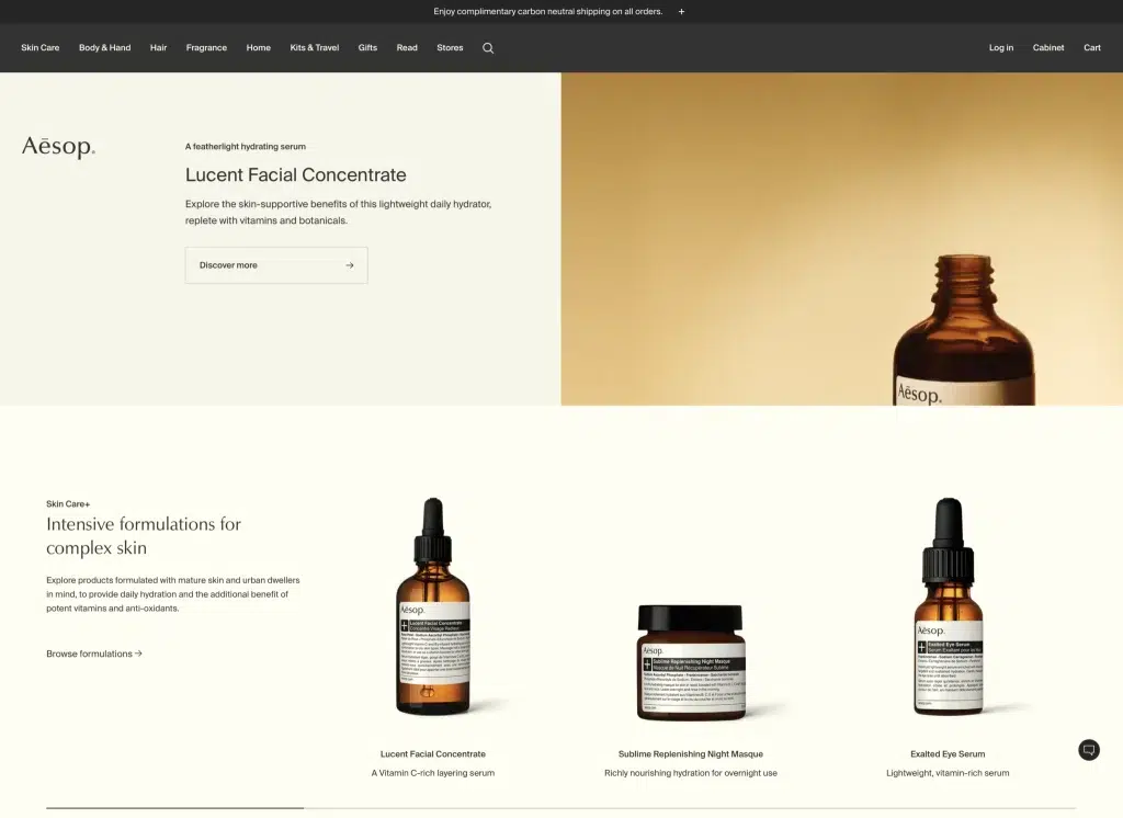
White space lets your design breathe and gives it a more premium feel. It also directs attention exactly where you want it.
A good example is Aesop’s website. It’s pretty minimalist, which makes it look high-end.
Design tip
Sometimes it helps to start by stripping everything down to the essentials and keeping only what actually serves the message.
8. Get your alignment right
The way you align your text affects both how your design looks and how easy it is to read.
For body text, left-aligned is usually the best choice. Readers in left-to-right cultures can start each line at the same point, which reduces eye strain.
When using left-aligned text, pay attention to the rag—the uneven vertical edge on the right. A good rag looks soft and organic, not like a staircase or a canyon. This is exactly where AI still falls short. It breaks lines wherever they hit the container’s edge, without considering the visual rhythm.
Centred text works well for short passages like quotes or headings, but becomes harder to follow over longer lines.
Justified text can look formal in print, but it’s harder to get right. Narrow columns often result in uneven word spacing, so only use it when your line length is long enough to avoid gaps. For websites, I wouldn’t recommend it at all.
Design tip
Always enable hyphenation when using justified text. This ensures that the spacing is distributed more evenly and prevents ugly gaps.
9. Avoid pure black and white
Black text on a white background can be tiring on the eyes, especially on screens. It helps to dial down the intensity a little. Most readers won’t consciously notice the difference between pure and near-black, but they’ll feel it.
My website, for example, uses #080708 for black and #F5F5F5 for white. It makes reading noticeably more pleasant.
The same applies to dark mode. White text on a black background can feel harsh. Cream text on dark grey is much easier on the eye.
Design tip
You can also use a background in a subtle shade of your brand colour. This creates a subliminal brand reference.
In this context, you might also like my article on what makes a brand recognisable.
10. Align optically, not mathematically
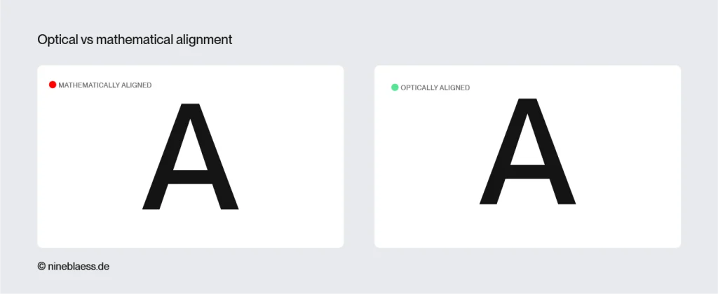
Even if something is mathematically centred, it can still look off. Certain letterforms—like A, V or T—have more open space on one side, which makes them appear off-centre against a background, even when they’re not.
Type designers know this and build small optical corrections into their typefaces. You should do the same, especially when placing text in buttons or other shapes.
A good approach is to start with mathematical alignment, then fine-tune by eye. If something looks off, trust your instincts—you’re usually right.
By the way, AI still can’t do this. It works with bounding boxes—the outermost edges of a shape—and aligns purely mathematically.
Design tip
The more you practise, the better and quicker your eye will get with this.Text inside buttons and shapes usually needs the same treatment.
If you’re finding it difficult to spot uneven spacing because you are focusing on reading the word, simply turn your design upside down and your brain will start reading the letters as shapes instead of words.
11. Use a typographic scale
A typographic scale ensures that heading and body text sizes are coordinated and everything feels related rather than arbitrary. The principle is that each size is derived from the previous one by multiplying it by a fixed ratio.
Always start with your body text size and work the headings out from there. If your body text is 16px and you use the Golden Ratio (1.618), the next size up would be 16 × 1.618 = roughly 26px.
Typescale.com does the maths for you. But always adjust the final sizes by eye. What looks right in a tool can still feel off in a real layout.
Design tip
A typographic scale also makes life easier for developers, since a well-thought-out typographic system gets built once and can be used everywhere.
In web design, I like to use the CSS clamp() function to create fluid type that scales automatically between mobile and desktop.
12. Use optical sizes (display vs. text fonts)
Typography isn’t as simple as scaling a font up or down. High-quality families sometimes come with optical sizes, which are cuts drawn for a specific scale rather than scaled versions of one drawing. Klim’s Tiempos is a good example, with Headline, Text and Fine covering three different jobs.
Display and headline fonts are designed for 24px and above. They have tighter letter spacing and fine hairlines that look elegant at large sizes.
Text fonts are designed for body copy. They have wider apertures—the openings in letters like ‘e’ or ‘c’—and more robust strokes that hold up at small sizes.
Most AI tools and basic generators simply scale body fonts up or down. And it shows. The results look clunky and hard to read.
Design tip
Check whether your font family includes cuts called Display, Headline, Banner or Poster. These are made for large sizes. For small text, stick to the Text or Body variants.
13. Get your leading right
Leading is the distance between lines of text. If you get it wrong, your text will be hard to read. Lines that are too close together blur into each other, and lines that are too far apart look scattered and disconnected.
A good starting point is 1.2 times the font size for headings and 1.5 times for body text. Adjust from there based on your font and line length.
Design tip
In web design, you’ll often need to tweak line height (your leading) for different screen sizes. What works on desktop can feel too tight on mobile, especially when the line length is shorter.
14. Control your line length
Line length has a bigger impact on readability than most people realise. Long lines make it hard to find your way back to the start of the next one, and lines that are too short disrupt the reading flow.
For body text, a good rule of thumb is 45 to 75 characters per line, with around 65 being ideal for single-column layouts.
That means, on wide screens, keep your text column narrow rather than letting it stretch across the full width.
Design tip
On mobile, shorter lines of around 40 to 50 characters tend to work better because of the narrower screen.
15. Use lead paragraphs
A lead paragraph is a short intro that stands out visually from the rest of the body text—through a larger size, a different weight, style, or even a drop capital. It eases readers in before they commit to the full piece.
Lead paragraphs are also useful for breaking up long text. In a brochure or on a website, not everything can carry equal weight. Setting one paragraph differently signals what matters and makes the layout feel more considered. Online, articles get shared even before people read them. A lead paragraph is a great wat to give them a passage they can quote without having finished the piece.
To see this in practice, scroll back up. The first paragraph of every article on this website is set larger.
16. Use low-stroke-contrast fonts for body text
Fonts with high stroke contrast, like Bodoni, look great in large sizes. But at small sizes, the fine hairline strokes disappear, and the text becomes difficult to read.
When it comes to body text, it’s always best to go for fonts that have consistent stroke weights and low contrast. They’re easier on the eye and stay legible even at small sizes.
17. Pay attention to x-height
The x-height refers to the height of the lowercase letters in a typeface. Fonts with a larger x-height are generally easier to read at small sizes because the letters stand out more clearly.
But there is a limit. A very large x-height leaves less room for ascenders and descenders, and those are what tell an h from an n, or a b from an o. When the ascenders and descenders shorten too much, the letters start to look alike, which makes reading more difficult.
18. Use italics, not bold, for emphasis
I always find it a bit irritating when I see a sentence full of bold words. It disrupts the reading flow and makes the eye jump around the page.
Italics are a more subtle way of emphasising. The message comes across without dominating the rest of the text.
That said, bold isn’t always wrong. At the start of a bullet point it helps readers skim. And accessibility guidance leans the other way on long passages, because italics are harder to read for people with dyslexia, so keep them to a phrase rather than a paragraph.
19. Watch for runts, widows and orphans
A runt is a single word alone on the last line of a paragraph, on the same page as the rest of the text. Widows and orphans happen where text breaks across pages or columns. A widow is a paragraph’s last line pushed to the top of the next page, an orphan its first line left at the bottom of the previous one. All three look unfinished.
In print you fix all three by adjusting line breaks or rewriting a few words. On the web you only ever get runts because a scrolling page has no page breaks. And since text reflows at every screen size, a rewrite that works on your laptop can create a new runt on someone’s phone. Sometimes you have to let it go.
Design tip
The CSS properties widows and orphans only work where pages or columns break, and browser support is patchy anyway. Against runts, the reliable fix is a non-breaking space ( ) between the last two words of a paragraph. They then break together.
20. Pay attention to kerning
Kerning is the space between individual letter pairs. Even a small mistake here can make a design look unprofessional. While most people won’t consciously notice it, they’ll sense something is off, especially in logos and large headlines.
Most design tools handle kerning automatically, but they can only work with what the font provides. Free fonts often have incomplete kerning tables, which is another reason to invest in a professional font.
Either way, always check headlines and logos manually. The bigger the type, the more visible bad kerning becomes.
Generative tools are worse off again. An image model draws letterforms rather than setting them, so no kerning table is involved at all. And where a tool does set real type, it applies what the font provides and stops there. Pairs like Va, Ty, Wa or Ly still open optical gaps in a headline, and only a trained eye will catch them.
Design tip
If you want to train your eye, this kerning game is a good exercise. Five minutes is all it takes and afterwards, you’ll spot bad kerning everywhere.
21. Use OpenType features and glyphs
Most professional fonts have options that many designers never use, but OpenType features make your typesetting look instantly professional.
Depending on the font, you might have access to:
- Ligatures combine two letters into one glyph, like fi or fl, for cleaner spacing and a more polished look.
- Small caps are drawn as their own shapes, slightly taller than the x-height and with the stroke weight adjusted to match the lowercase. That’s why they beat the fake ones made from real capitals, which always come out too thin.
- Stylistic alternates offer different versions of specific letters for a slightly different feel.
- Swashes add decorative flourishes to certain characters, which works well for display type.
- Old-style figures rise and fall like lowercase letters instead of standing at a uniform height, so numbers blend into running text.
- Contextual alternates adjust automatically based on surrounding characters for better spacing and flow.
- Fractions give you proper glyphs like ¼ instead of the clunky 1/4.
Design tip
In Illustrator and InDesign, you’ll find ‘OpenType’ and ‘Glyphs’ among your tools. It’s worth spending a few minutes exploring them to see what your fonts have to offer.
22. Get your punctuation right
Punctuation is part of typography too. If you get it wrong, it disrupts the reading flow, even if most people couldn’t pinpoint exactly why.
It’s also one of the clearest signs of AI-generated or amateur layouts. Algorithms default to straight quotation marks and foot marks because they don’t understand the context of the sentence.
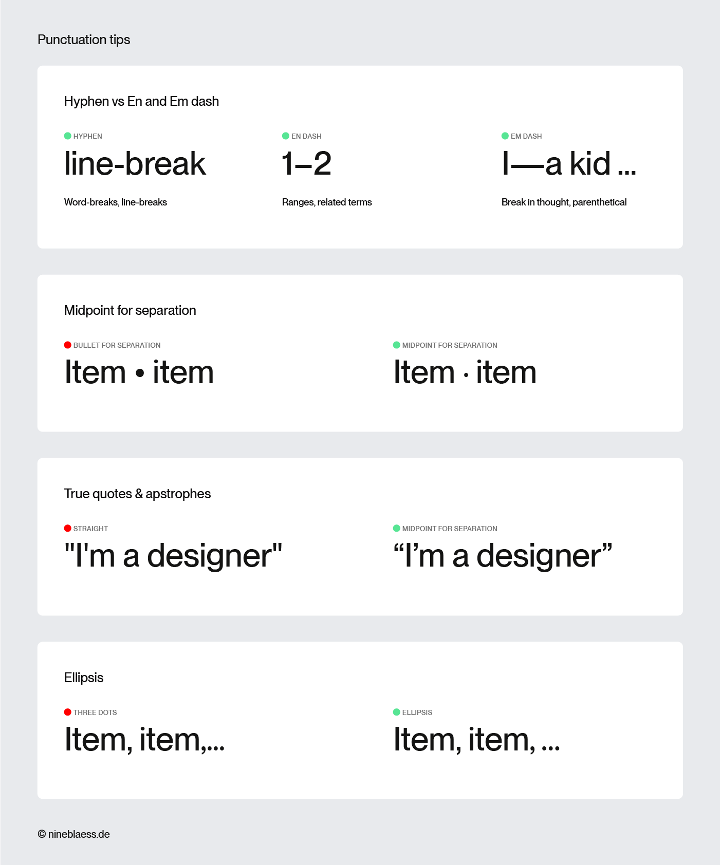
Here’s a quick overview of the correct characters:
- Hyphen (-): joins words together or breaks them at the end of a line
- En dash (–): used for number ranges (pages 10–20) and to connect related terms
- Em dash (—): marks a break in thought or sets off a parenthetical—like this. British and Australian style usually sets a spaced en dash instead – like this.
- Midpoint (·): a subtle alternative to bullet points for separating list items
- Proper quotes (“ ”): curved and directional, not the straight default (” “) your keyboard types
- Apostrophe (’): the curved mark used for possessives and contractions, not the straight typewriter version. It’s also not the prime, which marks feet and minutes, or the double prime, which marks inches and seconds.
- Ellipsis (…): a single character, not three dots typed separately
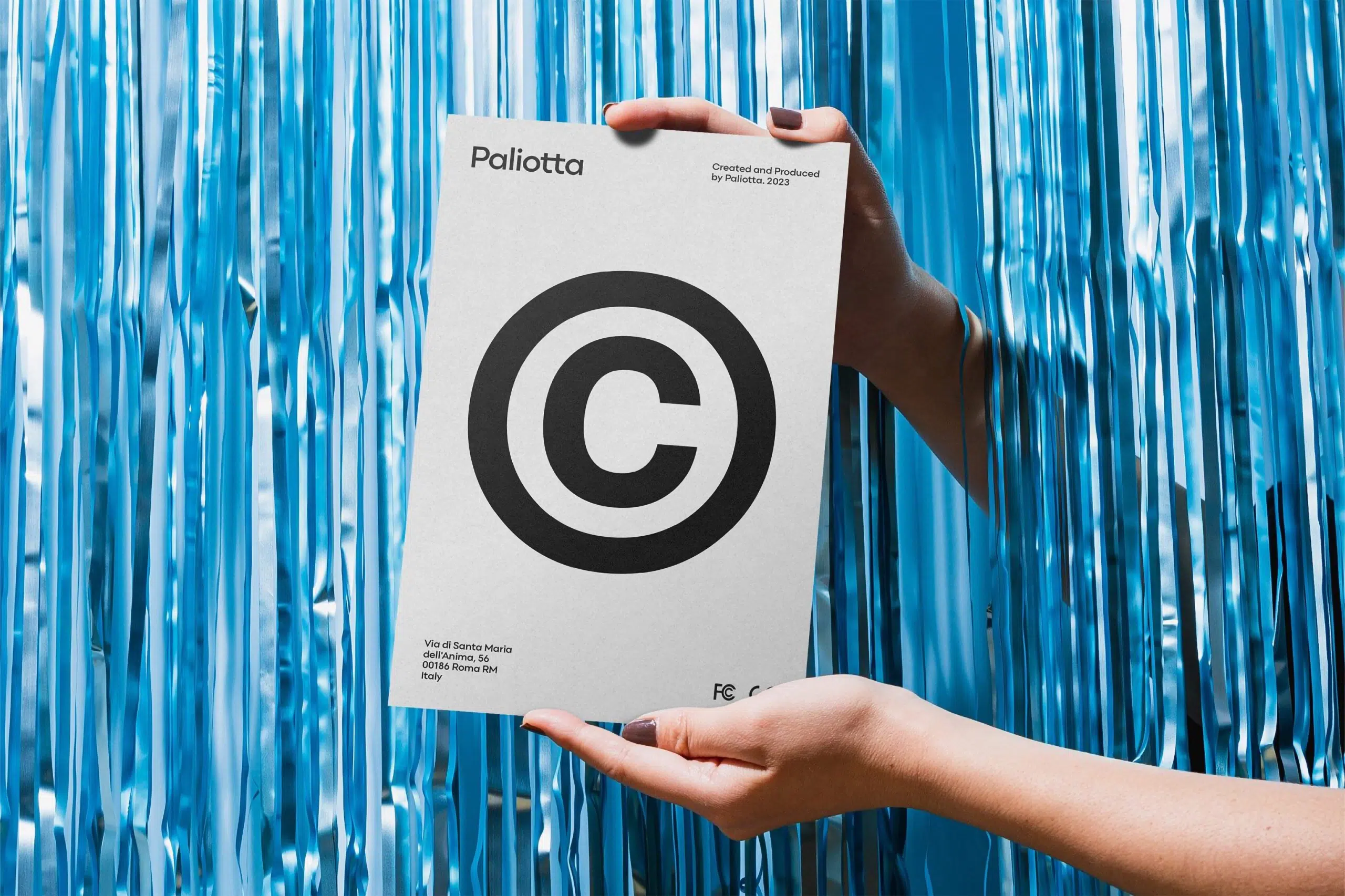
- Correct symbols (© ® °C ™): use the proper character, not a typed approximation like (c)
Bonus tip: Keep improving your typography skills
None of this came naturally to me. I learned it though trial and error. So, a trained eye isn’t something you have or don’t have. It needs practise to build. Ultimately, typography is about creating a system so intuitive that people don’t even realise they’re being guided. I hope these tips help you get there.
Lastly, knowing the rules is great but knowing when to break them matters just as much. AI tools will follow them perfectly every time. That’s exactly where your advantage lies—in designing like a human.
Typography resources
- Numerous books and courses offer an excellent way to delve deeper into the subject.
- A valuable resource is also The Flawless Typography Checklist by Typewolf, which synthesises insights and expertise from various sources.
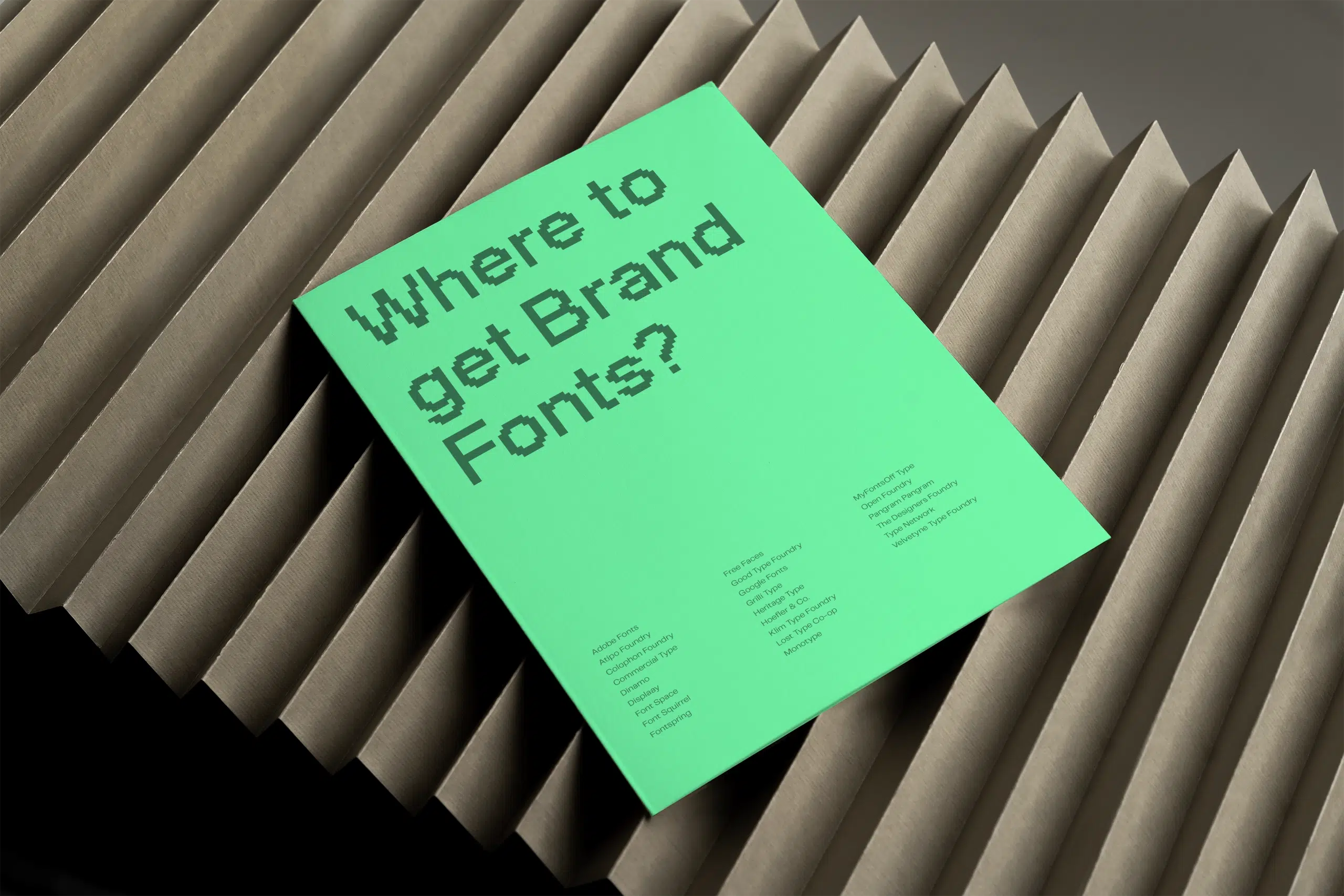
- Here are the 27 best websites to find fonts for your brand.
- This article with eight cutting-edge font trends might inspire you—although I don’t advise you to follow trends too closely as designs that do tend to look outdated after a while.
- And finally practise, practice, practise.
What’s next?
- If you want to present your work professionally, check out my collection of the best premium mockup sites—including some discount codes.
- If you also want to improve the photography side of your designs, my article on the best stock photo sites is a good place to start.
- And if you want to keep building your skills beyond typography, I’ve put together the best branding resources with books, tools, and references worth keeping handy.
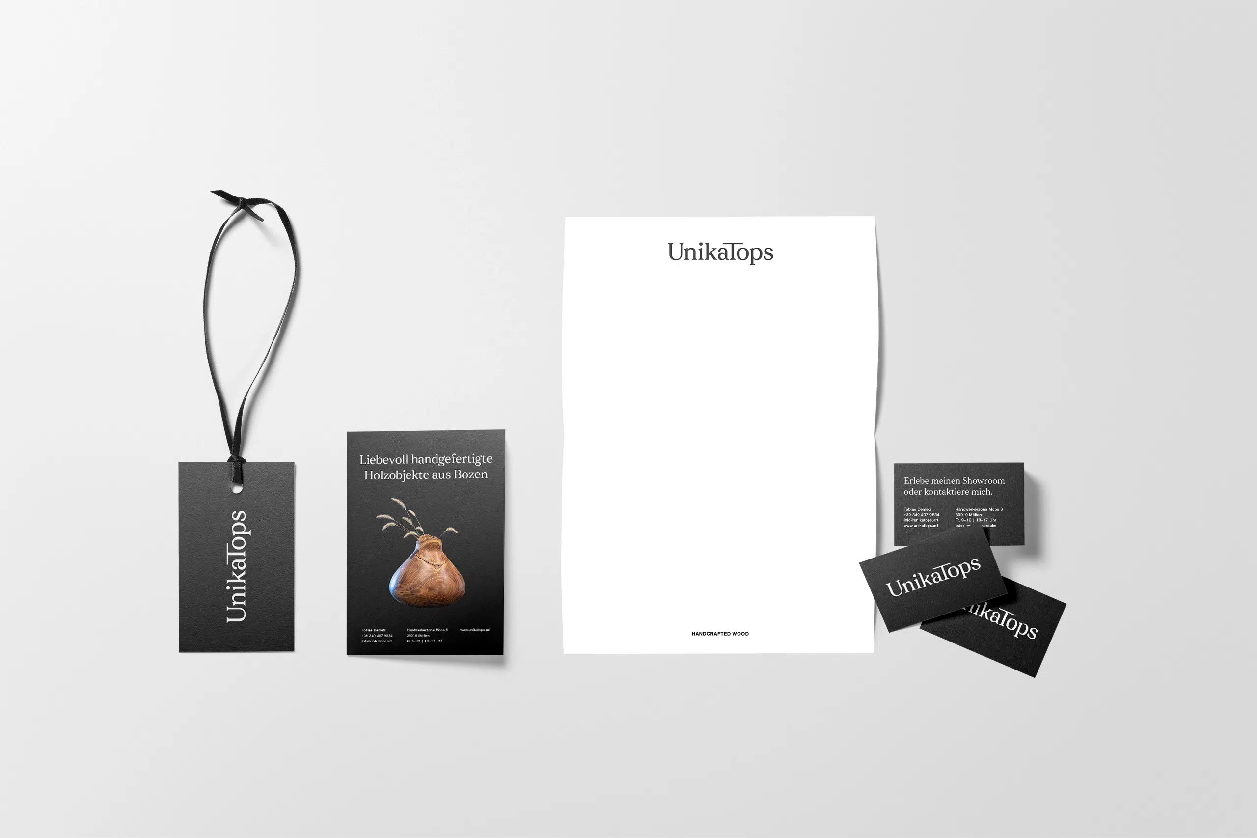
These are the details I obsess over in client work. If you’d like to see how they look in a finished identity, check out my work.